If your own an IT company, your logo must be spot on. A strong tech company logo communicates your organization's vision, objective, and future in a single, unassuming brand symbol. In addition, your logo should reflect your goals, strategies, and philosophies.
You've come to the correct place for technology logo inspiration! We've collected a considerable amount of cutting-edge technology company logos to serve as inspiration for your quest to create the ideal logo. View the latest color, typefaces, and symbols used in technology, software, and logo designs from businesses of all sizes.
Who Can Design an IT Logo?
Anyone can make a logo. However, it is advised to conduct adequate research before getting started on a successful design. Hiring a research and development firm with exposure to an innovative R&D team that specializes in R&D design and can determine the ideal aspects for a tech logo is advisable.
Investing in a quality logo is vital, as much as spending on the research and development of a product is. Observing what other profitable companies do is among the finest methods to generate ideas for a new logo.
Let's now look at some features of a good tech logo.
Characteristics of a Good IT Logo
Simple
Simplicity is a crucial component of logo design since most consumers only pay attention to logos for a short time. Therefore, a straightforward design can succinctly and successfully convey your brand's essence.
With little space available, simple logos accentuate the core characteristics of a brand's identity. This entails paying more attention to details like colors and typefaces and simplifying complex concepts. A symbol is an effective tool for achieving simplicity, which can imprint a mental connection with a particular set of principles or ideas.
Relevant
First and foremost, great logos are relevant to the markets their organizations are trying to reach. But, more significantly, they effectively convey the individuality and identity of a brand. Therefore, your logo's use of colors, which may elicit various feelings and give your brand's personality to customers, is crucial.
![]()
The typeface used in the logo or wordmark is the next crucial element. Fonts help in conveying the tone and values of your brand, which helps to establish your identity better. Technology-related enterprises should be highlighted with more angular, thinner fonts, whereas jewelry and women's goods businesses could use gentler cursives. But that's not accurate! Bold decisions are definitely trending right now!
Memorable
Another essential quality of a strong logo is that it stands out even at first glance. A logo should establish a relationship with customers and spark interest in your company. Having a memorable logo is essential and makes a big impression since this will help consumers recall your company.
![]()
Memorable logos incorporate many previously described characteristics but also strike the ideal balance between verbal and graphic features. More significantly, they effectively and consistently convey the tone and passion of your brand.
Timeless
While it might be enticing to include the latest design trends and ideas in your logo design, it's not always a good idea.
Although these logos may be attractive now, they will likely need to be updated in the future to remain relevant. Conversely, an ageless logo will continue to be meaningful and resonate with consumers regardless of the context in which it is used. For example, Coca-recognizable Cola's word mark and McDonald's gold arches have mostly stayed the same throughout the years.
![]()
Timeless designs emphasize quality above quantity, eliminating numerous superfluous components and wacky concepts. Finding the most efficient approach to communicate your brand's essential beliefs and values without adding extraneous noise entails concentrating solely on them.
Versatile
Finally, a great logo can be used in many manners, forms, and circumstances. However, even the most attractive logos might only sometimes be the greatest if they lose their legibility or recognition when they are shrunk for packing or distorted when placed on a banner. Your logo will immediately become more adaptable on a design level if you limit the complexity to a minimum and use a straightforward style.
![]()
Top IT Logo Trends 2023
Here are this year's top logo trends:
Simple and understated style
Recent years have seen a massive increase in the popularity of simple, essential, and straightforward designs. As more businesses convert their logos to this design, we can expect this practice to grow. The explanation is simple: basic designs are simple to use on any media, whether printed or digital.
Minimalist designs will help you save expenses because you won't need as many alternate logos for every medium, saving time and money.
Amusing typography
Fonts have always been necessary when creating logos. However, many designers are now emphasizing the typeface, which is interesting. Making brand-new typefaces that have never been used before is now famous, and if done well, a unique font can reflect your business differently.
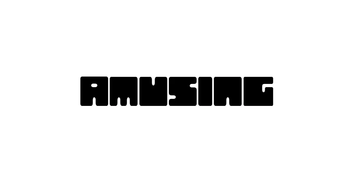
Utilizing this trend to their benefit, IT businesses are developing new typefaces that showcase the innovative nature of their offerings.
Vintage aesthetics
People adore retro products and aesthetics. Because of this, it's more usual for brands to include retro-inspired motifs in their logos.
![]()
You can draw inspiration from the lengthy evolution of tech sector designs and make your throwback logo. But, of course, the neon signs from the 1980s, vintage video game imagery, or whimsical designs from the 1930s are the most well-liked ones.
Geometrical patterns
This year is no exception to the historical popularity of using geometry in logos. Although the objective has been immediate impact and variety in advertising, the focus has been on simple geometry. The most effective techniques have been demonstrated by several research studies supported by UX design data. It has also been common to name a business after a geometric object or design a physical symbol of the company, despite logos increasingly using geometric frames.
![]()
Using a more complex form and a simple geometric design concurrently makes geometric framing extremely intriguing. Using this method, you can achieve the symmetrical and uncomplicated appearance of basic geometric design while also having the flexibility to use more creative approaches as you see fit.
Incomplete designs
Consider creating a more straightforward, raw logo to differentiate yourself from competitors. The goal is to get away from the idea of perfection that is propagated everywhere.
![]()
Digital designs often have too many sharp edges and seem flat or excessively corporate. However, if done correctly, including some doodles of your logo could be wise, as it can give your business more character.
Why not strive to simplify technological advances for the average user to make your business seem more relatable? New technologies can sometimes seem intimidating to the average user.
Line drawing
![]()
Line art is a more modern innovation that has proven massively popular in logo design. This year is taking this trend ahead, as it is used in various logos. Minimal line art evokes sentiments of tranquility and clarity. Most graphic designers consider it a classic, sophisticated, and versatile art style.
Dynamic gradients
Remember, 3D gradients are a significant trend in logo design. You can create a spectrum for your logo using dynamic gradients and set your color theme. It is a fantastic method to give your logo additional vitality. Particularly, sharp gradients are becoming increasingly prevalent in logo design as they frequently provide the finest contrast.
![]()
The visible design work that goes into developing 3D gradients makes your company appear more reliable and sophisticated, which may be helpful for your branding efforts. Luckily, 3D gradient logos work well for screens and can depict depth and shadowing in a manner other logotypes cannot.
Great and Famous Logos in the IT Sphere:
Microsoft
![]()
The Microsoft logo, one of the most well-known, was created in the late 1980s and has seen several changes. This logo is shaped like a window to represent how technologies and computers provide consumers access to various market-based business options.
Due to developments in the GUI and motion fields, the Microsoft logo, derived from the Windows logo, shifted away from this in the 2000s. Nevertheless, Microsoft has returned to the conventional window iconography after the release of Windows 7 and the present Windows azure logo used in Windows 11.
Salesforce
![]()
Salesforce has created one of the world's biggest and most important CRM systems. Thanks to the logo's straightforward concept, everyone can easily comprehend the company's strategy and cloud solutions. The emblem is specific, yet the effective fusion of a tidy appearance and visual brand identification produces a very identifiable design.
Nuvia
![]()
A tech startup called Nuvia creates semiconductors for data Centres. Their logo's creators used the color blue, which stands for reliability and wisdom. Additionally, they used a clean, slick sans serif typeface. The two used components imply motion and speed. The logo is compact, straightforward, and potent—just like a computer chip.
Intel
In 2020, Intel switched to a more straightforward, primary sans-serif typeface in place of the iconic swirl surrounding its lettering. This action was taken to simplify the situation and make it far more business-friendly. In light of this, the new logo aspires to be clear and concise to facilitate things for customers.
![]()
The new logo's font resembles the Robert Noyce and Gordon Moore-created original.
AMD
![]()
Although it varies depending on the product and market niche, the AMDA logo has two square arrowheads that create the letter "A." This logo has been used by AMD, or Advanced Micro Devices, for over 50 years.
We frequently see laptops and PCs with this logo, among other designs. However, the initial inventive and robust vibe that the AMD logo was intended to express has mostly stayed the same throughout the years.
Dell
Dell strives to honor its origins with its logo. The Dell Logo has seen several minor alterations, but it still has the square-shaped "E" that resembles a microchip.
![]()
IBM
IBM, one of the major players in technology, has a lengthy history and its present logo. The corporation was formed in 1972. The IBM logo conveys the swiftness and fearlessness with which the corporation grows its operations.
![]()
When it was first created, the logo had 13 stripes. The logo was designed to give users a distinct overall feeling from previous work.
HP
Another corporation whose logo hasn't undergone much change over time is HP. Bill Hewlett and David Packard, the company's creators, inspired its design. The HP logo attempts to be unassuming yet is effective when used with marketing-related information. The H and P are commonly printed in a circle and are typically shown in blue, which helps to give a sense of reliability, but lately on the official website we see a black and white logo.
![]()
HP is one of the most established computer companies. Its logo has been a constant in the computer industry thus far.
To sum up
An effective IT logo should generally be straightforward, memorable, and relevant. While the creation of such logos may appear clear, it is not. It demands a tremendous amount of patience and a preoccupation with accuracy.
Get some advice from IT experts on creating a logo before you start. Which of these tech company logos do you like best? Leave a comment below. Remember to share this article on various media to express your support.