Do you need a logo created for your baby youtube channel, childcare center, clothing line, or Toy Company? Please read our guide to creating a kid's and nursery logo for ideas and inspiration.
A professional logo is necessary if you work in the children's industry and produce children's and infant items or offer childcare services. That is a requirement for the branding of every new company, product, or business. As a result, you should develop a brand personality that appeals to practically everyone. One of the greatest approaches to begin the procedure is with the kid’s logo design.
Discover the ABCs of kid-friendly logo design before you begin creating your own. Browse our collection of kid-friendly logos from some of the largest brands in the business to start your education. Learn which hues, designs, typefaces, and symbols appeal to children (and youngsters at heart), then read our practical advice for incorporating those elements into your logo.
What You Should Know Before Designing a Kids' & Nursery Logo
Here are some suggestions to help create the ultimate baby, kids, or children's logo. First, consider the characteristics that distinguish your business, brand, or affiliation before beginning the logo design process. When creating your logo, consider using beautiful and humorous images that reflect the pure and vibrant world of children and newborns, such as a smile, a moon, or a cloud. You can also use a full-text logo, choose a playful or rounded font resembling a plush toy.
Use bright hues like deep yellow, orange, green, violet, blue, or pink to provide your logo design with a dreamlike and magical edge. If you combine many colors, make sure they go well together and are sufficiently contrasting to stand out.
If you run a children's hospital or daycare center, you may get ideas from the themes, colors, and symbols used in the logos of well-known organizations in the same field. Your brand identity and the nature of your particular activity should guide your typographic decisions. Generally speaking, solid and rounded fonts are preferred. For example, choose rounded sans-serif fonts to give your logo a fun undertone. However, you are free to use your imagination and try new things. Why wait, then? Make a beautiful logo right now in 5 minutes.
What to Consider When Designing a Logo for a Child Care Business
Do you want to design a logo for a school or a website selling baby clothes? Then, we advise creating a logo with gentle and amusing tones. You can use large, rounded typefaces, delicate hues like violet, pink, and yellow, and light shades of blue and green. Consider funny images like a smile, a toy, and a stars.
The most excellent part of creating kid-friendly logos is playing around with colors and images. Children are drawn to colorful, intriguing, and enjoyable images! Thankfully, our logo guide provides an extensive collection of exquisite kid's logo brand ideas. So consider what you want your business to convey, and start designing your amusing kid's logo immediately.
A pertinent and expert children's logo can take your brand and online presence to the next level, regardless of whether you work as a child healthcare professional or are in the childcare industry.
You can select the finest logo design and alter it by modifying the fonts, colors, icons, and more. Once you're satisfied with the design, download it and use it on your website, social media accounts, business cards, and more.
Best Practices for Children's Logo Design
The best part about Kid's Logo Design is that you may experiment with different colors, fonts, and other components. To acquire the most excellent logo that makes you stand out from competitors, however, if you are not a designer, you need to master the ABCs of Kid's Logo Design.
Therefore, we have developed some best practices to assist you in discovering which fonts, colors, symbols, and layouts appeal to children and their parents. Look through these beneficial ideas and apply them to your logo creation.
Select the Proper Color Scheme
A critical initial step in creating the Kid's Logo is selecting colors. Colors can influence any design's atmosphere and elicit a range of feelings in viewers. Therefore, you must pick the appropriate colors for the kid’s logo design based on the meaning you want to portray with the logo.
Consider your target demographic while selecting colors for your logo. What impression do you want your brand to convey to your audience? Once you have these two responses, you can begin selecting colors. A few examples:
Energetic

Calm

Cheerful

Good-natured

It would be great to keep things cheery and bright when you create the logo for your business, focusing on youngsters. It will assist you in developing a social perception of your brand. However, limit the number of colors in your logo to no more than two to be safe.
Furthermore, for a simple design, you can use several tints and tones of a single color. Finally, find a good color scheme with this article's advice on the best color pairings.
Select fonts carefully
Fonts in your company name and slogan in the logo establish the tone, while colors in the design create the atmosphere. Your industry and company KPIs should be considered while selecting the typefaces for the procedure. For example, you may choose bolder and rounder fonts for Kid's Logo Design. These typefaces can give your logo a whimsical touch while establishing a visual hierarchy throughout the entire design. A single logo should only contain two fonts: one for the company name and one for the tagline or slogan.
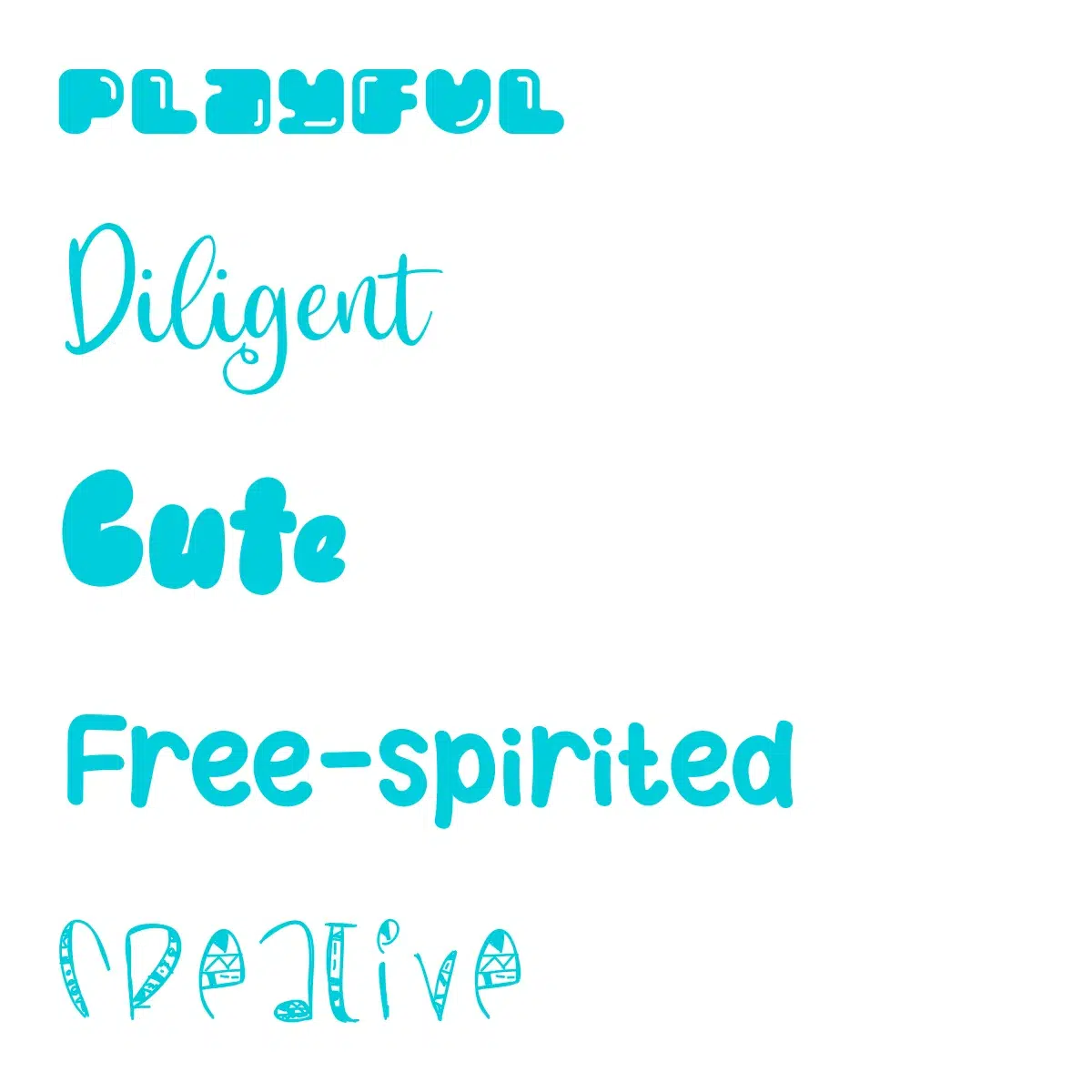
Always choose typefaces with readability as your primary consideration. While fun, rounded typefaces are only sometimes readable. Make a typeface structure for your kid’s logo design, too.
Keep things simple
You may be familiar with the proverb, "Simplification Is the Ultimate Sophistication," which means that you should work to keep your logo as straightforward and aesthetically pleasing as you can. To accomplish the same result, follow all of the directions above.
Best Kid’s Logo Brands
Disney Company, Inc.
This company's logo may not be intricate or have a visually appealing design, yet it has the most vital branding. The words "Walt Disney" are inscribed in the recognized Disney typeface as part of the logo. In addition to being playful and youthful, this typeface is most notable for leaving its mark on every Disney product, including theme parks, movies, and clothes. In addition, the Disney typeface is well-known to children and adults worldwide, making this one of the most popular media business logos ever created.
Sesame Street
This logo was a timeless representation of children from the program's start decades ago. This most recognizable children's logo has an unmistakable green street sign with the program name, frequently accompanied by the characters who make this show such an unequivocal success. Children's Television Workshop, the organization that creates this and other top-notch family programs, is identified by the letters 'CTW' above the show's title. One of the finest logos for kids is that of Sesame Street since it is simple and hasn't been altered throughout the program.
Lego
What could be easier than Legos, the recognizable, timeless building blocks that have given kids worldwide many hours of entertainment? The company name is written in white within a plain red square highlighted in yellow and black in the logo. The font's fullness and bouncy design imply amusement. This logo may be among the most straightforward minimalist style, but it is also classic and suitable for the topic.
Baby Einstein
Through early exposure to engaging art, music, and ideas, Baby Einstein creates goods that increase children's intelligence and appreciation of great art. The youthful youngster in the logo, who is reminiscent of Albert Einstein, and the vibrant colors in the design represent the company's objective.
Chicco
A good example of when a playful approach in logo design is employed by a major children's goods manufacturer. It is both professional and playful, with the emphasis on the dot in "i" letter adding recognizability to the logo. The font is sleek, yet the letters have a slight "dance" to them, reflecting the company's sphere of activity.
Madison Children’s Museum
Although not the only children's museum with a fantastic logo, this one is unquestionably an excellent illustration of a great logo for kids. It has a crisp square outline, yet the square is fragmented like a jigsaw puzzle. This jigsaw puzzle's parts come together to form typical toys like an aircraft and a bell. This logo is among our favorite children's museum designs since it is appealing enough to get the correct attention.
How to create a fantastic Children's logo
Take advantage of our service to create a unique logo that truly represents your brand. We specialize in font-based logos, utilizing modern design approaches to ensure your logo stands out from the crowd. Our extensive collection includes carefully selected color combinations and a diverse set of fonts to choose from.
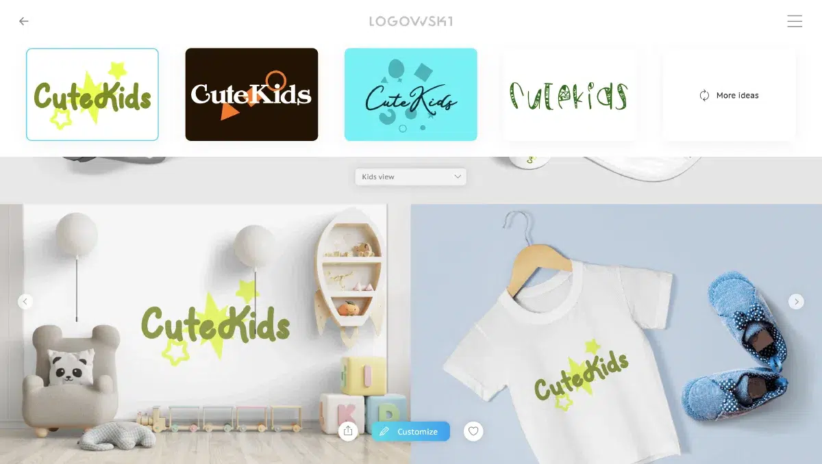
When embarking on the logo creation process, it is essential to consider the positioning of your brand and the message you want to convey to your target audience. Reflect on the essence of your product or service and identify three key characteristics that define your brand's identity. These characteristics could be anything from friendliness and approachability to quality and reliability or even safety and trustworthiness.
By understanding the core attributes of your brand, you can easily align them with appropriate colors and fonts that effectively communicate those characteristics. The right combination of colors and fonts will not only visually represent your brand but also evoke the desired emotional response from your audience.
With our guidance and expertise, you can confidently create a logo that captures the essence of your brand and leaves a lasting impression. Start the journey today and watch your brand identity come to life!
