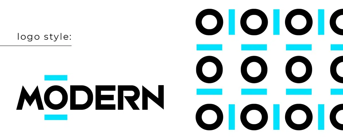
Popular styles and fashions are constantly evolving. Therefore businesses that want to leave the biggest impression need a modern logo.
Businesses and entrepreneurs frequently request "modern" when using Branding Guidelines as a logo feature. This is because they want their brand to represent current fashions, ideas, or tastes. Modern isn't just another word for "new," though. Instead, it is a design strategy that includes various distinctive features.
With examples from big businesses and smaller brands, we'll analyze the modern logo and current trends in logo design in this article.
What Do We Mean By A “Modern Logo”?
While "modern" is often used to express something fresh, in style, and modern, it also refers to qualities associated with modernism. This artistic style emerged in the late 19th century and gained popularity in the 20th.
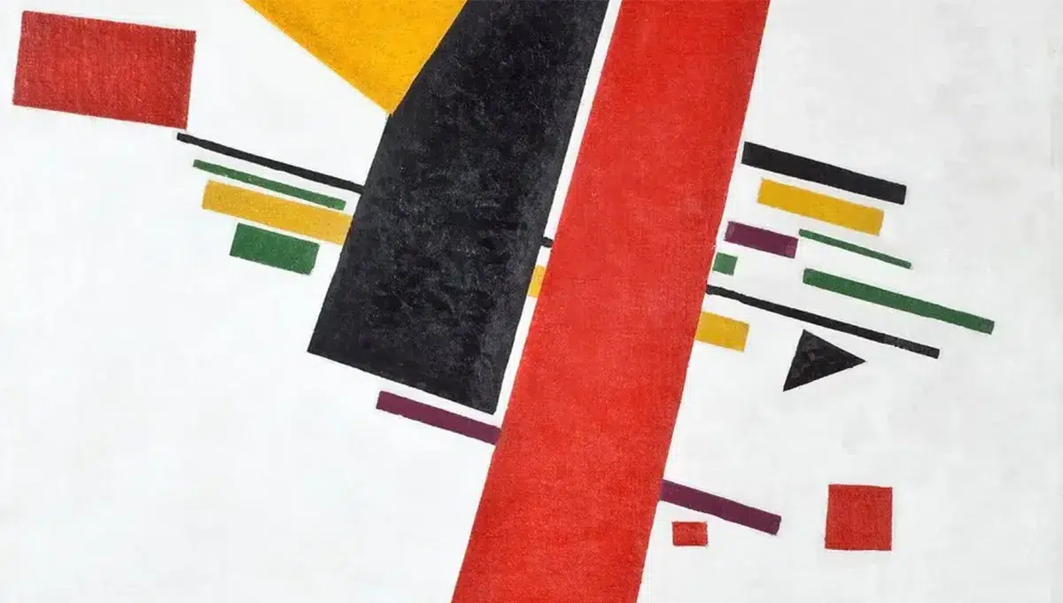
The Fragment of Kazimir Malevich's work "Suprematism No. 38" 1916.
A modern logo includes simple, eye-catching colors, clear lines, and a minimalistic design. In other terms, it's a straightforward but successful design!
To create a contemporary corporate mark, modern logo design combines traditional and contemporary aspects. Today's modern design is distinguished by clean lines, straightforward text, color, and well-defined features.
Nearly every day, we see logos from businesses of various sizes whose popularity can be due to their contemporary features.
Features of Modern Logos
Here are some essential characteristics of modern logos. These are the elements you must also consider while thinking about how to create a logo.
Plain Designs
Modern logos stand out for their simplicity in design. In reality, many logos are made up of merely one slightly jagged line. Some merely have the corporate name and are plain wordmarks. Then there are logos, which are appropriate images.
Choose a color
Modern logo designs often use a maximum of 1-3 colors. A logo with too many colors can confuse your audience. Consider how your primary color will mix with your second and third colors to draw more attention to your brand. For the best contrast, select a background color of either white or black.
The psychology of colors is a crucial factor to take into account. Each color has the potential to elicit a unique feeling or a variety of emotions in your audience.
Hand-drawn components
The utilization of a handwritten font in the logo design introduces a distinct touch of humanity and personal style, elevating its overall appeal. Whether applied to the title or slogan, the use of a handwritten font injects a sense of authenticity and warmth into the logo, forging an immediate and relatable connection with the audience.
A hand-drawn feature gives a touch of humanity lacking in many modern logos.
Symbols and geometrical forms
Simple design components like graphical shapes or tiny line drawings are frequently used in modern logos. These components might enhance visual interest or provide a clue as to the brand's sector. "You can make the logo plain and simple with geometry, simple shapes, and edges, and it will stay longer," "Simple, sleek, advanced: There's the recipe for a contemporary logo."
Scalability
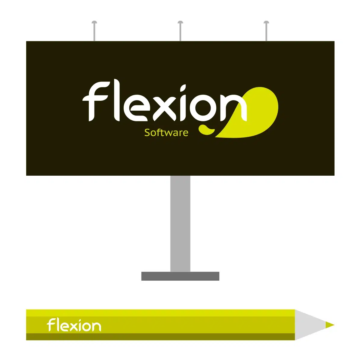
Scalability in a logo is crucial, given the abundance of social media and other digital and offline venues. It should look fantastic on a giant billboard and a small marketing item such as a pen or paper.
Versatility
Modern logos look fantastic even when printed in black and white on newspapers, faxed documents, magazines, and other similar media. They are therefore striking in black and white in addition to being scalable.
Promote a brand message
Modern logos also differ from older ones in that they serve a function rather than being a mere design. The clever use of color, typefaces, and forms effectively conveys a brand's message to its intended audience.
How to Create a Classy, Modern Logo.
1 Step
Step into our realm of creativity and let your brand's essence come to life. As you embark on our unique service, enter the name of your brand and witness a world of possibilities unfold before your eyes. Choose the captivating "modern" style, meticulously crafted to capture the imagination of your target audience and artfully reflect the essence of your exceptional product or service.
2 Step
Immerse yourself in the realm of perfection. Our powerful editor awaits, offering you an array of tools to refine every detail of your design. Select from a curated collection of fonts, each one carefully handpicked to resonate harmoniously with your project. Elevate your visuals by exploring an extensive range of graphics, ensuring that every element seamlessly aligns with your brand's vision. Discover the right color palette that paints your brand's story with elegance and impact.
3 Step
Indulge in a wellspring of inspiration. Journey to our coveted "ideas" section, where an abundance of creative concepts awaits your exploration. Immerse yourself in a tapestry of possibilities, meticulously crafted and tailored to spark your imagination. Discover a multitude of variations, each one inspiring fresh perspectives and igniting the creative fire within you.
4 Step
Have you found the treasure you seek? Embrace the satisfaction of a quest fulfilled. With a simple click, download your masterpiece and unleash it upon the world. From social media platforms to marketing collateral, relish the joy of seeing your vision materialize, captivating your audience and leaving a lasting impression. Unleash your creativity, and let our creations become a canvas for your dreams.
Best Modern Logo examples
Finally, let's look at what a contemporary logo looks like.
UNITED COLORS OF BENETTON
The United Colors of Benetton logo design is a vibrant and dynamic representation of the brand's core values. The logo features the brand name, "United Colors of Benetton," written in lowercase letters. Each word is separated by a colorful rectangular block, with each block representing a different color.
The typeface used is a modern and clean sans-serif font, conveying a sense of contemporary style. The use of vibrant colors in the logo reflects the brand's commitment to diversity, inclusivity, and celebrating the beauty of different cultures. The arrangement of the colorful blocks creates a visually striking and playful composition, capturing attention and expressing the brand's bold and energetic personality.
The United Colors of Benetton logo design embodies a sense of unity, diversity, and optimism, making it instantly recognizable and synonymous with the brand's mission.
In contrast to other social networking sites, Instagram has chosen a distinctive and vibrant style for its modern logo. Several have claimed that the logo depicts the artistic filters that users can use on their pictures. Still, a more plausible explanation would be that the icon design should reflect the product's characteristics, which is a picture archive or, to use a different term, a private photo album.
Uber
Uber diverged from the previous slim typeface and opted for a stronger one while revamping its logo. This inspires sentiments of fortitude, development, and maturity—characteristics most IT businesses seek to imitate. Even on little devices, the white stands out against the black backdrop and draws attention to the text. Moreover, Uber's robust and straightforward logo is a perfect match for its preferred media, as the firm is mainly renowned for its smartphone app.
GitHub
GitHub uses a kitten symbol as a separate emblem, but the primary logo is a typographic version. GitHub is a web-based platform that provides hosting for software development projects using the Git version control system.
Gemns
Gemns is a company that sells energy-harvesting generators made using green technologies. The designers could express their message by placing an electrical emblem in the blank area between 'm' and 'n'. The company portrays itself as a leader in environmentally friendly and pollution-free technologies, which is why its logo is green.
With a white lowercase typeface on a blue backdrop, Facebook's logo is uncomplicated and straightforward. The informal lowercase letters, particularly the "f," frequently used alone, represent the company's "social" nature. While Facebook did update its logo in 2019, that change only applied to the parent business; the previous version still represents the primary social media site.
Levi's
The Levi's logo design features the iconic Levi's wordmark in bold, capital letters. The typeface used is a clean and timeless sans-serif font, creating a strong and recognizable visual identity. The letters are evenly spaced and proportioned, conveying a sense of stability and reliability. The color scheme often includes a classic combination of blue and white, representing the brand's heritage and denim roots. The simplicity of the logo allows it to be versatile and adaptable, making it easily recognizable on various brand applications, from clothing tags to storefronts. Overall, the Levi's logo design embodies a sense of enduring style and authenticity, reflecting the brand's longstanding reputation in the fashion industry.
Conclusion
Well-designed modern logos will make your work stand out amid hundreds of competitors. Remember the significant trends when creating your next logo: simple geometry, excellent typography, grayscale, and streamlined logos. The most important thing is to keep up with design trends because they tend to change frequently, and you want your design to look modern. Be the creator of your logo, feel free to incorporate a contemporary twist. How about creating your original logo right away? We hope you find inspiration from our selection!
- Artigo AnteriorMost Powerful Logo Redesigns of The Decade
- Próximo ArtigoHard Logo Style
