Introduction
The Apple logo is one of the most recognizable symbols in the world. But how did it evolve from a detailed illustration to the sleek, minimalist design we know today? Apple’s branding has played a significant role in shaping its identity, influencing not only tech culture but also global design trends.
The First Apple Logo (1976)
In 1976, Apple’s first logo was a highly detailed illustration of Sir Isaac Newton sitting under an apple tree, created by co-founder Ronald Wayne. This intricate design included a banner with the words "Apple Computer Co." wrapped around the image. While the artwork paid homage to Newton’s groundbreaking discoveries, it was quickly deemed too complex for branding purposes.
Fun fact: The original logo was inspired by an engraving-style art form, making it look more like a historical emblem than a modern tech brand. Steve Jobs disliked it because it didn’t reflect Apple’s vision of simplicity and innovation.
![]()
The Birth of the Iconic Apple Shape (1977)
Realizing the need for a cleaner, more impactful logo, Apple commissioned designer Rob Janoff in 1977. He created the now-iconic bitten apple shape, which has become synonymous with the company. The original version featured rainbow-colored stripes, representing Apple’s push for color display technology in personal computers.
Janoff’s design was revolutionary because it ditched unnecessary details, focusing on simplicity and memorability. The bite mark was added for two reasons: to prevent confusion with a cherry and as a playful reference to computing terminology (byte/bite).
Interesting fact: Janoff presented the logo without any accompanying text, allowing the symbol to stand on its own. Jobs immediately approved the design, recognizing its timeless potential.
![]()
Monochrome and Minimalism (1998-Present)
When Steve Jobs returned to Apple in 1997, he led a major rebranding initiative. As part of the company’s shift towards modern aesthetics, the colorful stripes were removed in 1998, and the logo adopted a sleek, monochrome style. This change reflected Apple's new design philosophy: minimalism, elegance, and technological advancement.
Since then, the logo has evolved subtly, appearing in different finishes like glass, metal, and even glowing variations on MacBooks and iPhones.
![]()
Did you know? Apple experimented with a 3D glass-effect logo in the early 2000s, but eventually returned to a flat design, aligning with modern UI trends.
Expert Opinions on the Apple Logo
Branding and design experts consider the Apple logo one of the most successful corporate symbols ever created. According to design strategist Marty Neumeier, "The Apple logo’s simplicity makes it instantly recognizable and infinitely adaptable." Many believe that Apple’s decision to remove text from its branding set a new standard for modern logo design.
Marketing guru Seth Godin has stated, "Apple’s logo is a perfect representation of their core values: innovation, simplicity, and elegance." This universal appeal helps Apple maintain strong brand recognition across diverse markets.
Interesting Facts About the Apple Logo
- The bite in the logo: It was intentionally added to prevent it from looking like a cherry and is also a nod to computing ("byte").
- Not a reference to Alan Turing: A popular myth suggests the bitten apple is a tribute to Alan Turing, the father of modern computing, who allegedly died by biting a cyanide-laced apple. However, designer Rob Janoff has confirmed this was not the inspiration.
- A logo that needs no name: The Apple logo is one of the few in the world that is instantly recognizable without accompanying text.
- Apple’s secret branding strategy: Apple deliberately keeps the logo hidden on some products, like the AirPods, to maintain a clean and minimalist aesthetic.
![]()
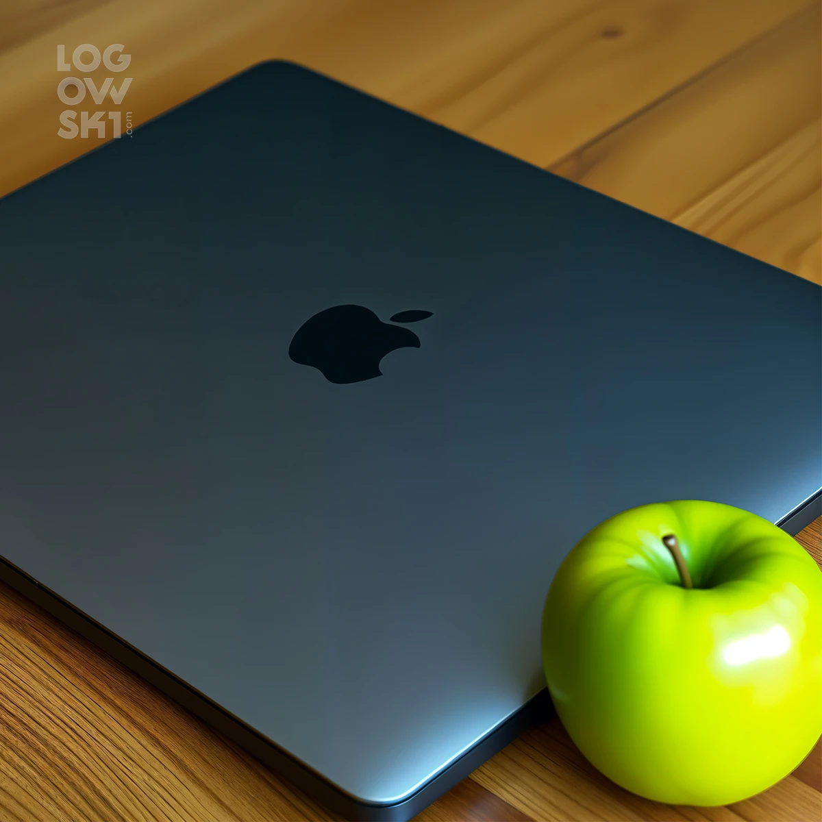
Apple Logo 2025
Well, as usual, here’s what our neural network came up with. I think this is also quite an interesting option, and it definitely has potential!
FAQ
Why does the Apple logo have a bite?
The bite was added to differentiate the apple from a cherry and as a fun nod to computing (byte/bite).
Who designed the current Apple logo?
Rob Janoff designed the bitten apple logo in 1977, and although the colors and textures have changed, the core design remains the same.
Has the Apple logo always been monochrome?
No, from 1977 to 1998, the Apple logo featured rainbow stripes to emphasize Apple’s pioneering color display technology. It switched to monochrome in 1998.
What does the Apple logo symbolize?
It represents knowledge, innovation, and simplicity—core principles of Apple’s philosophy. Some also see it as a symbol of curiosity and discovery.
Why did Apple remove the rainbow colors from the logo?
The transition to a monochrome logo in 1998 aligned with Apple's shift towards minimalistic and sleek product designs, making the brand look more modern and sophisticated.
How does Apple's logo compare to other tech companies?
Apple’s logo is one of the few tech logos that doesn't rely on text. Unlike Google or Microsoft, which use typography in their branding, Apple relies solely on the power of its iconic symbol.
Has the Apple logo ever been redesigned drastically?
While the colors and textures have changed, the core bitten apple shape has remained consistent since 1977, making it one of the longest-standing tech logos in history.
- Previous ArticleAdobe Logo Evolution: From Past to Present
- Next ArticleIBM Logo Evolution: The History Behind the Iconic Brand