Introduction
The IBM logo is one of the most recognizable corporate symbols in the world. Over the decades, it has undergone multiple transformations, reflecting the company's growth and innovation. A well-crafted logo plays a crucial role in brand recognition, and IBM has consistently adapted its identity to stay relevant in the tech industry.
![]()
From its early days as a simple text-based design to its modern, sleek, and timeless representation, the IBM logo tells the story of a company that has evolved with the times. But what makes the IBM logo so powerful? In this article, we explore the history of the IBM logo, its design changes, key milestones, and interesting facts about its evolution.
IBM Logo Evolution: A Timeline
![]()
A great example of a vintage logo, it has a hint of the invention era and a bit of steampunk :)
1888 – The Early Years
Before IBM was founded, its predecessor, the International Time Recording Company (ITR), had a simple and traditional logo. It primarily focused on industrial timekeeping solutions. At this stage, branding was minimal, as the focus was on function rather than identity.
![]()
1924 – The First IBM Logo
In 1924, the company officially became International Business Machines (IBM), marking a new era. The first IBM logo featured a bold, serif typeface, reflecting the company’s focus on business and technology. The letters were enclosed in a circle, symbolizing unity and professionalism. The logo symbolized the brand's clear plans for a global presence.
![]()
1947 – A More Modern Approach
After World War II, IBM underwent significant growth, requiring a modernized brand identity. The 1947 logo was simpler, removing the circular enclosure and opting for a bold typeface. This change symbolized IBM’s shift toward modern computing and technological advancements.
![]()
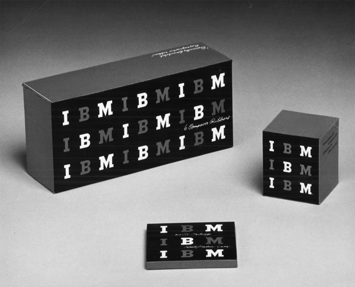
Packaging for IBM print accessories
1956 – Paul Rand's Influence
Renowned graphic designer Paul Rand revamped the IBM logo in 1956, introducing a cleaner, sans-serif font. Rand’s design philosophy emphasized simplicity and functionality, laying the groundwork for IBM's future branding.
His approach focused on making logos memorable and easy to reproduce in any format. - Golden words that are true even now.
1967-1972 – The Iconic Striped Logo
According to IBM's official website, in 1972, designer Paul Rand introduced the updated logo with 8 stripes, which is still in use today. (ibm.com)
![]()
Earlier, in 1967, Rand designed a version of the logo with 13 stripes, symbolizing speed and dynamism. However, due to reproduction issues on photocopying devices at the time, the number of stripes was reduced to 8 in 1972.
The striped design also created a sense of movement, reinforcing IBM’s reputation as a company focused on innovation and forward-thinking technology. Over the years, the logo has been subtly refined, but its core identity has remained consistent.
![]()
The 1981 "Eye-Bee-M" Logo
In 1981, Paul Rand created a special rebus-style IBM logo, replacing the letters with visual symbols: an eye for "I," a bee for "B," and the traditional striped "M." This playful design was not meant to replace the official IBM logo but was instead used for internal promotions and design-related events.
The eye represents vision and perception, the bee symbolizes hard work and productivity, and the striped "M" maintains IBM’s strong brand identity.
Although never officially adopted as the company’s main logo, the "Eye-Bee-M" design remains one of Paul Rand’s most iconic works, often referenced in design studies and exhibited in museums.
Interesting Facts About the IBM Logo
- The 8-bar striped logo symbolizes equality and unity, values deeply embedded in IBM's corporate culture.
- Paul Rand, the designer of the 1972 logo, also worked on branding for major companies like UPS, ABC, and Westinghouse.
- IBM’s blue color, often referred to as “Big Blue,” represents trust, reliability, and professionalism.
- The logo has remained unchanged for over 50 years, a testament to its timeless design.
- IBM's logo has been an inspiration for countless tech brands, proving the power of a well-executed visual identity.
- The company experimented with different variations of the logo but always retained its core elements, demonstrating the importance of brand consistency.
And by tradition, the 2025 AI version of the IBM logo
We tried to create an IBM logo in our AI logo generator. The prompt was: "A modern logo with the letters 'IBM' symbolizing technology, dynamics, and progress."
![]()
Frequently Asked Questions (FAQ)
What does the IBM logo represent?
The IBM logo symbolizes innovation, progress, and technological leadership. The horizontal stripes in the 1972 design reflect speed and dynamism, emphasizing IBM's commitment to cutting-edge advancements.
Who designed the IBM logo?
The most famous IBM logo (1972) was designed by Paul Rand, a legendary graphic designer known for his minimalist and effective branding strategies.
Why is IBM called "Big Blue"?
IBM is often referred to as "Big Blue" due to its iconic blue logo and its dominance in the technology industry. The name also reflects the company's stability and authority in the field.
Has the IBM logo changed recently?
No, the IBM logo has remained unchanged since 1972, proving its strong and timeless design. While minor refinements have been made, the brand identity has remained consistent.
What makes the IBM logo so iconic?
The IBM logo is iconic because of its simplicity, clean lines, and strong visual impact. Paul Rand’s design ensured that the logo would be instantly recognizable, no matter where it appeared.
How has IBM maintained its branding over the years?
IBM has maintained its branding by keeping its logo consistent while adapting to new technologies and market demands. Its commitment to innovation while preserving its legacy has made it a leader in corporate identity.
- Previous ArticleApple Logo Evolution: History, Meaning & Fun Facts
- Next ArticleThe Evolution of Mazda's Logo: From Its Origins to 2025