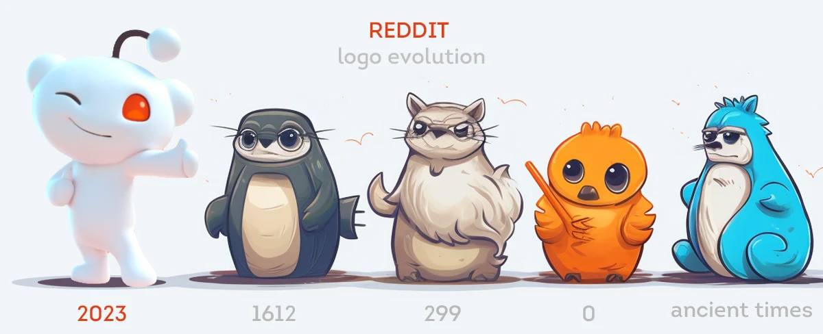
The Evolution of the reddit Logo - From Snoo to the Iconic Symbol of the Internet Community

By ・ Published in Logo design18 min read

Let’s start with Logowski

reddit 2023 logo evolution

Reddit is a popular online social platform and website where users can share and discuss user-generated content. It is known for its unique logo and vibrant community. The logo of Reddit has undergone several transformations over the years, reflecting the growth and evolution of the platform.

Founded in 2005 by Steve Huffman and Alexis Ohanian, Reddit initially started as an experiment to create an online community where users could share links and discuss various topics. The founders wanted to create a platform that emphasized democratic principles, allowing users to have a say in the content that gets promoted to the front page.

The name "Reddit" is a play on words, derived from the phrase "read it." This embodies the platform's focus on reading and sharing content. The logo, a stylized alien head known as the "snoo," represents the Reddit community.

The early versions of the Reddit logo featured a simple, black-and-white illustration of the snoo, with different variations representing various aspects of the platform. Over time, the design of the logo evolved, incorporating more vibrant colors and a more modern aesthetic.

The Evolution of the Logo

In 2017, Reddit introduced a major logo redesign, aiming to give the logo a more polished and modern look. The updated logo featured a more detailed and stylized snoo, surrounded by a circle containing the brand name "reddit" in bold, lowercase letters. The color scheme was also updated, with a vibrant orange-red hue that became synonymous with the brand.

In recent years, the Reddit logo has continued to evolve, with variations and special editions created for different events and campaigns. The logo remains a recognizable symbol of the Reddit community and its commitment to user-generated content and discussion.

In November 2023, Reddit announced its new logo. The character became more voluminous and received an additional dark gray color.
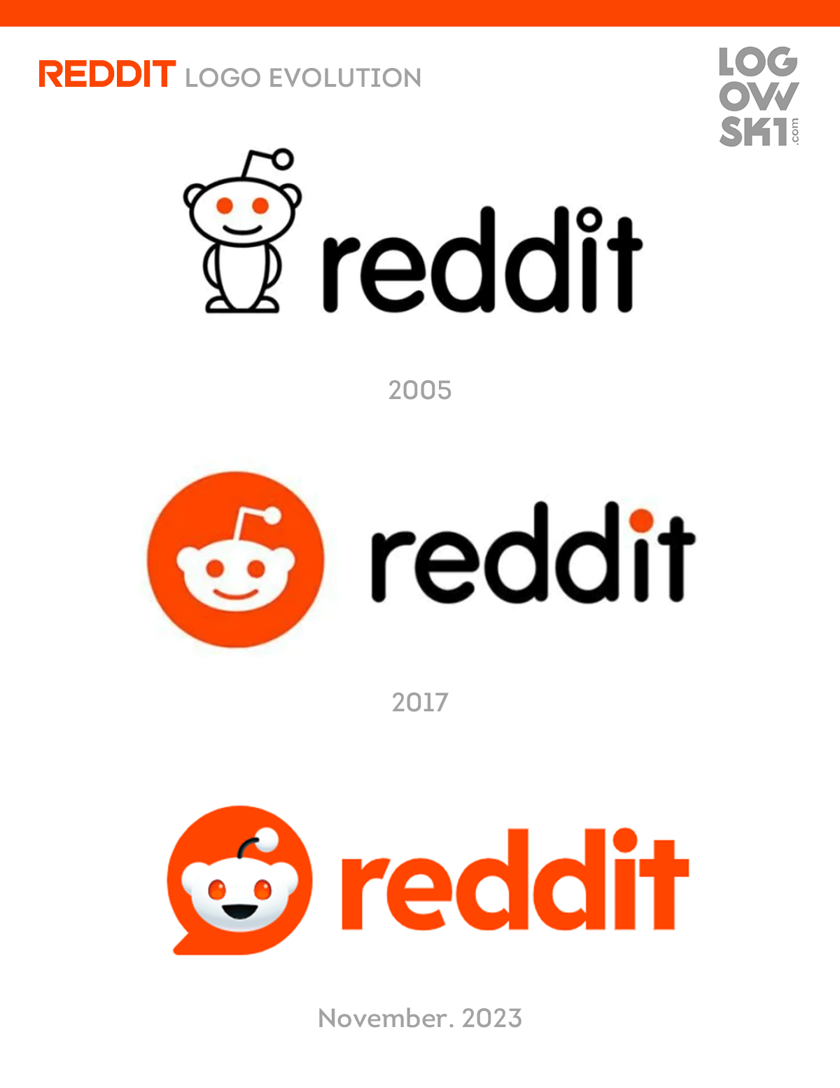
reddit-logo-evolution-full


Birth of the Reddit Logo

In the user-generated and community-driven landscape of the internet, social platforms play a pivotal role. One such platform that has grown to become a major player is Reddit. At the heart of the website is its iconic logo, which represents the essence of the Reddit community and the content it shares.

The birth of the Reddit logo was a result of the platform's ongoing efforts to establish its identity. It was crucial for Reddit to have a distinct and recognizable logo that would symbolize its mission of connecting and engaging users from all corners of the internet.

The Early Days

When Reddit first launched in 2005, it didn't have a logo of its own. Instead, it relied on a placeholder image which featured the word "reddit" in a simple sans-serif font. This temporary logo served its purpose, but the lack of a unique visual identity hindered Reddit's ability to stand out in the crowded social media landscape.

As Reddit gained popularity and the user base grew, the need for a more distinct logo became apparent. The platform wanted a logo that would resonate with its diverse user community and represent the vibrant and ever-evolving content that Reddit had to offer.

In 2005, Reddit approached Aaron Swartz, a talented designer and programmer, to create a new logo for the platform. Swartz took on the challenge and came up with a design that captured the essence of Reddit's user-driven, community-oriented nature.

The result was the familiar Reddit logo we know today - a simple, stylized alien mascot known as "Snoo." The logo featured a smiling alien figure with red features and antenna, representing the dynamic and inclusive nature of Reddit's community.

reddit-logo-2005-mascot

The success of the logo redesign marked a significant milestone in Reddit's development. The new logo reflected the values and aspirations of the platform, and it quickly became a symbol of the Reddit community.

Since its introduction, the Reddit logo has undergone minor adjustments and variations, but its core design has remained consistent. It has become a recognizable symbol not only among Reddit users but also in the wider online community.

In conclusion, the birth of the Reddit logo was a pivotal moment in the platform's history. It not only gave Reddit a unique visual identity but also represented the user-generated, community-driven nature of the website. The logo continues to be a significant part of Reddit's brand and serves as a visual representation of the vibrant and diverse content that the platform offers.

Reddit's Early Logo Designs

As one of the most popular user-generated content platforms on the internet, Reddit has become synonymous with community engagement and lively discussions. However, the iconic Reddit logo that we know today didn't appear overnight. The early logo designs went through several iterations before settling on the familiar emblem we see now.

When Reddit was first launched in 2005, its logo did not have the polished look that it has today. Instead, the logo consisted of a simple wordmark that spelled "reddit" in lowercase letters. The design was minimalist and straightforward, reflecting the website's focus on content and user-generated discussions.

In the early years, Reddit's logo underwent a few modifications while still maintaining its simplistic aesthetic. The wordmark remained intact, but slight adjustments were made to the typography and spacing. These changes were subtle but aimed to improve the legibility and overall visual appeal of the logo.

During this period, Reddit experimented with different color schemes for its logo. While the most commonly used color was orange, variations in shade and positioning were explored. The color choices aimed to evoke a sense of vibrancy and energy, aligning with the lively nature of the Reddit community.

After gathering feedback from its users and analyzing the evolving trends in design, Reddit decided to give its logo a fresh update in 2013. The lowercase wordmark was replaced with a capitalized version, making it more prominent and visually striking. The typography was refined, enhancing the legibility and adding a touch of modernity to the logo.

Simultaneously, the color palette underwent a significant change. The vibrant orange was replaced with a deeper shade of red, symbolizing the passionate and engaging discussions that take place on the platform. This new color choice further solidified Reddit's brand identity.

Since the 2013 overhaul, the Reddit logo has remained relatively consistent. The evolution of its early logo designs reflects the growth of the platform and its commitment to providing a user-friendly and visually appealing website. Today, the Reddit logo is instantly recognizable and serves as a symbol of the vibrant and diverse community that Reddit has become.

The Rise of the Snoo Alien

One of the most recognizable symbols on the internet, the Reddit logo, has undergone various changes throughout its evolution. However, one character that has remained a constant presence in the logo is the Snoo alien.

Originally designed by Reddit co-founder Alexis Ohanian, the Snoo alien quickly became synonymous with the Reddit community. Representing the diverse and user-generated content found on the social website, the Snoo alien has become a beloved symbol of the platform.

With its whimsical appearance and wide-eyed expression, the Snoo alien captures the essence of Reddit's community-driven nature. The alien's antenna, resembling the letter "R," represents the Reddit brand, while its friendly smile suggests the welcoming and inclusive atmosphere of the website.

Over the years, the Snoo alien has become an iconic logo that represents not only Reddit but also the power of internet communities. It has been widely used in various forms, from Reddit merchandise and community artwork to social media avatars. The Snoo alien has become a recognizable symbol for fans and users of Reddit.

The rise of the Snoo alien can be attributed to Reddit's unique approach to content sharing and community interaction. Unlike many other social media platforms, Reddit places a strong emphasis on user-generated content, allowing users to create their own communities and participate in discussions on a wide range of topics.

As Reddit continues to grow and evolve, the Snoo alien remains a constant reminder of the platform's commitment to fostering an online community where users can freely share and engage with content. It serves as a symbol of the internet's potential to connect people from all around the world and create meaningful connections.


The First Official Reddit Logo

The first official Reddit logo was introduced when the platform was initially launched in 2005. As a social platform that focused on user-generated content, Reddit aimed to create a community-driven website where users could share and discuss various topics.
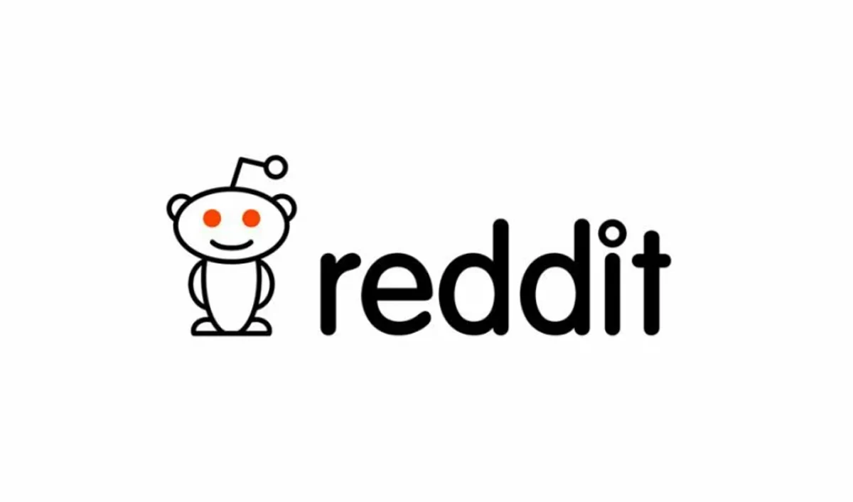
first-reddit-logo

Designed by Alexis Ohanian and Reddit's co-founder Steve Huffman, the logo featured the word "reddit" written in lowercase letters in a simple and clean font. The lowercase "r" and "e" were joined together, creating a distinctive look for the logo. This logo represented the essence of Reddit as a platform that emphasized open and inclusive discussions.

The choice of lowercase letters conveyed a sense of informality and approachability, which aligned well with Reddit's goal of creating an inclusive community. The logo's simplicity allowed the focus to be on the content and the users, rather than the design itself.

Overall, the first official Reddit logo symbolized the platform's commitment to being a user-driven community where individuals could freely express their thoughts and views. It laid the groundwork for the iconic Reddit logo that is recognized and beloved by millions of users today.

The Modern Reddit Logo

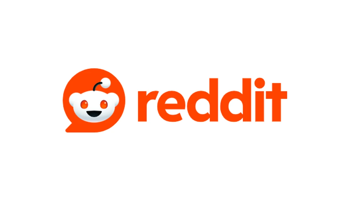
In the exciting developments of November 2023, Reddit unveiled a strikingly refreshed logo, marking a significant departure from its previous flat and monochromatic design. The new logo introduces a subtle but noticeable three-dimensional quality, infusing a sense of depth and dynamism that was absent in its predecessor.

One of the prominent alterations involves the incorporation of a dark gray color palette for the "antenna" and the "smile" elements of the logo. This addition not only diversifies the visual aesthetics but also imparts a touch of sophistication to these iconic features.
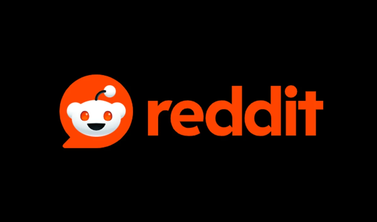
2023-logo-reddit

Moreover, the robotic figure at the core of the logo has undergone a transformation, evolving into a more creature-like entity. This departure from a purely mechanical appearance adds a playful and approachable aspect to the mascot, endowing it with a certain charm that resonates with users.

The framework surrounding the mascot has also been subject to redesign. The previously circular shape has given way to a form reminiscent of a "message," injecting a layer of symbolism into the logo. This subtle change conveys a sense of communication and interaction, aligning with the essence of the Reddit platform as a hub for diverse conversations.
2023-logo-reddit-white

Notably, the alterations extend beyond the visual components, encompassing a shift in the font style. The once rounded and consistently thick typeface has been replaced by a more rugged and contemporary font. This change in typography reflects a desire for a bolder and more assertive visual identity, capturing the essence of Reddit's evolution and adaptability in the ever-changing digital landscape.


The Reddit Logo in Popular Culture

The Reddit logo has become an iconic symbol in popular culture. As one of the largest online communities, Reddit has had a significant impact on social media and internet culture. The logo is instantly recognizable and is often associated with the platform, representing the sense of community and user-generated content that Reddit is known for.

The logo's simplicity and bold design make it easily adaptable and versatile. It can be found in various forms and adaptations across different mediums, including stickers, merchandise, and even tattoo designs. The logo has become a symbol of identification and belonging for Reddit users, showcasing their connection to the platform and the community.

Not only is the Reddit logo popular among users, but it has also made its way into the mainstream spotlight. It has been featured in movies, TV shows, and other pop culture references, further solidifying its status as a recognizable emblem. Its presence in popular culture serves as a testament to the widespread influence and impact of the Reddit platform.

Overall, the Reddit logo has become more than just a symbol for an internet platform. It has transcended its original purpose and become a cultural icon, representing the power of community and social engagement in the digital age.

Reddit Logo Merchandise

As Reddit has grown into one of the most popular user-generated content platforms on the internet, the logo has become a symbol of the thriving internet community and social platform. The logo has become so iconic that it is now featured on a wide range of merchandise items.

From t-shirts and hoodies to mugs and phone cases, Reddit logo merchandise allows users to show their love and support for the website in a tangible way. Many redditors proudly sport these items in real life, creating a sense of camaraderie among users.

One of the reasons why Reddit logo merchandise has become so popular is the strong sense of community that exists within the website. Redditors feel a connection to each other and to the platform itself, and wearing Reddit merchandise is a way to express that connection.

In addition to showing support for the website, Reddit logo merchandise also serves as a conversation starter. When redditors wear these items out in public, they often find themselves engaging in conversations with fellow Reddit users who recognize the logo. These interactions can lead to new friendships and connections.

Overall, Reddit logo merchandise has become more than just a way to show support for the website. It has become a symbol of the passionate and engaged user base that makes Reddit a special place on the internet.

The Reddit Logo and Brand Identity

As one of the largest and most influential platforms on the internet, Reddit has built a strong brand identity over the years. The logo of Reddit, with its distinct color scheme and design, plays a crucial role in representing the content and community it fosters.

The logo embodies the essence of Reddit as a user-generated content platform. The iconic alien mascot, known as "Snoo," has become synonymous with the website and its vibrant community. Snoo's smiling face represents the welcoming and inclusive nature of the platform, inviting users from all walks of life to join and share in the discussions.

With its bright orange color, the Reddit logo stands out in an increasingly crowded social media landscape. The color choice not only catches the eye but also reflects the energetic and dynamic nature of the website. This vibrant color, combined with the clean and simple design of the logo, creates a memorable and recognizable visual identity for Reddit.

A Symbol of Connection

The Reddit logo serves as a symbol of connection between like-minded individuals on the platform. It acts as a unifying emblem that fosters a sense of community and belonging. When users see the Reddit logo, they know that they are part of a larger network of individuals who share common interests and beliefs.

Furthermore, the logo represents the power of user-generated content. Reddit is known for its diverse range of communities covering a wide variety of topics. The logo encapsulates the spirit of these communities, highlighting that Reddit is a place where users have the freedom to create, share, and engage with the content that matters most to them.

Visual Consistency

In addition to its symbolic meaning, the Reddit logo also plays a practical role in maintaining visual consistency across the platform. Whether users encounter the logo on the website, mobile app, or any other promotional material, they will instantly recognize it as representing Reddit.

The consistency of the logo across different platforms and media helps reinforce the brand identity of Reddit and build trust among its users. This consistency creates a cohesive aesthetic that not only reflects the professionalism of the platform but also ensures a seamless user experience.

In conclusion, the Reddit logo is not just a simple graphic; it represents a powerful brand identity. With its vibrant color, clean design, and association with user-generated content and community, the logo is an integral part of Reddit's success as a platform for both content creators and users alike.

reddit-logo-3d-mascot

The Reddit Logo's Influence on Other Brands

The Reddit logo is an iconic symbol of the internet and its influence can be seen in various other brands. As one of the most popular user-generated content websites, Reddit has become a social platform that fosters an engaged online community. This has led to the logo becoming a recognizable emblem of the website and its diverse community.

1. Brand Associations

The Reddit logo's association with a thriving online platform has inspired other brands to incorporate similar design elements into their own logos. The use of bright colors, bold typography, and playful imagery has become a popular choice for brands looking to convey a sense of community and user-generated content.

2. Online Communities

Many brands strive to create an online community of their own, and the success of Reddit's logo has provided inspiration for these efforts. The logo's association with a vibrant and engaged user base has encouraged brands to adopt elements that convey a sense of inclusivity and empower their users to generate and share content.

  • Brands have embraced the Reddit logo's signature alien mascot, using similar characters to represent their own communities.
  • The logo's simplicity and versatility have also influenced brands to adopt minimalist designs that can be easily recognized and scaled across different platforms.
  • Some brands have even utilized elements of Reddit's logo to create interactive and gamified experiences, encouraging user participation and engagement.

In summary, the Reddit logo's influence on other brands can be seen in their use of similar design elements and their efforts to create thriving online communities. The logo's association with user-generated content, internet culture, and the sense of community has inspired brands to adopt similar strategies for their marketing and branding efforts.

The Future of the Reddit Logo

As the platform continues to grow and evolve, the future of the Reddit logo is an important consideration for the popular social news aggregation website. The logo plays a significant role in representing the identity and values of the platform, and as Reddit continues to shape the internet and its user-generated content, the logo must adapt and reflect those changes.

One possible direction for the future logo is to emphasize the social aspect of Reddit. With its vast user base and community-driven content, Reddit has become a hub for discussions and interactions. The logo could incorporate elements that highlight the social nature of the platform, such as stylized speech bubbles or interconnected lines.

Another aspect of the future logo could focus on the diversity and breadth of content found on Reddit. The platform is home to a wide range of topics and communities, from technology and science to art and gaming. A logo that showcases this diversity could feature various symbols or icons representing different content categories, creating a visually dynamic and engaging logo.

Considering the ever-changing nature of the internet, it is also crucial for the future logo to be adaptable and flexible. Reddit is constantly evolving, and the logo should be able to evolve alongside the platform, seamlessly integrating new features and functionalities while maintaining the core essence of Reddit.

In conclusion, the future of the Reddit logo is an exciting prospect. The logo has the potential to play a significant role in reinforcing the platform's identity and values. By incorporating elements that highlight the social aspect, diversity of content, and adaptability, the future logo can further enhance the user experience and solidify Reddit's position as a leading internet platform.

Q&A:

What is the origin of the Reddit logo?

The Reddit logo was created by Alexis Ohanian and Steve Huffman, the founders of the platform. They wanted a simple and recognizable symbol that would stand out among other website logos.

How has the Reddit logo evolved over time?

The Reddit logo has gone through several changes since its creation. It started with a simple alien figure in red, which has been modified multiple times to include the full-body alien known as Snoo. The color and style have also been altered to match the evolving design trends.

Why did Reddit change its logo?

Reddit has changed its logo several times to reflect the evolution of the platform and to stay up-to-date with design trends. The changes also aimed to make the logo more versatile and adaptable for different uses.

What is the meaning behind the current Reddit logo?

The current Reddit logo, featuring Snoo, represents the friendly and inclusive community atmosphere of the platform. The alien figure is meant to be relatable and welcoming to all users.

Can users change the Reddit logo?

No, individual users cannot change the Reddit logo. However, they can customize their own profiles with personal avatars and banners.

What is the history of the Reddit logo?

The Reddit logo has gone through several changes since the platform's inception in 2005. Initially, the logo featured a simple alien head with antennas, known as "Snoo." Over the years, the logo has been redesigned multiple times to give it a more modern and polished look.

Why did the Reddit logo change?

The Reddit logo changed over the years to reflect the growth and evolution of the platform. Each redesign aimed to create a more aesthetically pleasing and user-friendly logo that would appeal to a wider audience.

Who designed the current Reddit logo?

The current Reddit logo was designed by Alexis Ohanian, one of the co-founders of the platform. Ohanian drew inspiration from internet culture and combined it with simplicity and recognizable features to create the iconic Reddit logo we see today.

What are the main elements of the Reddit logo?

The Reddit logo primarily consists of the alien mascot, known as "Snoo," depicted in a simple and minimalistic style. Snoo has a round head, oval-shaped eyes, and antenna-like appendages. The logo usually appears in the color orange or against a white background.

Does the Reddit logo have any hidden meanings?

Yes, the Reddit logo has a few hidden meanings. The antenna-like appendages of the alien mascot represent the diversity and interconnectivity of the Reddit community. Additionally, the word "Reddit" itself is a play on words, combining "read it" with "Reddit" to emphasize the platform's focus on sharing and discussing content.


Let’s start with Logowski

\n
\n Why did Starbucks change their logo?\n

Starbucks changed their logo in an effort to modernize their brand image and appeal to a wider audience.

\n
\n\n\n
\n What does the Starbucks logo symbolize?\n

Heckler's inspiration for his research came from a Norse woodcut of a two-tailed siren from the 16th century, which played a crucial role in the creation of the iconic Starbucks logo design. According to Heckler, the siren is a metaphor for the allure of caffeine, similar to the sirens who drew sailors into the rocks. This quote was originally published in The Seattle Times in 2011.

\n
\n\n\n
\n When was the original Starbucks logo introduced?\n

The original Starbucks logo was introduced in 1971.

\n
\n\n\n
\n What does the Starbucks logo meaning?\n

The Starbucks logo features a twin-tailed siren, representing the sea and Seattle, where Starbucks originated. The green circle represents nature, healing, and wealth. The logo has undergone changes over time, including a notable redesign in 2011. The original logo was inspired by seafaring and the character Moby-Dick, as Starbucks was initially named after this character. The logo's changes reflect Starbucks' history and maritime connections.

\n
\n\n\n
\n What does the siren in the original Starbucks logo represent?\n

The siren in the original Starbucks logo is a twin-tailed mermaid, which represents seduction and allurement, symbolizing the allure and appeal of coffee.

\n
\n\n\n
\n What are some of the changes that were made to the original Starbucks logo over the years?\n

Over the years, some changes that were made to the original Starbucks logo include the removal of the text and the simplification of the siren image.

\n
\n\n\n
\n Is the original Starbucks logo still used today?\n

No, the original Starbucks logo is not used today. It has been replaced with a more simplified and modern logo.

\n
\n\n\n
\n Why did Starbucks change its logo?\n

Starbucks changed its logo in 2011 to refresh and modernize its brand image. The new logo was aimed at symbolizing the company's evolution and transformation.

\n
\n\n\n
\n What was the original Starbucks logo?\n

The original Starbucks logo, used from 1971 to 1987, featured a brown depiction of a twin-tailed mermaid or siren. The logo was inspired by a 16th-century Norse woodcut of a twin-tailed mermaid, which represented seduction and allure.

\n
\n\n\n
\n What is the significance of the green color in the Starbucks logo?\n

The green color in the Starbucks logo represents freshness, growth, and the environment. It is also associated with the coffee beans and nature, aligning with the company's commitment to ethically sourced and sustainable coffee.

\n
\n\n\n
\n What is the history behind the original Starbucks logo, and how did founders like Jerry Baldwin contribute to its creation?\n

The original Starbucks logo featured a twin-tailed mermaid or siren, based on a 16th-century Norse woodcut, which symbolized seduction, beauty, and the essence of coffee.

\n
\n\n\n
\n How did the Starbucks logo evolve over time?\n

The Starbucks logo went through several changes, from the initial brown version in 1971 to the green and white version we see today, reflecting the company's growth and evolution.

\n
\n\n\n
\n Who were the founders behind the Starbucks logo design?\n

The original Starbucks logo was created by Terry Heckler, who was inspired by old marine books and wanted to capture the seafaring history of coffee and the company's nautical roots.

\n
\n\n\n
\n What is the significance of the name \"Starbucks\" in relation to the logo?\n

The name \"Starbucks\" was inspired by the first mate in Herman Melville's Moby Dick, reflecting the company's love for the sea and coffee, which influenced the design of the original logo.

\n
\n\n\n
\n What is the meaning behind the Starbucks logo's colors?\n

The green and white colors of the Starbucks logo represent growth, freshness, and purity, reflecting the company's commitment to quality and sustainability.

\n
\n\n\n
\n What role did graphic design play in shaping the evolution of the Starbucks logo?\n

Graphic design played a crucial role in refining and modernizing the Starbucks logo over the years, keeping it relevant and appealing to a global audience.

\n
\n\n\n
\n Why is the Starbucks logo considered one of the most famous logos worldwide?\n

The Starbucks logo is renowned for its iconic design, rich history, and global recognition, making it a standout example of successful branding and logo design.

\n
\n\n

","isPublished":true,"isSubtitleEnabled":true,"isBlogPostFooterEnabled":true,"isPaginationEnabled":true,"isSideMenuEnabled":true,"isSlider":null,"__v":1},{"tags":["624bfd4728657dc6093be4b2","65895b3ee09f84002ca880b1"],"related":["6530eb4101476b006699cdaf","652fcdfb01476b006699ab73","64dcae9bd3dd0e002b3551f2","633c6acabb4863001e8befd1"],"categories":["624fa3d6d1b5fe2f759a220a"],"_id":"655230137a5540010492f1c4","image":"pepsi-logo-evolution_1699884980632.webp","title":"The Evolution and Impact of Pepsi Logo Design Over the Years","path":"blog/the-evolution-and-impact-of-pepsi-logo-design-over-the-years","user":null,"creationDate":"2023-11-13T14:15:00.000Z","imageAlt":"Evolution of Pepsi Logo","timeToRead":"8","description":"Pepsi Logo History. How has Pepsi logo changed over the years\nIn the late 19th century, in t...","seoTitle":"The Evolution and History of Pepsi Logo Through the Years","seoDescription":"Explore the visual history of the iconic Pepsi logo design, from its origins to today. Learn how this branding has influenced pop culture, commerce, society","params":"

Pepsi Logo History. How has Pepsi logo changed over the years

\nIn the late 19th century, in the heart of America's bustling industry, a new drink was created in the vibrant streets of New Bern, North Carolina. This drink, with its caramel hues and effervescent bubbles, became an icon of refreshment and a symbol of cherished moments.

This marked the beginning of a beverage that would go down in history, famously known as Pepsi.\n\nThe old Pepsi logos—those timeless symbols that have danced through generations, capturing the spirit of an ever-evolving society—are far more than mere marks of commerce. They are chapters in a visual saga, telling a tale of innovation, identity, and the indomitable spirit of a brand that has stood the test of time.\n\nReflect for a moment on the significance of a logo. It is not simply an image or a collection of letters.

\"pepsi-logo-old-advertising\"

A logo is the heartbeat of a brand, pulsing with the lifeblood of its ethos, its identity, and the very essence of its soul. In the symphony of the market's cacophony, a logo is the melody that resonates with us, that we hum subconsciously as we navigate the aisles of our choices.\n\nWith each sip of Pepsi, we've not just quenched our thirst, we've imbibed a piece of Pepsi history. The old Pepsi logos remind us of our first stolen kiss at a high school dance, of the cheers at a baseball game, of the solace found in the fizz and pop during times both jubilant and trying. They evoke the taste of youth and the rush of memories, each logo a bookmark in the diary of our lives.\n\nWhy does this matter? Because as we venture into the narrative of Pepsi and its storied emblem, we delve into a cultural lexicon that extends beyond the boundaries of a simple drink.

\"pepsi-logo-evolution\"

We explore the alchemy of design and desire, of color and culture, and how a singular brand has managed to encapsulate the ethos of not just a nation, but of a global family.\n\nThrough the old Pepsi logos, we will witness the evolution of a symbol that has mirrored the American dream. The dream is both constant and ever-changing, as vibrant and bold as the colors adorning the cans and bottles that line the shelves of our collective experience.\n\nLet's raise a glass to the old Pepsi logos that have witnessed the world turn and have remained with us as sentinels of a legacy that continues to bubble forth with hope, resilience, and the promise of refreshment in every drop. Here's to the journey of the Pepsi logo - an emblem not just of a drink, but of times lived and cherished.

\n

The Early Years (1893-1940)

\"pepsi-logo-brads-drink\"

\nIn the quaint year of 1893, in the bustling town of New Bern, North Carolina, a new beverage emerged, christened 'Brad's Drink' by its creator, Caleb Bradham. This potion of sweet, fizzy delight would soon take on the iconic name 'Pepsi-Cola', a moniker that would resonate through the annals of time. The very first old Pepsi logos were as humble as the drink itself, with simple font and straightforward design, much like a signature on a personal letter, marking the beginning of a legacy.\n

\"pepsi-logo-1898\"

\"pepsi-logo-1903\"

\"pepsi-logo-1930-advertising\"

\nImagine the scene: the soda fountain, the clink of ice against glass, the laughter and camaraderie of a community coming together, all under the watchful eye of the burgeoning brand's emblem. As the years ticked by, the logo took on the patriotic hues of red, white, and blue, a nod to the nation's flag, and in 1940, it settled into a form that many still hold dear. It wasn’t just a logo; it was a stamp of American life, a beacon of refreshment in a world on the brink of change.

\"pepsi-logo-1950\"

\"pepsi-logo-1940-advertising\"

\n

The Mid-Century Shift (1950-1980)

\nAs the 1950s dawned, the world was changing at a dizzying pace. Design took flight with the jet age, and Pepsi's logo soared along. This era saw the old Pepsi logos evolve with more than just a nod to aesthetics; they became sleeker, more dynamic.

\"pepsi-logo-1962\"

The introduction of the iconic globe, nestled next to the script, symbolized an embrace of a new, interconnected world.\n\nThis globe wasn't just a design element; it was a crystal ball reflecting a future full of possibilities, a world growing smaller, a brand becoming larger. It stood as a testament to Pepsi's global reach, its universal appeal.

\"pepsi-logo-70s-advertising\"

\"pepsi-logo-1973\"

The swirling red, white, and blue design beckoned to consumers, inviting them to be part of the Pepsi generation, to live for the moment, to \"Think young.\"

\n

The Modern Era (1981-Present)

\nAs we strode into the 1980s and beyond, the old Pepsi logos matured, yet remained ever youthful.

\"pepsi-logo-1991\"

In 1991, a bold decision was made: the wordmark and the globe were separated, giving each element its own space to shine. The globe, known affectionately as the 'Pepsi Globe', was no longer confined by letters, free to become a standalone icon of pop culture.\n

\"pepsi-logo-1998\"

\"pepsi-logo-2006\"

\nThe millennium brought with it a new design frontier, and Pepsi's logo ventured into the third dimension. The blue of the globe deepened, like the twilight sky, heralding the brand's confidence and depth. Then, in 2008, a revolution: the logo was distilled to its essence, a simple circle, dynamic and fluid, a symbol of movement and potential.

\"pepsi-logo-2008\"

Back to the past

In 2023, Pepsi updated its globe logo, and like many companies returned to its roots, but this time it drew inspiration from the well-forgotten 70s, gently playing on the feeling of nostalgia.

\"pepsi-logo-2023\"

\"pepsi

\n

Impact and Recognition

\nThrough the decades, the old Pepsi logos have witnessed the world in flux but have remained a constant in our lives. These variations of circles, swirls, and text have been more than just a brand identifier; they've been a canvas capturing our collective dreams, a familiar friend in moments of joy and solace.\n

Cultural and Marketing Significance

\nEach iteration of the old Pepsi logos has been a response to the heartbeat of culture, pulsing with the times. They've been the silent witness to our history, evolving with our music, our fashion, and our values. When Pepsi dared to tweak its logo, it wasn't just a business decision; it was a cultural statement, an invitation to the public to see the world through a refreshed lens.\n

Future Speculations

\nGazing into the horizon, one wonders how the old Pepsi logos will evolve. Will they take on new shapes, embrace virtual realities, or return to their vintage roots? They stand at the crossroads of heritage and innovation, ready to leap into the unknown, to reflect the new dreams of the next century.\n

\nAs our journey through the tapestry of old Pepsi logos draws to a close, we stand at the precipice of reflection and awe. Like the final notes of a symphony lingering in the concert hall, the essence of Pepsi’s visual anthem resonates within us. We’ve traversed more than a century, a voyage through time carried on the wings of a logo that has become much more than a brand identifier—it has become a cultural icon, a beacon of innovation, and a companion to the collective moments that define us.\n

\nWith every redesign, every bold stroke of creativity, the old Pepsi logos have whispered tales of eras bygone and hinted at the promise of tomorrow. They have been the silent observers of history, the constants in the chaos, evolving yet enduring. They have not just survived the shifting sands of time; they have thrived, reflecting our changing tastes, our aspirations, and our undying quest for that which is refreshingly familiar.\n\nThe Pepsi logo is a symbol of the brand's indomitable spirit. As Pepsi changes its logo, it continues to boldly etch its place in our hearts. It reflects both our past and our future, and punctuates the sentences of our lives. Just as Pepsi changes logo, the logo itself always retains that expressible quality that makes us stop and say, “Yes, that's Pepsi”.\n\nThe old Pepsi logos have not merely been emblems of a beverage; they have served as bookmarks in the narrative of our lives, from the sunlit picnics of our youth to the shared moments of joy across generations.

\"all

They remind us that within each sip lies the fizz of innovation, the sparkle of anticipation, and the sweet taste of memories waiting to be made.\n\nIn the end, what remains is more than the sum of colors, shapes, and fonts—it’s the embodiment of a legacy that spans over 120 years. The Pepsi logo, in its many forms, stands resilient and adaptive, much like the human spirit it has endeavored to encapsulate. Here’s to the old Pepsi logos, may they continue to evolve, inspire, and refresh our souls as we look forward to the next chapter in this effervescent saga.\n

\nAs we conclude, we see that our story is not ending. It is simply pausing to take a breath as the brand continues its journey forward. The future chapters of the Pepsi logo are waiting to be written in the hearts of new generations, ready to be unveiled like a fresh canvas to a waiting world. So, we look ahead with anticipation, ready to embrace the new versions with the same enthusiasm as those that have come before.\n\nLet's raise a toast again to the lasting legacy of Pepsi. The brand has captured the essence of time in a bottle and its logo is as timeless as the effervescent spirit it represents. Cheers to the past, present, and future of a logo that is, and always will be, uniquely Pepsi.

\n","isPublished":true,"isSubtitleEnabled":true,"isBlogPostFooterEnabled":true,"isPaginationEnabled":true,"isSideMenuEnabled":true,"isSlider":null,"__v":2},{"tags":["624bfd4728657dc6093be4b2"],"related":["65d3459d9c01ca002b6a5b69","652fcdfb01476b006699ab73","652cef523dee3600735fa435","65211970640042002c36d762"],"categories":["624fa3d6d1b5fe2f759a220a"],"_id":"6530eb4101476b006699cdaf","image":"logo-logic-preview2_1697704672032.webp","title":"Logo Logic","path":"blog/logo-logic","user":null,"creationDate":"2023-10-19T08:16:00.000Z","imageAlt":"logo logic set","timeToRead":"14","description":"Article Menu:\nLogo Design Services Compared\nKey Factors in Choosing a Logo Design Service\nDI...","seoTitle":"Logo Logic: How to Choose Right Logo Design for Your Brand","seoDescription":"Don't leave your brand logo to chance. Learn how to select the ideal logo design for crafting a visual identity that truly connects with your target audience","params":"

Article Menu:

\n
    \n
  1. Logo Design Services Compared
  2. \n
  3. Key Factors in Choosing a Logo Design Service
  4. \n
  5. DIY vs. Hiring a Designer: Which is Right For You?
  6. \n
  7. Questions to Ask Potential Logo Designers
  8. \n
  9. 8 Tips for Creating a Strong Visual Brand Identity
  10. \n
  11. Are Two Color Logos Better Than Single Color?
  12. \n
  13. Should You Hire a Freelancer or Design Agency for Logo Design?
  14. \n
  15. 5 Must-Have Elements in a Professional Logo Design
  16. \n
  17. Logo Design Process Step-By-Step
  18. \n
  19. How Much Should a Logo Design Cost? Factors to Consider
  20. \n
  21. 7 Mistakes to Avoid When Designing Your Logo
  22. \n
  23. Key Questions to Ask Yourself When Designing a Logo
  24. \n
  25. Why Invest in a Professional Logo Design
  26. \n
  27. Logo Design Trends to Avoid
  28. \n
  29. Choosing the Right Logo Design for Long-Term Success
  30. \n
\n

Creating a logo that represents your brand and connects with your target audience is crucial for any business. But with so many logo design services out there, how do you choose the right one? This article will compare the key players in logo logic to help you make the best decision for your brand.

\n

Logo Design Services Compared

\n

Here is an overview of the top logo design services and their key features:

\n


99designs


\n

99designs is a logo design crowdsourcing platform where designers compete to create the best logo for you.

\n

Pros:

\n\n

Cons:

\n\n


Designhill

\"logo-on-designhill-screen\"

\n

Designhill uses AI and algorithms to match you with a designer, then facilitates collaboration to finalize the logo.

\n

Pros:

\n\n

Cons:

\n\n


Fiverr

\"logo-on-fiverr-screen\"

\n

Fiverr profiles a range of freelance logo designers you can browse and connect with directly.

\n

Pros:

\n\n

Cons:

\n


\n

Upwork

\"upwork-screen-logo-design\"

\n

Upwork is a freelance network with a range of logo designers available for hire.

\n

Pros:

\n\n

Cons:

\n\n


Logojoy

Oh, wow. Update! The website is no longer available, it now redirects to looka.com.
\n


DesignCrowd


\n

DesignCrowd facilitates logo design contests where designers submit concepts and you pick the winner.

\n

Pros:

\n\n

Cons:

\n\n


Logowski Logo Maker


\n

Logowski.com is an online logo maker that uses templates and AI to generate logos you can customize.

\n

Pros:

\n\n

Cons:

\n\n


Tailor Brands


\n

Tailor Brands uses AI to generate a customized logo you can edit yourself in their platform.

\n

Pros:

\n\n

Cons:

\n\n

Looka


\n

Looka is a DIY online logo maker with AI assistance and stock icons/fonts for creating logos.

\n

Pros:

\n\n

Cons:

\n\n


Squarespace Logo


\n

Squarespace Logo is a built-in logo maker for the Squarespace website builder.

\n

Pros:

\n\n

Cons:

\n\n


LogoMaker


\n

LogoMaker is an automated logo generator with customization options.

\n

Pros:

\n\n

Cons:

\n\n


\n

Key Factors in Choosing a Logo Design Service

\n

With so many options for creating a logo, here are the key factors to consider when deciding which service is best for your brand:

\n

Level of Customization

\n

The level of design customization ranges from completely templated DIY logos to fully hand crafted custom logos. Consider how unique you want your logo to be.

\n

Human vs. AI Design

\n

Some services rely fully on AI while others utilize human designers. AI has limitations, so if you want a more creative logo, choose human design.

\n

Cost

\n

Pricing varies greatly based on level of design complexity and customization. DIY templated logos are cheapest while custom agency logos cost much more.

\n

Turnaround Time

\n

Turnaround ranges from instant DIY logos to weeks for designer crowdsourcing and agency work. Consider your timeline.

\n

Designer Communication

\n

Some services have direct communication with designers while others have little to none. Factor in how involved you want to be.

\n

Quality Control

\n

Quality varies greatly. DIY platforms offer limited quality control while design agencies actively manage it. Vet designer skill if quality is paramount.

\n

Brand Strategy

\n

Services range from zero brand strategy to in-depth branding guidance from experts. If you want strategy advice, choose services with branding focus.

\n

By weighing these key factors, you can determine which logo design service matches your budget, brand needs, and goals.

\n

DIY vs. Hiring a Designer: Which is Right For You?


\n

A key decision is whether to go the DIY logo maker route or hire a professional designer. Here's an overview of the pros and cons:

\n


DIY Logo Makers

\n

Pros:

\n\n

Cons:

\n\n


Hiring a Designer

\n

Pros:

\n\n

Cons:

\n\n

For many startups and cost-conscious businesses, a DIY logo may be the best fit. But if you want a one-of-a-kind logo that represents your brand essence, hiring a professional designer is worth the investment.

\n

Questions to Ask Potential Logo Designers

\n

If you decide to hire a logo designer, here are some key questions to ask before signing an agreement:

\n
\n

Their responses will help you gauge their experience, customization process, and strategic value to determine if they are the right fit to design your logo.


\n

8 Tips for Creating a Strong Visual Brand Identity

\n

Your logo is the cornerstone of your visual brand identity. Here are 8 tips for creating a logo and brand identity that connect with your audience:

\n

1. Know your target audience.

Research your ideal customers so your logo resonates with them.

\n

2. Understand your brand personality.

Define your brand character - is it elegant, edgy, quirky? Let this shine through.

\n

3. Consider the psychology of shapes, colors and fonts.

Circles represent community, blue conveys trust - make intentional choices.

\n

4. Align with your brand mission and values.

Let your logo reflect what your brand stands for.

\n

5. Keep it simple and memorable.

A logo should communicate your brand at a glance in a cluttered digital world.

\n

6. Ensure visual consistency.

Use your logo across platforms and materials to build recognition.

\n

7. Adapt for digital platforms.

Optimized logo variations ensure clarity on websites, apps and social media.

\n

8. Plan for scalability.

Your logo should be effective at any size, in any medium. Test it at small and large scales.

\n

Follow these strategic steps as you embark on creating a logo that builds your brand’s visual identity and forms an emotional connection with your customers.

Are Two Color Logos Better Than Single Color?

\n

Should your logo be single color or double color? Here are factors to help you decide:

Benefits of single color logos


\n

Benefits of two color logos

\n

\n

Tips for choosing colors

\n\n

So in most cases, two tastefully blended colors create a more dynamic logo than a single color. But simplicity can be effective when done creatively. Evaluate your brand identity and audience preferences when deciding on colors.

\n

Should You Hire a Freelancer or Design Agency for Logo Design?


\n

Choosing between a freelance logo designer vs design agency comes down to your budget and needs:

\n

Freelancer Pros

\n\n

Freelancer Cons

\n\n

Agency Pros

\n\n

Agency Cons

\n\n

Key Questions

\n
\n

For a small business needing just a logo, a talented freelancer may suffice. But for an enterprise rebrand, an agency’s strategic branding guidance proves more valuable. Assess your budget, brand needs and growth goals before deciding.

\n

5 Must-Have Elements in a Professional Logo Design

\n

Well-executed logo logic require these 5 essential elements:

\n

Simplicity


\n

A logo should be clean, uncomplicated, and convey the brand story at a glance. Simple logos are memorable and effective in any format.

The trend towards simplification can be especially well observed by looking at the redesigns of well-known companies in recent years.

\n

Relevance

\n

Every element in a logo should tie directly back to the brand identity, values and audience. Avoid superfluous decoration.

\n

Memorability

\n

Logos should be visually distinctive and unique enough to imprint in the audience’s memory. Striking logos have boldness and creative flair.

\n

Adaptability


\n

Logos must remain effective when scaled up or down and translated into various mediums. Test logos at small and large sizes.

\n

Timelessness

\n

An effective logo withstands shifting trends and temporary fads. Choose designs aligned with enduring design principles.

\n

By ensuring these five fundamentals are met, your logo will represent your brand effectively in the long run. A professional logo designer keeps these elements at the core of the design process.

\n

Logo Design Process Step-By-Step

\n

Designing a high quality, effective logo requires a strategic design process including:

\n

1. Initial brand research

Learn core brand identity, values, audience, competitive landscape.


\n


\n

2. Concept development

Explore creative directions aligned to research findings.


\n


\n

3. Refinement through iteration

Improve logo concepts through exploration and feedback.


\n


\n

4. Presentation of options

Present a selection of refined logo directions.


\n


\n

5. Selection & revision

\n

Choose a logo direction and refine chosen concept.

\n

6. Final delivery

\n

Deliver logo in needed formats and guideline document.

\n

Following this rigorous creative process ensures the end logo connects with the target audience and becomes an iconic brand asset. The process allows creative exploration rather than jumping to early conclusions.

\n

How Much Should a Logo Design Cost? Factors to Consider

\n

Logo design pricing varies based on:

\n

Designer level

\n

Professional freelancers: $200-$500\nTop agencies: $500-$1500+

\n

Details and complexity

\n

Simple wordmark: $200-$500 \nDetailed illustration: $800-$2000+

\n

Scope of work

\n

Logo only: $300-$1500\nFull brand identity system: $2000-$5000+

\n

Rights and usage

\n

More extensive rights: higher cost

\n

Audience size

\n

Small business vs enterprise branding

\n

Industry

\n

Some industries have higher branding costs (fashion, luxury)

\n

Ideally, focus first on designer portfolio and process rather than budget. A more experienced designer may cost more but the lifetime value of an effective brand mark justifies the investment.

\n

7 Mistakes to Avoid When Designing Your Logo


\n

Common logo design mistakes to steer clear of:

\n

1. 🙅‍♀️ Skipping strategy

- No research into target audience and brand values.

2. 🙅‍♀️ Cluttered composition

- Trying to cram in too many elements and details.

3. 🙅‍♀️ Choosing overused motifs

- Generic shapes like globes and lightbulbs.

4. 🙅‍♀️ Copying competitors

- Lacking originality.

5. 🙅‍♀️ Choosing overly intricate fonts

- Hard to read at small sizes.

6. 🙅‍♀️ Being too abstract

- Forgetting the logo meaning altogether.

7. 🙅‍♀️ Not future-proofing

- Designing for current fads rather than longevity.

\n\n\n\n\n\n\n

Great logos derive from intentional design, not haphazard graphics. Take time to strategize, simplify, and develop an original concept aligned to your branding goals.

\n

Key Questions to Ask Yourself When Designing a Logo

\n

As you design your logo, continuously revisit these critical questions:

\n\n

Evaluating these aspects throughout the design process will keep you on track to an impactful logo that becomes an iconic brand asset.

\n

Why Invest in a Professional Logo Design


\n\n

Because your logo is essentially the face of your brand, it's worth investing in professional design rather than a DIY template. Here's why:

\n\n

You only launch a new logo once - First impressions count. Presenting a professionally crafted logo builds credibility from day one.

\n

Logos last for decades - You want to get it right the first time. Think long-term.

\n

Top designers understand brand strategy - They'll help express what makes your brand unique.

\n

Expertise saves you time and stress - Avoid sifting through weak concepts and revisions.

\n

A strong visual identity attracts customers - It makes an emotional connection that DIY can’t.

\n

It pays dividends over time - The lifetime value of a high quality logo is well worth the upfront investment.

\n
\n\n\n\n\n\n

In our visually-driven world, your logo is your most valuable marketing asset. Hiring an expert to create an iconic logo that resonates with your audience is one of the wisest brand investments you can make.

\n

Logo Design Trends to Avoid

\n

Certain logo trends come and go. Here are a few current trends designers recommend avoiding:

\n

Outlined glow effects

\n

Glowing outlines may seem cool at first but the trend could fade quickly. Keep effects timeless like subtle shadows/depth.

\n

Unbalanced visual weight

\n

All elements should be balanced visually. Avoid heaviness in some areas and not others. White space is key.

\n

Weak negative space usage

\n

Cluttered logos leave no room for negative space to let key elements breathe. Leave strategic gaps.

\n

Hard-to-reproduce intricacy

\n

If a logo is so complicated it can't be printed or etched clearly, then it's too intricate. Simplify components.

\n

Anything requiring explanation

\n

Logos should be self-explanatory. If you have to explain a shape or color, go back to the drawing board.

\n

By learning which trends to reject for longevity, you give your logo the best chance of becoming a recognizable, iconic brand symbol for decades to come.

\n

Choosing the Right Logo Design for Long-Term Success

\n

In an era where visual branding plays a pivotal role, committing to a strong logo design lays the foundation for your brand identity. But with so many options for logos, from DIY templates to crowdsourced design contests to professional agencies, it can be daunting to determine which direction is right for your company.

\n
By understanding the key factors like customization level, human vs. AI design, cost, timeline, quality control, and brand strategy, you can weigh each element according to your budget and needs. DIY logo makers provide an affordable starting point but lack strategic value and customization. Professional designers offer a more thoughtful, tailored process yet require greater investment.
\n

Ultimately, the visual mark that conveys your brand essence in an instant can make an emotional connection with customers for decades to come – making it worth the search for finding the right logo design partner. Do your due diligence, ask the right questions, and don't settle for less than a logo that encapsulates your vision. Your brand identity and connection with your audience depends on it.

\n\n","isPublished":true,"isSubtitleEnabled":true,"isBlogPostFooterEnabled":true,"isPaginationEnabled":true,"isSideMenuEnabled":true,"isSlider":true,"__v":1},{"tags":["647af734369048002bd74d21"],"related":[],"categories":["624fa3d6d1b5fe2f759a220a"],"_id":"64be4581d0669c002bf345ba","image":"it-logo-style_1690191206359.webp","title":"IT Logo Style","path":"blog/it-logo-style","user":null,"creationDate":"2023-06-02T09:29:00.000Z","imageAlt":"it-logo-style-design","timeToRead":"9","description":"If your own an IT company, your logo must be spot on. A strong tech company logo communicate...","seoTitle":"Top IT Logo Trends for 2023 | Cutting-Edge Tech Company Logos and Design Ideas","seoDescription":"Discover 2023 IT logo trends! Cutting-edge tech company logos & design ideas that convey your brand's vision. Get inspired for a standout brand identity with top tech giants' evolution.","params":"

If your own an IT company, your logo must be spot on. A strong tech company logo communicates your organization's vision, objective, and future in a single, unassuming brand symbol. In addition, your logo should reflect your goals, strategies, and philosophies.

\n

You've come to the correct place for technology logo inspiration! We've collected a considerable amount of cutting-edge technology company logos to serve as inspiration for your quest to create the ideal logo. View the latest color, typefaces, and symbols used in technology, software, and logo designs from businesses of all sizes.

\n

Who Can Design an IT Logo?

\n

Anyone can make a logo. However, it is advised to conduct adequate research before getting started on a successful design. Hiring a research and development firm with exposure to an innovative R&D team that specializes in R&D design and can determine the ideal aspects for a tech logo is advisable.

\n

Investing in a quality logo is vital, as much as spending on the research and development of a product is. Observing what other profitable companies do is among the finest methods to generate ideas for a new logo.

\n

Let's now look at some features of a good tech logo.

\n

Characteristics of a Good IT Logo

\n

Simple

\n

Simplicity is a crucial component of logo design since most consumers only pay attention to logos for a short time. Therefore, a straightforward design can succinctly and successfully convey your brand's essence.


\n

With little space available, simple logos accentuate the core characteristics of a brand's identity. This entails paying more attention to details like colors and typefaces and simplifying complex concepts. A symbol is an effective tool for achieving simplicity, which can imprint a mental connection with a particular set of principles or ideas.

\n

Relevant

\n

First and foremost, great logos are relevant to the markets their organizations are trying to reach. But, more significantly, they effectively convey the individuality and identity of a brand. Therefore, your logo's use of colors, which may elicit various feelings and give your brand's personality to customers, is crucial.


\n

The typeface used in the logo or wordmark is the next crucial element. Fonts help in conveying the tone and values of your brand, which helps to establish your identity better. Technology-related enterprises should be highlighted with more angular, thinner fonts, whereas jewelry and women's goods businesses could use gentler cursives. But that's not accurate! Bold decisions are definitely trending right now!

\n

Memorable

\n

Another essential quality of a strong logo is that it stands out even at first glance. A logo should establish a relationship with customers and spark interest in your company. Having a memorable logo is essential and makes a big impression since this will help consumers recall your company.


\n

Memorable logos incorporate many previously described characteristics but also strike the ideal balance between verbal and graphic features. More significantly, they effectively and consistently convey the tone and passion of your brand.

\n

Timeless

\n

While it might be enticing to include the latest design trends and ideas in your logo design, it's not always a good idea.

\n

Although these logos may be attractive now, they will likely need to be updated in the future to remain relevant. Conversely, an ageless logo will continue to be meaningful and resonate with consumers regardless of the context in which it is used. For example, Coca-recognizable Cola's word mark and McDonald's gold arches have mostly stayed the same throughout the years.


\n

Timeless designs emphasize quality above quantity, eliminating numerous superfluous components and wacky concepts. Finding the most efficient approach to communicate your brand's essential beliefs and values without adding extraneous noise entails concentrating solely on them.

\n

Versatile

\n

Finally, a great logo can be used in many manners, forms, and circumstances. However, even the most attractive logos might only sometimes be the greatest if they lose their legibility or recognition when they are shrunk for packing or distorted when placed on a banner. Your logo will immediately become more adaptable on a design level if you limit the complexity to a minimum and use a straightforward style.


\n

Top IT Logo Trends 2023

\n

Here are this year's top logo trends:

\n

Simple and understated style

\n

Recent years have seen a massive increase in the popularity of simple, essential, and straightforward designs. As more businesses convert their logos to this design, we can expect this practice to grow. The explanation is simple: basic designs are simple to use on any media, whether printed or digital.


\n

Minimalist designs will help you save expenses because you won't need as many alternate logos for every medium, saving time and money.

\n

Amusing typography

\n

Fonts have always been necessary when creating logos. However, many designers are now emphasizing the typeface, which is interesting. Making brand-new typefaces that have never been used before is now famous, and if done well, a unique font can reflect your business differently.


\n

Utilizing this trend to their benefit, IT businesses are developing new typefaces that showcase the innovative nature of their offerings.

\n

Vintage aesthetics

\n

People adore retro products and aesthetics. Because of this, it's more usual for brands to include retro-inspired motifs in their logos.


\n

You can draw inspiration from the lengthy evolution of tech sector designs and make your throwback logo. But, of course, the neon signs from the 1980s, vintage video game imagery, or whimsical designs from the 1930s are the most well-liked ones.

\n

Geometrical patterns

\n

This year is no exception to the historical popularity of using geometry in logos. Although the objective has been immediate impact and variety in advertising, the focus has been on simple geometry. The most effective techniques have been demonstrated by several research studies supported by UX design data. It has also been common to name a business after a geometric object or design a physical symbol of the company, despite logos increasingly using geometric frames.


\n

Using a more complex form and a simple geometric design concurrently makes geometric framing extremely intriguing. Using this method, you can achieve the symmetrical and uncomplicated appearance of basic geometric design while also having the flexibility to use more creative approaches as you see fit.

\n

Incomplete designs

\n

Consider creating a more straightforward, raw logo to differentiate yourself from competitors. The goal is to get away from the idea of perfection that is propagated everywhere.


\n

Digital designs often have too many sharp edges and seem flat or excessively corporate. However, if done correctly, including some doodles of your logo could be wise, as it can give your business more character.

\n

Why not strive to simplify technological advances for the average user to make your business seem more relatable? New technologies can sometimes seem intimidating to the average user.

\n

Line drawing


\n

Line art is a more modern innovation that has proven massively popular in logo design. This year is taking this trend ahead, as it is used in various logos. Minimal line art evokes sentiments of tranquility and clarity. Most graphic designers consider it a classic, sophisticated, and versatile art style.

\n

Dynamic gradients

\n

Remember, 3D gradients are a significant trend in logo design. You can create a spectrum for your logo using dynamic gradients and set your color theme. It is a fantastic method to give your logo additional vitality. Particularly, sharp gradients are becoming increasingly prevalent in logo design as they frequently provide the finest contrast.


\n

The visible design work that goes into developing 3D gradients makes your company appear more reliable and sophisticated, which may be helpful for your branding efforts. Luckily, 3D gradient logos work well for screens and can depict depth and shadowing in a manner other logotypes cannot.


Great and Famous Logos in the IT Sphere:

\n

Microsoft


\n

The Microsoft logo, one of the most well-known, was created in the late 1980s and has seen several changes. This logo is shaped like a window to represent how technologies and computers provide consumers access to various market-based business options.

\n

Due to developments in the GUI and motion fields, the Microsoft logo, derived from the Windows logo, shifted away from this in the 2000s. Nevertheless, Microsoft has returned to the conventional window iconography after the release of Windows 7 and the present Windows azure logo used in Windows 11.

\n

Salesforce

\n


Salesforce has created one of the world's biggest and most important CRM systems. Thanks to the logo's straightforward concept, everyone can easily comprehend the company's strategy and cloud solutions. The emblem is specific, yet the effective fusion of a tidy appearance and visual brand identification produces a very identifiable design.

\n

Nuvia


\n

A tech startup called Nuvia creates semiconductors for data Centres. Their logo's creators used the color blue, which stands for reliability and wisdom. Additionally, they used a clean, slick sans serif typeface. The two used components imply motion and speed. The logo is compact, straightforward, and potent—just like a computer chip.

\n

Intel

\n

In 2020, Intel switched to a more straightforward, primary sans-serif typeface in place of the iconic swirl surrounding its lettering. This action was taken to simplify the situation and make it far more business-friendly. In light of this, the new logo aspires to be clear and concise to facilitate things for customers.


\n

The new logo's font resembles the Robert Noyce and Gordon Moore-created original.

\n

AMD


\n

Although it varies depending on the product and market niche, the AMDA logo has two square arrowheads that create the letter \"A.\" This logo has been used by AMD, or Advanced Micro Devices, for over 50 years.

\n

We frequently see laptops and PCs with this logo, among other designs. However, the initial inventive and robust vibe that the AMD logo was intended to express has mostly stayed the same throughout the years.

\n

Dell

\n

Dell strives to honor its origins with its logo. The Dell Logo has seen several minor alterations, but it still has the square-shaped \"E\" that resembles a microchip.

\n


\n

IBM

\n

IBM, one of the major players in technology, has a lengthy history and its present logo. The corporation was formed in 1972. The IBM logo conveys the swiftness and fearlessness with which the corporation grows its operations.

\n


When it was first created, the logo had 13 stripes. The logo was designed to give users a distinct overall feeling from previous work.

\n

HP

\n

Another corporation whose logo hasn't undergone much change over time is HP. Bill Hewlett and David Packard, the company's creators, inspired its design. The HP logo attempts to be unassuming yet is effective when used with marketing-related information. The H and P are commonly printed in a circle and are typically shown in blue, which helps to give a sense of reliability, but lately on the official website we see a black and white logo.


\n

HP is one of the most established computer companies. Its logo has been a constant in the computer industry thus far.

\n

To sum up

\n

An effective IT logo should generally be straightforward, memorable, and relevant. While the creation of such logos may appear clear, it is not. It demands a tremendous amount of patience and a preoccupation with accuracy.

\n

Get some advice from IT experts on creating a logo before you start. Which of these tech company logos do you like best? Leave a comment below. Remember to share this article on various media to express your support.

\n\n\n","isPublished":true,"isSubtitleEnabled":true,"isBlogPostFooterEnabled":true,"isPaginationEnabled":null,"isSideMenuEnabled":null,"isSlider":null,"__v":0}],"categories":[{"_id":"624fa3d6d1b5fe2f759a220a","name":"Logo design"}],"_id":"659d0a88e09f84002ca9212f","image":"reddit-new-2023-logo-evolution2_1704790591653.jpg","title":"The Evolution of the reddit Logo - From Snoo to the Iconic Symbol of the Internet Community","path":"blog/the-evolution-of-the-reddit-logo-from-snoo-to-the-iconic-symbol-of-the-internet-community","user":null,"creationDate":"2024-01-09T08:56:00.000Z","imageAlt":"reddit 2023 logo evolution ","timeToRead":"18","description":"Reddit is a popular online social platform and website where users can share and discuss use...","seoTitle":"Reddit 2023 logo evolution. From Snoo to the Iconic Symbol","seoDescription":"As one of the most popular and influential websites on the internet, Reddit has built a thriving online community through user-generated content.","params":"

Reddit is a popular online social platform and website where users can share and discuss user-generated content. It is known for its unique logo and vibrant community. The logo of Reddit has undergone several transformations over the years, reflecting the growth and evolution of the platform.

\n

Founded in 2005 by Steve Huffman and Alexis Ohanian, Reddit initially started as an experiment to create an online community where users could share links and discuss various topics. The founders wanted to create a platform that emphasized democratic principles, allowing users to have a say in the content that gets promoted to the front page.

\n

The name \"Reddit\" is a play on words, derived from the phrase \"read it.\" This embodies the platform's focus on reading and sharing content. The logo, a stylized alien head known as the \"snoo,\" represents the Reddit community.

\n

The early versions of the Reddit logo featured a simple, black-and-white illustration of the snoo, with different variations representing various aspects of the platform. Over time, the design of the logo evolved, incorporating more vibrant colors and a more modern aesthetic.

\n

The Evolution of the Logo

\n

In 2017, Reddit introduced a major logo redesign, aiming to give the logo a more polished and modern look. The updated logo featured a more detailed and stylized snoo, surrounded by a circle containing the brand name \"reddit\" in bold, lowercase letters. The color scheme was also updated, with a vibrant orange-red hue that became synonymous with the brand.

\n

In recent years, the Reddit logo has continued to evolve, with variations and special editions created for different events and campaigns. The logo remains a recognizable symbol of the Reddit community and its commitment to user-generated content and discussion.

In November 2023, Reddit announced its new logo. The character became more voluminous and received an additional dark gray color.

\"reddit-logo-evolution-full\"


\n

Birth of the Reddit Logo

\n

In the user-generated and community-driven landscape of the internet, social platforms play a pivotal role. One such platform that has grown to become a major player is Reddit. At the heart of the website is its iconic logo, which represents the essence of the Reddit community and the content it shares.

\n

The birth of the Reddit logo was a result of the platform's ongoing efforts to establish its identity. It was crucial for Reddit to have a distinct and recognizable logo that would symbolize its mission of connecting and engaging users from all corners of the internet.

\n

The Early Days

\n

When Reddit first launched in 2005, it didn't have a logo of its own. Instead, it relied on a placeholder image which featured the word \"reddit\" in a simple sans-serif font. This temporary logo served its purpose, but the lack of a unique visual identity hindered Reddit's ability to stand out in the crowded social media landscape.

\n

As Reddit gained popularity and the user base grew, the need for a more distinct logo became apparent. The platform wanted a logo that would resonate with its diverse user community and represent the vibrant and ever-evolving content that Reddit had to offer.

\n

In 2005, Reddit approached Aaron Swartz, a talented designer and programmer, to create a new logo for the platform. Swartz took on the challenge and came up with a design that captured the essence of Reddit's user-driven, community-oriented nature.

\n

The result was the familiar Reddit logo we know today - a simple, stylized alien mascot known as \"Snoo.\" The logo featured a smiling alien figure with red features and antenna, representing the dynamic and inclusive nature of Reddit's community.

\"reddit-logo-2005-mascot\"

\n

The success of the logo redesign marked a significant milestone in Reddit's development. The new logo reflected the values and aspirations of the platform, and it quickly became a symbol of the Reddit community.

\n

Since its introduction, the Reddit logo has undergone minor adjustments and variations, but its core design has remained consistent. It has become a recognizable symbol not only among Reddit users but also in the wider online community.

\n

In conclusion, the birth of the Reddit logo was a pivotal moment in the platform's history. It not only gave Reddit a unique visual identity but also represented the user-generated, community-driven nature of the website. The logo continues to be a significant part of Reddit's brand and serves as a visual representation of the vibrant and diverse content that the platform offers.

\n

Reddit's Early Logo Designs

\n

As one of the most popular user-generated content platforms on the internet, Reddit has become synonymous with community engagement and lively discussions. However, the iconic Reddit logo that we know today didn't appear overnight. The early logo designs went through several iterations before settling on the familiar emblem we see now.

\n

When Reddit was first launched in 2005, its logo did not have the polished look that it has today. Instead, the logo consisted of a simple wordmark that spelled \"reddit\" in lowercase letters. The design was minimalist and straightforward, reflecting the website's focus on content and user-generated discussions.

\n

In the early years, Reddit's logo underwent a few modifications while still maintaining its simplistic aesthetic. The wordmark remained intact, but slight adjustments were made to the typography and spacing. These changes were subtle but aimed to improve the legibility and overall visual appeal of the logo.

\n

During this period, Reddit experimented with different color schemes for its logo. While the most commonly used color was orange, variations in shade and positioning were explored. The color choices aimed to evoke a sense of vibrancy and energy, aligning with the lively nature of the Reddit community.

\n

After gathering feedback from its users and analyzing the evolving trends in design, Reddit decided to give its logo a fresh update in 2013. The lowercase wordmark was replaced with a capitalized version, making it more prominent and visually striking. The typography was refined, enhancing the legibility and adding a touch of modernity to the logo.

\n

Simultaneously, the color palette underwent a significant change. The vibrant orange was replaced with a deeper shade of red, symbolizing the passionate and engaging discussions that take place on the platform. This new color choice further solidified Reddit's brand identity.

\n

Since the 2013 overhaul, the Reddit logo has remained relatively consistent. The evolution of its early logo designs reflects the growth of the platform and its commitment to providing a user-friendly and visually appealing website. Today, the Reddit logo is instantly recognizable and serves as a symbol of the vibrant and diverse community that Reddit has become.

\n

The Rise of the Snoo Alien

\n

One of the most recognizable symbols on the internet, the Reddit logo, has undergone various changes throughout its evolution. However, one character that has remained a constant presence in the logo is the Snoo alien.

\n

Originally designed by Reddit co-founder Alexis Ohanian, the Snoo alien quickly became synonymous with the Reddit community. Representing the diverse and user-generated content found on the social website, the Snoo alien has become a beloved symbol of the platform.

\n

With its whimsical appearance and wide-eyed expression, the Snoo alien captures the essence of Reddit's community-driven nature. The alien's antenna, resembling the letter \"R,\" represents the Reddit brand, while its friendly smile suggests the welcoming and inclusive atmosphere of the website.

\n

Over the years, the Snoo alien has become an iconic logo that represents not only Reddit but also the power of internet communities. It has been widely used in various forms, from Reddit merchandise and community artwork to social media avatars. The Snoo alien has become a recognizable symbol for fans and users of Reddit.

\n

The rise of the Snoo alien can be attributed to Reddit's unique approach to content sharing and community interaction. Unlike many other social media platforms, Reddit places a strong emphasis on user-generated content, allowing users to create their own communities and participate in discussions on a wide range of topics.

\n

As Reddit continues to grow and evolve, the Snoo alien remains a constant reminder of the platform's commitment to fostering an online community where users can freely share and engage with content. It serves as a symbol of the internet's potential to connect people from all around the world and create meaningful connections.

\n
\n

The First Official Reddit Logo

\n

The first official Reddit logo was introduced when the platform was initially launched in 2005. As a social platform that focused on user-generated content, Reddit aimed to create a community-driven website where users could share and discuss various topics.

\"first-reddit-logo\"

\n

Designed by Alexis Ohanian and Reddit's co-founder Steve Huffman, the logo featured the word \"reddit\" written in lowercase letters in a simple and clean font. The lowercase \"r\" and \"e\" were joined together, creating a distinctive look for the logo. This logo represented the essence of Reddit as a platform that emphasized open and inclusive discussions.

\n

The choice of lowercase letters conveyed a sense of informality and approachability, which aligned well with Reddit's goal of creating an inclusive community. The logo's simplicity allowed the focus to be on the content and the users, rather than the design itself.

\n

Overall, the first official Reddit logo symbolized the platform's commitment to being a user-driven community where individuals could freely express their thoughts and views. It laid the groundwork for the iconic Reddit logo that is recognized and beloved by millions of users today.

\n

The Modern Reddit Logo

\n

In the exciting developments of November 2023, Reddit unveiled a strikingly refreshed logo, marking a significant departure from its previous flat and monochromatic design. The new logo introduces a subtle but noticeable three-dimensional quality, infusing a sense of depth and dynamism that was absent in its predecessor.

One of the prominent alterations involves the incorporation of a dark gray color palette for the \"antenna\" and the \"smile\" elements of the logo. This addition not only diversifies the visual aesthetics but also imparts a touch of sophistication to these iconic features.

\"2023-logo-reddit\"

Moreover, the robotic figure at the core of the logo has undergone a transformation, evolving into a more creature-like entity. This departure from a purely mechanical appearance adds a playful and approachable aspect to the mascot, endowing it with a certain charm that resonates with users.

The framework surrounding the mascot has also been subject to redesign. The previously circular shape has given way to a form reminiscent of a \"message,\" injecting a layer of symbolism into the logo. This subtle change conveys a sense of communication and interaction, aligning with the essence of the Reddit platform as a hub for diverse conversations.

\"2023-logo-reddit-white\"

Notably, the alterations extend beyond the visual components, encompassing a shift in the font style. The once rounded and consistently thick typeface has been replaced by a more rugged and contemporary font. This change in typography reflects a desire for a bolder and more assertive visual identity, capturing the essence of Reddit's evolution and adaptability in the ever-changing digital landscape.

\n


\n

The Reddit Logo in Popular Culture

\n

The Reddit logo has become an iconic symbol in popular culture. As one of the largest online communities, Reddit has had a significant impact on social media and internet culture. The logo is instantly recognizable and is often associated with the platform, representing the sense of community and user-generated content that Reddit is known for.

\n

The logo's simplicity and bold design make it easily adaptable and versatile. It can be found in various forms and adaptations across different mediums, including stickers, merchandise, and even tattoo designs. The logo has become a symbol of identification and belonging for Reddit users, showcasing their connection to the platform and the community.

\n

Not only is the Reddit logo popular among users, but it has also made its way into the mainstream spotlight. It has been featured in movies, TV shows, and other pop culture references, further solidifying its status as a recognizable emblem. Its presence in popular culture serves as a testament to the widespread influence and impact of the Reddit platform.

\n

Overall, the Reddit logo has become more than just a symbol for an internet platform. It has transcended its original purpose and become a cultural icon, representing the power of community and social engagement in the digital age.

\n

Reddit Logo Merchandise

\n

As Reddit has grown into one of the most popular user-generated content platforms on the internet, the logo has become a symbol of the thriving internet community and social platform. The logo has become so iconic that it is now featured on a wide range of merchandise items.

\n

From t-shirts and hoodies to mugs and phone cases, Reddit logo merchandise allows users to show their love and support for the website in a tangible way. Many redditors proudly sport these items in real life, creating a sense of camaraderie among users.

\n

One of the reasons why Reddit logo merchandise has become so popular is the strong sense of community that exists within the website. Redditors feel a connection to each other and to the platform itself, and wearing Reddit merchandise is a way to express that connection.

\n

In addition to showing support for the website, Reddit logo merchandise also serves as a conversation starter. When redditors wear these items out in public, they often find themselves engaging in conversations with fellow Reddit users who recognize the logo. These interactions can lead to new friendships and connections.

\n

Overall, Reddit logo merchandise has become more than just a way to show support for the website. It has become a symbol of the passionate and engaged user base that makes Reddit a special place on the internet.

\n

The Reddit Logo and Brand Identity

\n

As one of the largest and most influential platforms on the internet, Reddit has built a strong brand identity over the years. The logo of Reddit, with its distinct color scheme and design, plays a crucial role in representing the content and community it fosters.

\n

The logo embodies the essence of Reddit as a user-generated content platform. The iconic alien mascot, known as \"Snoo,\" has become synonymous with the website and its vibrant community. Snoo's smiling face represents the welcoming and inclusive nature of the platform, inviting users from all walks of life to join and share in the discussions.

\n

With its bright orange color, the Reddit logo stands out in an increasingly crowded social media landscape. The color choice not only catches the eye but also reflects the energetic and dynamic nature of the website. This vibrant color, combined with the clean and simple design of the logo, creates a memorable and recognizable visual identity for Reddit.

\n

A Symbol of Connection

\n

The Reddit logo serves as a symbol of connection between like-minded individuals on the platform. It acts as a unifying emblem that fosters a sense of community and belonging. When users see the Reddit logo, they know that they are part of a larger network of individuals who share common interests and beliefs.

\n

Furthermore, the logo represents the power of user-generated content. Reddit is known for its diverse range of communities covering a wide variety of topics. The logo encapsulates the spirit of these communities, highlighting that Reddit is a place where users have the freedom to create, share, and engage with the content that matters most to them.

\n

Visual Consistency

\n

In addition to its symbolic meaning, the Reddit logo also plays a practical role in maintaining visual consistency across the platform. Whether users encounter the logo on the website, mobile app, or any other promotional material, they will instantly recognize it as representing Reddit.

\n

The consistency of the logo across different platforms and media helps reinforce the brand identity of Reddit and build trust among its users. This consistency creates a cohesive aesthetic that not only reflects the professionalism of the platform but also ensures a seamless user experience.

\n

In conclusion, the Reddit logo is not just a simple graphic; it represents a powerful brand identity. With its vibrant color, clean design, and association with user-generated content and community, the logo is an integral part of Reddit's success as a platform for both content creators and users alike.

\"reddit-logo-3d-mascot\"

\n

The Reddit Logo's Influence on Other Brands

\n

The Reddit logo is an iconic symbol of the internet and its influence can be seen in various other brands. As one of the most popular user-generated content websites, Reddit has become a social platform that fosters an engaged online community. This has led to the logo becoming a recognizable emblem of the website and its diverse community.

\n

1. Brand Associations

\n

The Reddit logo's association with a thriving online platform has inspired other brands to incorporate similar design elements into their own logos. The use of bright colors, bold typography, and playful imagery has become a popular choice for brands looking to convey a sense of community and user-generated content.

\n

2. Online Communities

\n

Many brands strive to create an online community of their own, and the success of Reddit's logo has provided inspiration for these efforts. The logo's association with a vibrant and engaged user base has encouraged brands to adopt elements that convey a sense of inclusivity and empower their users to generate and share content.

\n\n

In summary, the Reddit logo's influence on other brands can be seen in their use of similar design elements and their efforts to create thriving online communities. The logo's association with user-generated content, internet culture, and the sense of community has inspired brands to adopt similar strategies for their marketing and branding efforts.

\n

The Future of the Reddit Logo

\n

As the platform continues to grow and evolve, the future of the Reddit logo is an important consideration for the popular social news aggregation website. The logo plays a significant role in representing the identity and values of the platform, and as Reddit continues to shape the internet and its user-generated content, the logo must adapt and reflect those changes.

\n

One possible direction for the future logo is to emphasize the social aspect of Reddit. With its vast user base and community-driven content, Reddit has become a hub for discussions and interactions. The logo could incorporate elements that highlight the social nature of the platform, such as stylized speech bubbles or interconnected lines.

\n

Another aspect of the future logo could focus on the diversity and breadth of content found on Reddit. The platform is home to a wide range of topics and communities, from technology and science to art and gaming. A logo that showcases this diversity could feature various symbols or icons representing different content categories, creating a visually dynamic and engaging logo.

\n

Considering the ever-changing nature of the internet, it is also crucial for the future logo to be adaptable and flexible. Reddit is constantly evolving, and the logo should be able to evolve alongside the platform, seamlessly integrating new features and functionalities while maintaining the core essence of Reddit.

\n

In conclusion, the future of the Reddit logo is an exciting prospect. The logo has the potential to play a significant role in reinforcing the platform's identity and values. By incorporating elements that highlight the social aspect, diversity of content, and adaptability, the future logo can further enhance the user experience and solidify Reddit's position as a leading internet platform.

\n

Q&A:

\n

What is the origin of the Reddit logo?

\n

The Reddit logo was created by Alexis Ohanian and Steve Huffman, the founders of the platform. They wanted a simple and recognizable symbol that would stand out among other website logos.

\n

How has the Reddit logo evolved over time?

\n

The Reddit logo has gone through several changes since its creation. It started with a simple alien figure in red, which has been modified multiple times to include the full-body alien known as Snoo. The color and style have also been altered to match the evolving design trends.

\n

Why did Reddit change its logo?

\n

Reddit has changed its logo several times to reflect the evolution of the platform and to stay up-to-date with design trends. The changes also aimed to make the logo more versatile and adaptable for different uses.

\n

What is the meaning behind the current Reddit logo?

\n

The current Reddit logo, featuring Snoo, represents the friendly and inclusive community atmosphere of the platform. The alien figure is meant to be relatable and welcoming to all users.

\n

Can users change the Reddit logo?

\n

No, individual users cannot change the Reddit logo. However, they can customize their own profiles with personal avatars and banners.

\n

What is the history of the Reddit logo?

\n

The Reddit logo has gone through several changes since the platform's inception in 2005. Initially, the logo featured a simple alien head with antennas, known as \"Snoo.\" Over the years, the logo has been redesigned multiple times to give it a more modern and polished look.

\n

Why did the Reddit logo change?

\n

The Reddit logo changed over the years to reflect the growth and evolution of the platform. Each redesign aimed to create a more aesthetically pleasing and user-friendly logo that would appeal to a wider audience.

\n

Who designed the current Reddit logo?

\n

The current Reddit logo was designed by Alexis Ohanian, one of the co-founders of the platform. Ohanian drew inspiration from internet culture and combined it with simplicity and recognizable features to create the iconic Reddit logo we see today.

\n

What are the main elements of the Reddit logo?

\n

The Reddit logo primarily consists of the alien mascot, known as \"Snoo,\" depicted in a simple and minimalistic style. Snoo has a round head, oval-shaped eyes, and antenna-like appendages. The logo usually appears in the color orange or against a white background.

\n

Does the Reddit logo have any hidden meanings?

\n

Yes, the Reddit logo has a few hidden meanings. The antenna-like appendages of the alien mascot represent the diversity and interconnectivity of the Reddit community. Additionally, the word \"Reddit\" itself is a play on words, combining \"read it\" with \"Reddit\" to emphasize the platform's focus on sharing and discussing content.

","isPublished":true,"isSubtitleEnabled":true,"isBlogPostFooterEnabled":true,"isPaginationEnabled":true,"isSideMenuEnabled":true,"isSlider":null,"__v":0};-->