In the fast-paced world of design, staying abreast of current trends is undoubtedly crucial for creating visually appealing and relevant work. However, equally important, if not more so, is understanding anti-trends—the pitfalls and design mistakes that can compromise the effectiveness and longevity of your creations. Knowing not only what's in vogue but also what to avoid allows designers to navigate the ever-shifting landscape with finesse, steering clear of clichés, gimmicks, and dated styles.
By recognizing and sidestepping these pitfalls, designers can ensure their work stands the test of time, resonating authentically with audiences and making a lasting impact in an increasingly crowded marketplace. In essence, embracing anti-trends isn't about stifling creativity; it's about empowering designers to create enduring, meaningful designs that transcend fleeting fads and leave a lasting impression.
We have carefully selected for you the TOP 13 most important anti-trends:
1. Ultra-minimalism
Taking minimalism too far by removing all personality or visual interest. This creates a logo that is too generic and boring.
In the realm of logo design, the anti-trend of ultra-minimalism emerges as a cautionary tale against stripping away too much. While minimalism can wield power through simplicity, going to extremes risks diluting a brand's identity into bland uniformity.
With ultra-minimalism, logos lose their distinctive flair, becoming indistinguishable from one another in a sea of sameness. Such designs lack the spark to captivate or leave a lasting impression on audiences, rendering them forgettable in the competitive landscape. In essence, while simplicity is often hailed as a virtue in design, ultra-minimalism showcases the importance of balance—wherein restraint meets creativity—to craft logos that are both refined and memorable.

2. Overly complicated illustrations
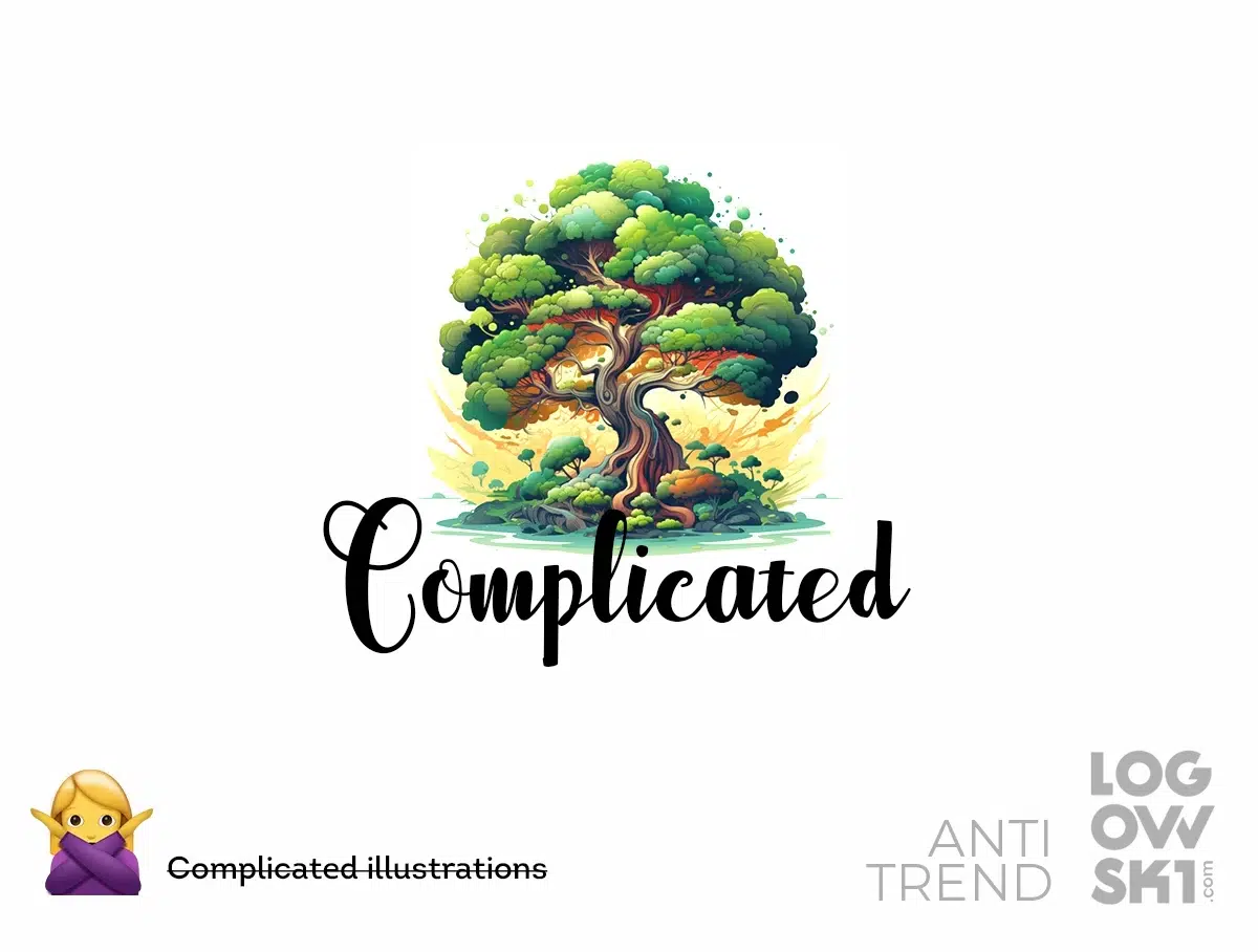
Using intricate illustrations that are difficult to decipher small or reproduce cleanly. Simple and iconic is best.
While intricate artwork may seem impressive, especially in terms of craftsmanship, it often falls short in practicality and scalability. Logos burdened with intricate details risk losing clarity when scaled down, making them challenging to decipher in smaller sizes or reproduce faithfully across various mediums. In contrast, simplicity reigns supreme in effective logo design. Iconic symbols and clean lines have the power to convey a brand's message swiftly and memorably. By embracing simplicity over complexity, designers ensure that logos remain versatile and easily recognizable across diverse platforms, reinforcing brand identity with clarity and impact.
3. Ironic or sarcastic logos
Attempting to be clever often backfires. Logos that rely on irony don't age well. Sincerity and clarity is smarter.
The allure of irony or sarcasm can sometimes lead to a design dead end. While cleverness may initially spark interest, logos steeped in irony risk falling flat over time. What might seem amusing or witty in the moment can quickly lose relevance or even offend as cultural contexts evolve.
In contrast, logos grounded in sincerity and clarity stand the test of time with enduring relevance. By prioritizing authenticity over irony, designers can craft logos that communicate a brand's message with clarity and integrity. In a landscape where authenticity resonates with audiences, sincerity emerges as the smarter choice, fostering deeper connections and lasting impressions.

4. Over-the-top visual effects
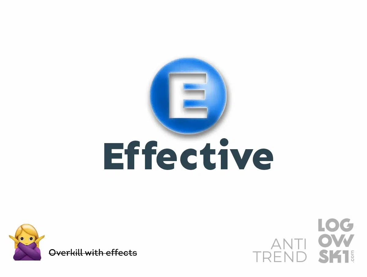
Things like extreme gradients, lots of shadows and textures tend to look gimmicky. Keep visual effects subtle.
The temptation to indulge in over-the-top visual effects can be a pitfall to avoid. While bold gradients, elaborate shadows, and intricate textures may initially catch the eye, they often veer into the territory of gimmickry.
Logos laden with excessive visual effects risk appearing dated or distracting, overshadowing the core message of the brand they represent. Instead, opting for subtlety in visual effects ensures that logos remain timeless and versatile. By harnessing the power of understated elegance, designers can create logos that command attention without overwhelming the viewer. In a world inundated with stimuli, restraint in visual effects emerges as a hallmark of sophistication, allowing the essence of the brand to shine through with clarity and impact.
5. Hard-to-read display fonts
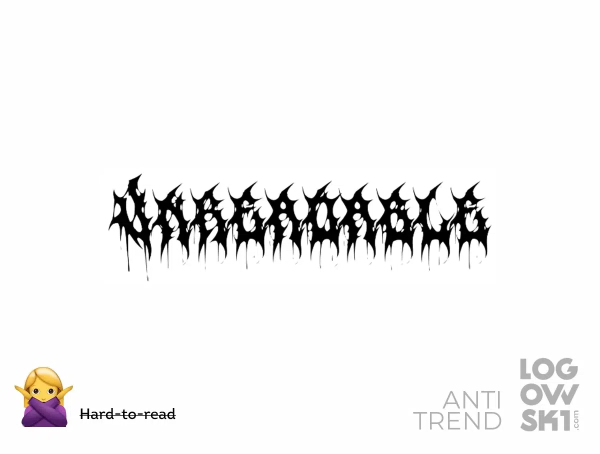
Illegible or overly intricate fonts don't work for logos meant to be versatile and readable. Avoid fonts that are just eye candy.
The choice of font plays a pivotal role in conveying a brand's identity effectively. However, the allure of intricate or ornate display fonts can sometimes lead to the anti-trend of hard-to-read typography. Fonts that sacrifice readability for flair risk undermining the logo's functionality, particularly in versatile applications across various mediums. Logos should prioritize clarity and legibility to ensure they resonate with audiences at a glance.
Avoiding fonts that are merely eye candy in favor of those that strike a balance between style and readability is paramount. By selecting fonts that are both visually appealing and easy to digest, designers can create logos that leave a lasting impression while maintaining versatility and accessibility. After all, a logo's purpose is to communicate the essence of the brand clearly and effectively, and legible typography is key to achieving that goal.
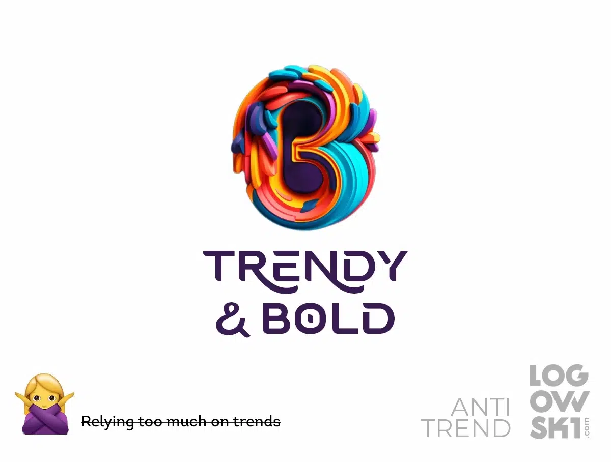
6. Relying too much on trends
Chasing trends like 3D or holographic effects often shortens a logo's shelf life. It’s smarter to aim for versatility.
The most effective logos utilize design principles like simplicity, clarity, and restraint. Timeless logos derive from creative concepts not trendy tricks.
It's tempting to chase after the latest trends in pursuit of relevance and novelty. However, relying too heavily on trends, such as 3D or holographic effects, can ultimately diminish a logo's longevity. Instead of enduring the test of time, trendy logos risk quickly becoming outdated, losing their impact and relevance as fads fade away. Smart designers recognize the value of aiming for versatility over trendiness.
By focusing on timeless design principles like simplicity, clarity, and restraint, logos can transcend fleeting trends to become enduring symbols of brand identity. The most effective logos derive their strength from creative concepts rather than relying on trendy tricks. By prioritizing ingenuity and originality, designers can craft logos that resonate deeply with audiences, standing the test of time while maintaining their relevance and impact for years to come.
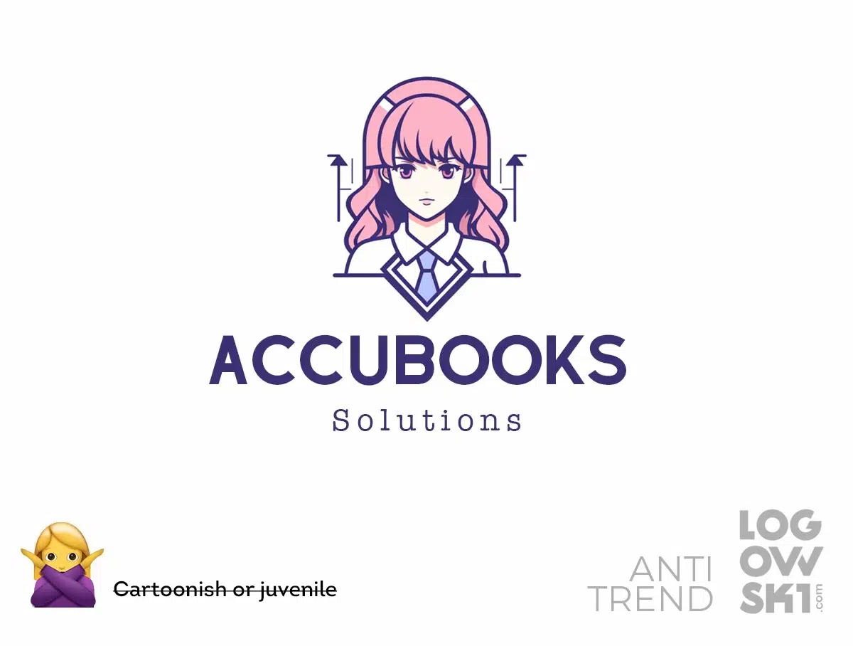
7. Cartoonish or juvenile styles
Using exaggerated cartoon graphics, silly characters or childish fonts only works for brands targeting kids. Most companies need a mature, professional look.
While cartoonish or juvenile styles may have their place in brands targeting children or playful audiences, they often fall short in conveying maturity and professionalism for most companies. Logos adorned with exaggerated cartoon graphics, silly characters, or childish fonts risk undermining the credibility and sophistication of the brand they represent. Instead, most companies benefit from adopting a mature and professional look in their logos.
By eschewing cartoonish elements in favor of sleek, refined designs, brands can project an image of professionalism and trustworthiness to their target audience. A logo's style should align closely with the values and identity of the brand, effectively communicating its message and establishing a lasting connection with its audience.
8. Stealing elements from other companies
While inspiration is fine, mimicking well known icons like swooshes or silhouettes of competitors is asking for legal trouble and criticism. Total originality is the goal.
The temptation to borrow elements from other companies' logos can be alluring. However, such actions not only invite legal repercussions but also risk tarnishing a brand's reputation and credibility. While drawing inspiration from existing designs is acceptable, outright mimicking of well-known icons like swooshes or silhouettes of competitors crosses ethical and legal boundaries. Striving for total originality should always be the goal in logo design.
By cultivating unique concepts and innovative elements, designers can ensure that their logos stand out in the marketplace, capturing attention and forging a distinct identity for the brand they represent. Originality not only mitigates the risk of legal disputes but also reinforces the authenticity and integrity of the brand, fostering trust and loyalty among its audience. In a landscape where differentiation is paramount, originality emerges as the cornerstone of effective logo design, setting brands apart and propelling them towards success.

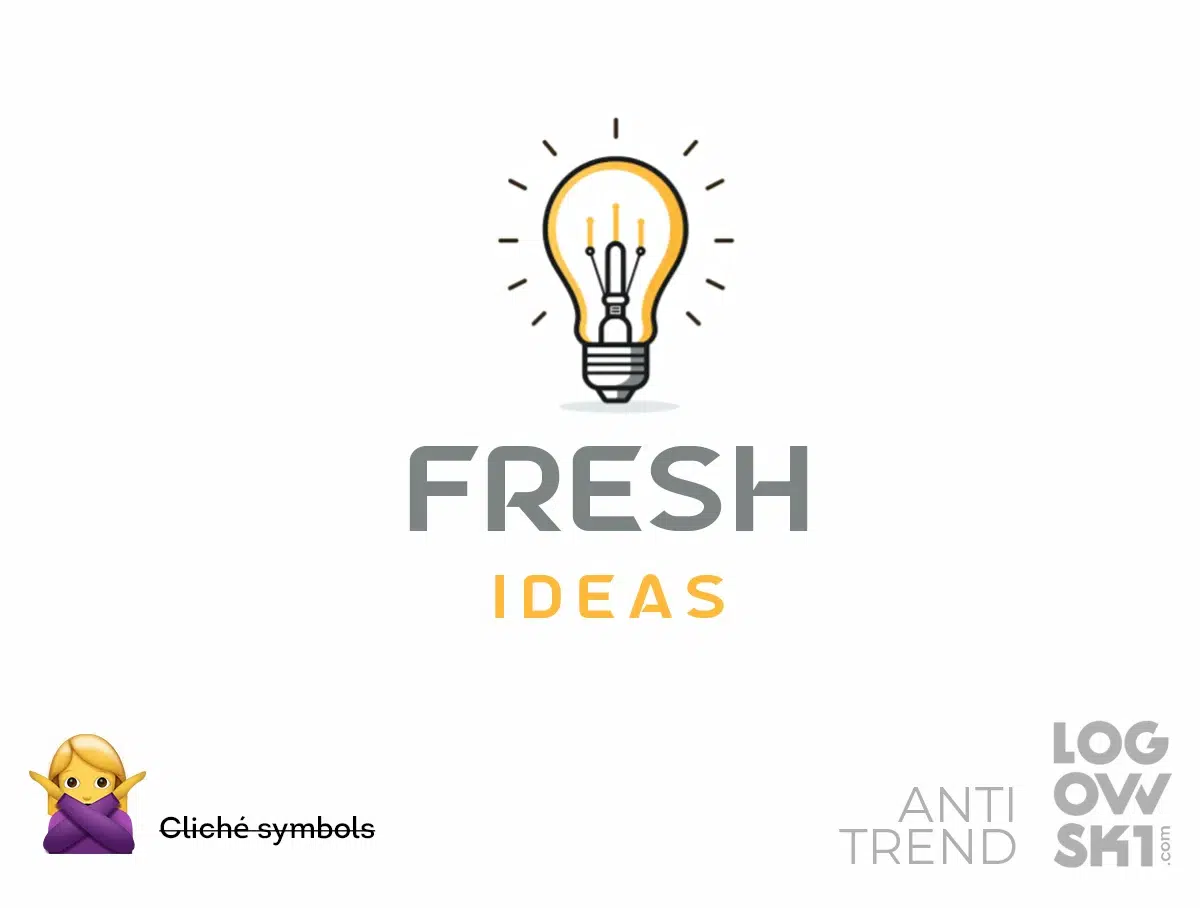
9. Cliché metaphors and symbols
Tired concepts like lightbulbs for ideas, speech bubbles for communication, etc. Lack of imagination shows. Dig deeper for an innovative, unexpected image that pops.
Concepts like lightbulbs for ideas or speech bubbles for communication, while once effective, have become tired and overused. Logos that rely on these predictable symbols risk blending into the noise of the marketplace, failing to capture attention or leave a lasting impression. To truly stand out, designers must dig deeper, eschewing clichés in favor of innovative and unexpected imagery that demands attention.
By pushing the boundaries of conventional thinking, designers can uncover fresh perspectives and unlock the potential for truly memorable and impactful logos. Whether through abstract symbolism or unconventional imagery, the goal remains the same: to create logos that resonate deeply with audiences, sparking intrigue and fostering meaningful connections with the brands they represent. In a world saturated with clichés, originality reigns supreme, signaling a brand's commitment to creativity and innovation.
10. Gimmicky visual tricks
Things like lens flare, glitch effects, extreme gradients quickly look dated. Favor a logo that stands confidently on its own without tricks.
In the realm of logo design, the allure of gimmicky visual tricks can sometimes overshadow the core message of the brand. Techniques like lens flare, glitch effects, or extreme gradients may initially catch the eye, but they often risk appearing dated or out of touch as design trends evolve. Instead of relying on these fleeting gimmicks, designers should prioritize crafting logos that stand confidently on their own merits.
By favoring timeless design elements and clean aesthetics, logos can maintain their relevance and impact over time. A logo that relies on tricks for attention may quickly lose its appeal, while one that exudes simplicity and authenticity endures as a timeless symbol of the brand's identity. In a landscape inundated with visual noise, restraint and substance emerge as the hallmarks of effective logo design, ensuring that the essence of the brand shines through with clarity and integrity.

11. Pixelated or low-resolution graphics
In an era of high-def screens and quality printing, a logo with blurry, pixelated or rasterized graphics looks unprofessional. Go vector and ultra crisp. By steering clear of these design approaches past their prime, your logo will stand the test of time as a distinctive brand asset.
Logos marred by pixelation, blurriness, or rasterization not only appear unprofessional but also fail to make a strong visual impact. Embracing vector graphics ensures that logos maintain their clarity and integrity across various mediums and sizes. By eschewing outdated design approaches like pixelation, designers can future-proof their logos, ensuring they remain distinctive brand assets for years to come. In a landscape where visual excellence is paramount, prioritizing vector graphics ensures that logos stand the test of time, commanding attention and leaving a lasting impression on audiences.
![]()
12. Gradient abuse
Subtle gradients can add dimension, but strong banded gradients quickly look dated and scream 2000's. Use sparingly and softly.
While subtle gradients can enhance depth and dimension, over-reliance on strong, banded gradients can quickly date a logo, evoking the design trends of the early 2000s. To ensure a logo maintains a modern and timeless aesthetic, designers should exercise restraint and use gradients sparingly and softly. By opting for subtle gradients that delicately enhance the logo's visual appeal, designers can avoid the pitfalls of gradient abuse and create logos that stand the test of time. In a landscape where design trends come and go, moderation is key to crafting logos that remain relevant and impactful for years to come.

13. Photorealistic representations
Ultra-detailed illustrations or photos rarely translate to small sizes or etching/engraving. Keep logos graphic and iconic.
While ultra-detailed illustrations or photos may impress at larger scales, they often lose their impact and clarity when scaled down or reproduced through techniques like etching or engraving. To ensure versatility and effectiveness across various applications, logos should prioritize graphic simplicity and iconicity. By embracing clean lines and simplified forms, designers can create logos that remain recognizable and impactful even at smaller sizes or in more intricate reproduction methods. In a world where adaptability is paramount, logos that eschew photorealism in favor of graphic clarity stand out as enduring symbols of brand identity.

In Conclusion
In the dynamic realm of logo design, understanding and navigating anti-trends is crucial for creating impactful and enduring brand identities. By recognizing and avoiding common pitfalls such as ultra-minimalism, overly complicated illustrations, or ironic designs, designers can steer clear of trends that risk diluting a brand's message or compromising its integrity. Instead, prioritizing authenticity, clarity, and originality ensures that logos stand out amidst the noise of the marketplace, leaving a lasting impression on audiences. Remember, while trends may come and go, timeless design principles remain the foundation of effective logo design, enabling brands to forge meaningful connections and establish lasting relationships with their audience.
Logos should be self-explanatory. If you have to explain a shape or color, go back to the drawing board.
Find out more about Logo Design Trends for 2024 in our selection
Frequently Asked Questions about Anti-Trends in Logo Design
What are anti-trends in logo design?
Anti-trends in logo design refer to design approaches that deviate from prevailing trends and focus on avoiding common pitfalls that can compromise a logo's effectiveness and longevity.
Why should I avoid trendy design approaches in logo design?
Avoiding trendy design approaches helps ensure that your logo remains relevant and timeless. Trends can quickly become outdated, whereas timeless design principles ensure enduring appeal.
How can I ensure my logo avoids anti-trends?
To avoid anti-trends in logo design, prioritize authenticity, simplicity, and clarity. Avoid overcomplicated designs, cliché metaphors, and gimmicky visual effects.
What role does originality play in avoiding anti-trends?
Originality is key to avoiding anti-trends. By focusing on innovative and unexpected design elements, you can ensure that your logo stands out and remains distinctive amidst changing design trends.
How can I ensure my logo remains relevant over time?
To ensure your logo remains relevant, focus on timeless design principles rather than following fleeting trends. Prioritize simplicity, clarity, and authenticity in your design.
What are some examples of anti-trends in logo design?
Examples of anti-trends include ultra-minimalism, overly complicated illustrations, ironic or sarcastic designs, reliance on trendy visual effects, and cliché metaphors or symbols.
Why is it important to avoid cliché metaphors and symbols in logo design?
Avoiding cliché metaphors and symbols ensures that your logo stands out and remains memorable. Overused symbols can make your brand appear generic and fail to communicate its unique identity effectively.
How can I strike a balance between following design trends and avoiding anti-trends?
To strike a balance, stay informed about current design trends but approach them critically. Evaluate whether a trend aligns with your brand identity and values. Prioritize timeless design principles over fleeting trends.
What should I do if my logo incorporates elements that are considered anti-trends?
If your logo includes elements that are considered anti-trends, consider revising it to align more closely with timeless design principles. Focus on simplifying the design, removing unnecessary elements, and emphasizing authenticity.
How can I ensure my logo remains versatile while avoiding anti-trends?
To ensure versatility, prioritize simplicity and clarity in your logo design. Avoid overly complex elements or trendy effects that may limit its adaptability across various mediums and applications.