In the field of design, logo design trends are constantly evolving to capture attention and reflect the evolving aesthetics of the industry. This curated collection presents the latest trends in logo design for 2024, at the intersection of innovation and visual storytelling.
Logo design is a crucial visual representation of a brand, encapsulating its essence and conveying a narrative that resonates with the audience. The trends of 2024 reflect not only the current state of design but also a forecast of where creativity is heading. This compilation demonstrates our ability to identify emerging patterns and our commitment to staying ahead of the curve.
Although design principles provide a foundation, logo design should not deviate from conventional norms and should embrace novel concepts only when appropriate. This visual journey explores the nuances of shape, color, and symbolism, anticipating the design landscapes that will define the year ahead.
These trends reflect industry shifts and celebrate the limitless possibilities within the creative process. As we present our selection of logo design trends for 2024, we invite you to immerse yourself in the world of innovation, where each logo tells a unique story, and each design choice is a brushstroke on the canvas of brand identity.
Embark with us on this visual exploration, as we unveil the pulse of logo design in 2024 — a fusion of intuition, creativity, and a forward-looking perspective.
Introducing our top 10 logo design trends for 2024:
1. Kids drawing
There is a growing trend in contemporary logo design that embraces the whimsy and authenticity of children's drawings, even for non-children's businesses. This unconventional approach taps into the nostalgic charm of childhood innocence, infusing brands with a playful and accessible vibe.

Incorporating elements reminiscent of children's doodles can convey a sense of openness, creativity, and a genuine connection with the audience.
This design trend challenges traditional norms, demonstrating that even in serious industries, a touch of lightheartedness can foster relatability and leave a lasting impression. Exploring unconventional avenues can demonstrate a commitment to connecting with consumers on a personal and emotional level. Using kids' drawings as design inspiration is a trend that showcases the simplicity of a child's imagination and can lead to a distinctive and meaningful brand expression.
2. Abstract shapes
Combining abstract shapes with geometric or simple fonts. This fusion of elements creates a visually striking and contemporary aesthetic that transcends industries. The use of abstract shapes brings a sense of fluidity that allows for multiple interpretations and promotes a brand identity that is both versatile and distinctive.

By combining abstract forms with geometric or simple fonts, designers can achieve a harmonious balance between complexity and simplicity. The clean lines and minimalist approach of geometric fonts complement the fluidity of abstract shapes, resulting in logos that are visually appealing and convey a sense of modernity and sophistication.
This trend emphasizes the effectiveness of visual storytelling. The use of abstract shapes and simple fonts in logo design encourages consumers to engage with and interpret the brand in their own way. This trend conveys innovation, flexibility, and a forward-thinking mindset through subtlety, demonstrating that less is often more when it comes to creating a lasting and memorable brand impression.
3. Vintage minimalism
In the ever-evolving landscape of logo design, the trend of vintage minimalism has emerged as a captivating fusion of nostalgia and modern simplicity. This design approach seamlessly blends vintage fonts with clean, simple borders or minimal graphic detail to create a timeless and refined aesthetic.

The combination of vintage fonts with simple frames or subtle graphics can create a sense of classic elegance while maintaining a contemporary edge. This trend embodies the essence of 'less-is-more', where each element is thoughtfully chosen to convey a message of sophistication and enduring style.
The juxtaposition of vintage and minimalism in logo design allows brands to tap into a rich reservoir of history while projecting a clean and relevant image. Designers can infuse a touch of personality into simplicity by incorporating carefully selected details, such as subtle embellishments or restrained graphics. This captures the viewer's attention with a sense of authenticity and timelessness.
The vintage minimalism logo trend pays homage to the past and showcases a commitment to enduring design principles. In a world full of visual clutter, this approach exemplifies the lasting allure of elegant simplicity and the timeless charm of vintage aesthetics.
4. Geometric composition
The trend of geometric composition has emerged as a powerful and visually striking approach. This design philosophy revolves around using basic, simple geometric shapes to construct logos that are visually appealing and convey a sense of order, balance, and modernity.

The geometric composition trend utilizes clean lines, sharp angles, and precise symmetry to create minimalist yet impactful visual representations of complex concepts. Fundamental geometric shapes such as circles, squares, and triangles are used as building blocks to form cohesive and aesthetically pleasing logos that resonate with contemporary design sensibilities.
This trend's strength lies in its ability to communicate clarity and efficiency. By utilizing geometric simplicity, logos can become instantly recognizable and memorable, making a bold statement about the brand's identity. The deliberate choice of shapes and their arrangement reflects a commitment to precision and a forward-thinking mindset.
The geometric composition of logo design embodies the notion that simplicity can be a powerful tool for conveying complex ideas. It is a visual language that transcends cultural and linguistic barriers, providing a universal appeal. In today's society, where initial impressions hold significant weight, this trend serves as evidence of the lasting appeal of geometric simplicity in logo design.
5. Metaphora
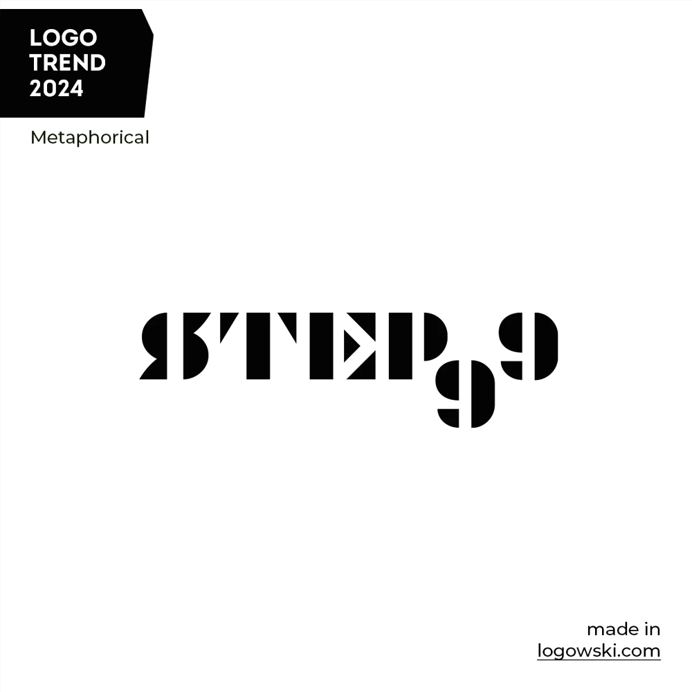
The 'Metaphora Idea' logo trend simplifies complex concepts into visually compelling symbols. It is grounded in simplicity and depth, transforming abstract ideas into straightforward, impactful designs. This approach embraces the power of metaphorical imagery to communicate depth and meaning, creating logos that resonate with clarity and creativity.

6. Modern Retro
Explore the 'Modern Retro' logo design trend, where the past meets the present in a seamless fusion of nostalgia and contemporary aesthetics. This trend utilizes modern fonts and clean shapes to create logos that evoke a sense of vintage allure while maintaining a fresh and current appeal.

By combining classic warmth with modern minimalism, these logos achieve a harmonious balance that captures both sentiment and sophistication. The 'Modern Retro' trend nods to the timeless charm of the past while committing to sleek, up-to-date design elements. This unique blend speaks to the enduring appeal of a well-crafted visual identity.
7. Custom illustrations
This trend celebrates intricate, bespoke artwork within brand identities. It departs from simplistic symbols and delves into the realm of bespoke illustrations, where every line and detail is meticulously crafted to tell a unique story.

Logos are transformed into vibrant canvases that showcase rich, custom graphics reflecting the essence of the brand. This trend employs detailed illustrations to establish a visual narrative that goes beyond mere representation, fostering a deep connection between the brand and its audience. It departs from conventional norms, embracing complexity to create logos that stand as works of art, intricately designed to leave a lasting and memorable impression.
8. Crazy palette
This trend challenges the status quo by turning logos into captivating visual spectacles with a spectrum of vibrant and unexpected hues. By embracing unconventional color palettes, brands can communicate a spirit of innovation and nonconformity, instantly capturing attention in a crowded visual landscape.

This trend is not only about color, but also a bold statement of a brand's unique personality and a testament to its willingness to break free from traditional norms. In a world where differentiation is key, the use of bold colors in logo design can be a powerful tool for leaving a lasting and memorable impression.
9. Hand-drawn
This trend embraces the charm of hand-drawn graphics and lettering, showcasing the unique imperfections and nuances of handcrafted elements. Logos become personalized works of art, injecting a sense of personality and originality, forging a more intimate connection between the brand and its audience.

By choosing hand-drawn elements, logos can transcend the digital realm and resonate with a nostalgic and artisanal quality. This can help them stand out in a visually saturated market.
10. Typographic mix
This trend moves away from uniformity by blending a variety of typefaces, from simple and clean to ornate and expressive. Logos become typographic symphonies, harmonizing diverse fonts to convey layers of meaning and style. This trend celebrates the art of typography, showcasing the versatility and creativity that emerge when different letterforms join forces.

By experimenting with contrasting fonts and lettering styles, brands can convey a nuanced identity that is both eclectic and cohesive, making a bold statement in the world of design. The 'Typographic Mix' trend celebrates the endless possibilities within the realm of letters, transforming logos into dynamic compositions that leave a lasting impression.
Final Thoughts about the latest Logo Design Trends:
In the constantly changing field of logo design, various trends have been explored, each bringing a unique flavor to visual storytelling. These trends range from simple geometric compositions to whimsical designs inspired by children's drawings, and from vintage minimalism to bold and audacious use of colors. They showcase the diverse and dynamic nature of creative expression within branding.
Designers are creating logos that go beyond mere symbols and become captivating works of art. The typographic mix trend celebrates the beauty of diverse fonts and lettering styles in a harmonious dance that breathes life into brand identities.
As we navigate these trends, it is clear that logo design is not just a visual representation, but also a storytelling medium. Each trend reflects a unique narrative, blending tradition and innovation, simplicity and complexity, to capture the essence of brands in a visually saturated world.
FAQ:
How do these logo trends impact brand identity?
A: These trends play a crucial role in shaping brand identity by influencing the visual language that consumers associate with a particular brand. They help convey a brand's personality, values, and uniqueness.
Are these trends suitable for all industries?
A: While some trends may have universal appeal, the suitability depends on the brand's positioning and target audience. Designers often tailor trends to align with the specific needs and characteristics of each industry.
How can businesses choose the right logo trend for them?
A: Businesses should consider their brand identity, target audience, and industry positioning. It's essential to choose a trend that aligns with the brand's values and resonates with the intended audience.
Is it necessary to follow logo design trends?
A: While it's not mandatory, staying aware of trends can be beneficial. Trends reflect current design preferences and can help brands stay relevant and visually appealing to their target audience.
How often should a company update its logo to stay on trend?
A: Logo updates should be strategic and not solely based on trends. A timeless logo can endure, but periodic refreshes may be necessary to align with evolving brand values or industry shifts.
Are there any logo trends that have timeless appeal?
A: Minimalism, simplicity, and versatility are often considered timeless elements in logo design. These characteristics ensure that a logo can withstand the test of time and remain relevant across changing trends.
How does the choice of colors impact logo design?
A: Colors evoke emotions and convey brand messages. The crazy and bold colors trend, for instance, aims to grab attention and infuse energy, while more subdued palettes may communicate sophistication or trustworthiness.
Can combining multiple trends in one logo work?
A: Yes, combining trends can lead to innovative and unique designs. However, it requires careful consideration to maintain cohesiveness and ensure that the combined elements complement rather than clash with each other.