Starbucks has undergone several rebranding efforts since it unveiled its first location in 1971. Each rebranding was accompanied by a reinterpretation of its logo. The original logo featured a green circular design with a sleek black mermaid in the center, symbolizing the brand's commitment to quality and excellence in coffee. The Siren, also known as the mermaid, is often associated with enchantment, allure, and the lure of the open sea. This makes her a fitting representation for a brand dedicated to bringing the best coffee experience to its customers, underscoring the significance of the iconic Starbucks siren in the Starbucks global brand identity.
The Starbucks logo has undergone subtle modifications over time to stay in tune with changing times and evolving consumer preferences. The color palette and overall design have remained consistent, but the details and styling of the Siren have been refined. In 1987, the company dropped the word 'Coffee' from the logo to align with its aspiration to expand beyond just a coffee shop and encompass a wider range of products and experiences. This change was a crucial moment in Starbucks' branding strategy and enabled the logo to become a genuine global icon.
Original Starbucks Logo
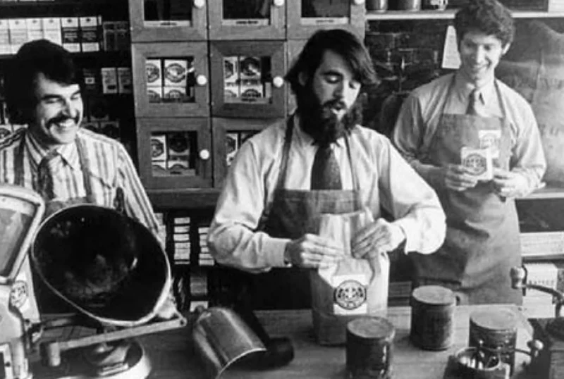
The original Starbucks logo is an iconic symbol in the coffee industry. The logo has gone through several evolutions since the brand's inception, but its roots can be traced back to the original concept of branding. The original starbucks logo 1971 is famous and easily recognizable worldwide. In 1971, when Starbucks opened its first store in Seattle's Pike Place Market, the logo was different from the current mermaid emblem. The original logo featured a two-tailed mermaid, or siren, with long, flowing hair covering her breasts. The siren was encircled by the store's name, 'Starbucks Coffee, Tea, and Spice.' Starbucks' logo was inspired by a 15th-century Norse woodcut of a twin-tailed mermaid.Co-founder Gordon Bowker suggested using the siren because it evoked the seductive mystique of coffee. In 1987, Starbucks hired designer Terry Heckler to update the logo, marking a pivotal moment in its logo redesign journey. Heckler streamlined the detailed woodcut style into a more contemporary graphic image, removing the encircling words and leaving just the siren and the name 'Starbucks.' The earthy hues of coffee are represented by the green and brown colors. From 1987 to 2011, the official Starbucks logo was a cleaner and simplified siren. In 2011, the logo was refreshed again, with the focus being just the graphic icon, showcasing the enduring appeal of the iconic Starbucks siren in the new Starbucks logo.
The siren was updated, and the nautical rope detail was removed to create a cleaner image. The green color was also brightened to a more vibrant lime green. The current Starbucks logo features a refreshed emblem. Although the logo has undergone several changes, the iconic siren image remains the core of the brand. The Starbucks original logo reflected seafaring coffee history. Subsequent iterations have simplified the design to the essential graphic mermaid, making it one of the most recognizable brand symbols worldwide.
![]()
Old Starbucks Logo
The Starbucks logo features a mesmerizing image of a siren, also known as a mermaid, which represents the allure and seduction of the brand's coffee. The siren is a mythical creature from Greek mythology that was known to lure sailors with its enchanting voice and beauty. In the logo, the siren is depicted in a vintage style, capturing the essence of the brand's rich history and commitment to quality. Old logo, featuring a two-tailed siren from Norse mythology, is an iconic part of the company's history. Some people mistake the image for a mermaid, but according to Starbucks, she is actually a siren. Starbucks founders were inspired by the seafaring history of coffee and the romance of the high seas.The siren was chosen to represent this inspiration.The old Starbucks logo features a siren holding what appears to be a cup of coffee. The logo has gone through some changes over the years, including covering up the siren's bare chest in 1987 to make the image more family-friendly, as part of the ongoing history and evolution of the Starbucks logo design. At this point, the company added the green color to the logo to represent their commitment to freshness and the environment. In 2011, Starbucks updated their logo by cropping the siren's image to show only her face. They also removed the words 'Starbucks Coffee' around her image and brightened the green color. However, the company ensured that the new logo retained key elements from Starbucks old logo, such as the seductive allure, luminous aura, and flowing hair of the original belled siren.
The old Starbucks logo is an essential part of the company's branding history and legacy. Although the logo has evolved, the mythical siren at its center still represents the irresistible temptation and seafaring history that inspired Starbucks at the start. The siren still evokes a sense of romance and longing for the high seas. Starbucks fans will always associate the twin-tailed belled siren image with the Starbucks experience.
Starbucks logo meaning
The iconic green Starbucks logo is recognized all over the world, but what is the starbucks symbol and what is the starbucks logo actually supposed to represent? The origins of the starbucks logo meaning date back to 1971 when the first Starbucks opened in Seattle's Pike Place Market. The original brown starbucks logo featured a twin-tailed mermaid, or siren, inspired by the seafaring history of coffee trading. This starbucks original logo was designed by an artist named Terry Heckler.Over the years, the starbucks logo has gone through some key evolutions, simplifying into the green and white emblem we know today. In 1987, Starbucks hired designer Lance Brooks to update the logo into a more contemporary graphic style. This green revision kept the siren image but stripped away the details, leaving just an abstracted representation. According to Howard Schultz, this starbucks logo evolution was intended to capture "the seafaring history of coffee and Seattle’s strong seaport roots." The siren is modeled after a 16th century Norse woodcut image, tying back to starbucks logo history and the seafaring coffee traders of centuries past. Her two tails represent the twin fish tails of these mythological creatures.
The green color palette nods to the natural environment, resonating with Starbucks' Pacific Northwest origins and highlighting the history and evolution of the Starbucks logo design. While Starbucks has never officially stated the meaning of the starbucks logo, the prevailing interpretation is that the siren symbolizes "the seductiveness of coffee." The enchanting, alluring siren draws customers in. So next time you visit your local Starbucks and see that familiar green Starbucks symbol, remember there's a whole story behind it, reflecting the rich history and evolution of the iconic Starbucks logo design. The starbucks logo meaning connects back to the very roots of coffee while creating an eye-catching icon that has become globally recognized today. Those twin tails still represent the rich history of great coffee.
The Green Color
The color green has been an integral part of the Starbucks logo from the beginning. It symbolizes freshness, growth, and nature, aligning perfectly with the brand's core values of sustainability and sourcing ethically grown coffee beans. The green color also represents the calming and rejuvenating effect of a cup of coffee, creating a sense of peace and relaxation for customers.
![]()
Starbucks logo embodies the brand's dedication to providing high-quality coffee in a vintage and enchanting way. The siren image and the green color are powerful elements that have become instantly recognizable and synonymous with the Starbucks brand. See more about vintage logos.
Starbucks 1971 logo
1971 Starbucks Logo, a result of the original logo ideas from Starbucks' founding period.</span>The Starbucks 1971 logo featured a green siren, a mythical creature from Greek mythology that is half-woman and half-fish. This vintage logo represented the company's roots in coffee and the welcoming atmosphere of their stores. The 1971 logo was quite different from the iconic green logo we all know today. Back in 1971 when Starbucks first opened its doors in Seattle's Pike Place Market, the original 1971 logo featured a two-tailed mermaid, or siren, as the central image.This early 1971 starbucks logo was created by an artist named Terry Heckler. According to Howard Schultz, who acquired Starbucks in 1987, Heckler was inspired by old marine woodcuts when he designed the logo. The siren evoked the seafaring history of coffee and the romance of the high seas. Her long, flowing hair and bare chest gave her a seductive, even scandalous look, becoming a controversial part of the logo. This was likely intentional, as the founders of Starbucks wanted the logo to capture attention. In the original starbucks logo 1971, the siren is inside a circle with the words "Starbucks Coffee Tea Spices" around the edge. The design is simple black line art, very much in keeping with the artistic style of the 1970s. While today we are used to seeing the siren against a green background, originally the logo was black or at times brown, showing the evolution of the background color.
Over the years, the siren logo has been updated and refined as Starbucks grew into the global mega-brand it is today, reflecting the continuous evolution of the iconic Starbucks logo design. The naked siren was considered too risque, so clothing was added. Details like the nautical crown and strands of hair were tweaked and perfected. But the essential image of the siren and her seductive power remains at the heart of Starbucks' identity and connection to its maritime origins. When we see the familiar green logo today, we are looking at an evolved version of that initial starbucks 1971 logo sketch of the two-tailed mermaid.
![]()
Changes in the 1980s
In the 1980s, Starbucks underwent a significant makeover in terms of its logo and branding. The coffee company decided to modernize its visual identity to appeal to a wider audience and reflect its growth as a brand. During this time, Starbucks transitioned from its original brown logo to a bold green design that is still recognized today. The decision to utilize the color green was a strategic move as it symbolizes freshness, growth, and the natural origins of coffee.
![]()
In addition to the change in color, the logo underwent some modifications as well. The siren, also known as the mermaid, was further stylized to give a more sophisticated and contemporary look. The graphic was simplified and featured bolder lines, accentuating the siren's features and creating a more memorable icon, embodying the essence of modern logo ideas.
This new logo was intended to represent Starbucks' commitment to quality coffee and exceptional service. The updated logo successfully conveyed the essence of Starbucks, while also giving it a more modern and trendy aesthetic. This change was crucial for the brand as it allowed Starbucks to stand out in a competitive market and attract a younger demographic who were seeking unique and authentic coffee experiences.
Starbucks Logo History
The vintage coffee house, Starbucks, has a distinct and recognizable logo. The original Starbucks logo featured a siren or a mermaid, which has become an iconic symbol of the company. This green logo has undergone several changes over the years, representing the evolution of Starbucks as a brand.
![]()
The original Starbucks logo, introduced in 1971, featured a siren with a flowing tail and two tails encircling her. This logo was designed to represent the maritime history of coffee and the connection of Starbucks to the sea. The siren was a symbol of seduction and allure, portraying Starbucks as a place where customers could indulge in the pleasure of a cup of coffee. In 1987, the Starbucks logo underwent a slight change. The siren lost her tail and the design became more simplified. The green color, however, remained the same, representing the company's commitment to environmental sustainability.
In 1992, the logo was redesigned once again. This time, the siren was zoomed in, focusing on her face, which was a strategic graphic design decision to emphasize the iconic Starbucks siren more. The words "Starbucks Coffee" were placed around the siren, creating a more cohesive and modern design. This logo remained in use until 2011. Finally, in 2011, the logo evolved once more, marking another chapter in Starbucks' commitment to logo redesign and evolution. The word "Coffee" was dropped, and the siren became the sole focus of the logo. The design was streamlined, with cleaner lines and a more symmetrical appearance. This modern and minimalist logo reflected Starbucks' commitment to simplicity and innovation.
Overall, the evolution of the Starbucks logo showcases the company's journey as a brand and its ability to adapt to changing trends and consumer preferences. The vintage siren logo in green has become an enduring symbol of Starbucks and its commitment to providing high-quality coffee experiences, marking a significant chapter in the history and evolution of the Starbucks logo design.
Streamlining the Design in 1992
In 1992, Starbucks made a significant change to their original green logo as part of their ongoing branding efforts. The iconic mermaid, or siren, was simplified and streamlined to create a more modern and contemporary look. Gone were the intricate details and fine lines of the original logo, replaced with a bolder and more minimalistic design. The updated logo featured a stylized, two-dimensional image of the mermaid, with her long hair and tail forming an elegant circular shape.
![]()
This new design allowed the logo to be easily recognizable and reproduced across various mediums, such as signage, packaging, and promotional materials. The simplified lines also ensured that the logo would be more versatile and adaptable, making it easier for the brand to evolve and expand its presence in the competitive coffee industry.
While the vintage original Starbucks logo had a certain charm and nostalgic appeal, the streamlined design of 1992 marked a new era for the brand. It demonstrated Starbucks' commitment to staying relevant and appealing to a wider audience, while still maintaining the essence of their coffee heritage.
Emphasizing the Siren Character in 2011
In 2011, Starbucks decided to emphasize the original siren character in their logo. The green vintage branding, which had become synonymous with the Starbucks brand, was updated to prominently feature the mermaid, also known as the siren. This decision was made to reconnect with the brand's original image and coffee heritage.The siren character has been an integral part of Starbucks' branding since the company's inception. It is a representation of seduction, allure, and the allure of coffee. By emphasizing the siren character in their logo, Starbucks aimed to evoke a sense of tradition and authenticity, while also symbolizing their commitment to providing high-quality coffee to their customers.
The Original Starbucks Logo
The original Starbucks logo featured the vintage green branding with the siren in the center. This logo was designed to capture the essence of the brand, with the siren's seductive pose and flowing hair symbolizing the allure of Starbucks coffee.The Evolution of the Logo
Over the years, Starbucks made several changes to their logo, modernizing it while still keeping the siren as a central element. In 2011, the decision was made to bring the siren back to prominence, making her larger and more detailed. This updated logo not only emphasized the siren character but also brought a fresh, contemporary look to the Starbucks brand.
Overall, the emphasis on the siren character in 2011 was a strategic move for Starbucks. It allowed them to reconnect with their roots and align their branding with their rich coffee heritage. The siren represents Starbucks' commitment to quality and their ability to provide customers with a unique coffee experience.
![]()
Minimalist Approach in 2011
n 2011, Starbucks took a minimalist approach to their branding and logo. This approach aimed to simplify their original logo, which featured a mermaid and the word "Starbucks" in a vintage green font. The new logo featured a sleeker and more simplified version of the original mermaid, removing some of the intricate details.
The mermaid, or siren as she is known, was still the centerpiece of the logo, but with a more streamlined and modern look. The green color remained as a nod to the brand's original identity, symbolizing their commitment to quality coffee and sustainability. The vintage font was also updated to a more contemporary and cleaner style, complementing the minimalist design.
The Impact
This minimalist approach in 2011 created a more modern and timeless logo for Starbucks. The simplified design allowed for better readability and adaptability across different mediums and platforms. By removing some of the intricate details, the logo became more versatile and easier to reproduce.It could be scaled down for smaller applications or displayed prominently on larger signage without losing its visual impact.Overall, the minimalist approach in 2011 ensured that Starbucks' logo remained recognizable and iconic, while also embracing a more contemporary aesthetic. It represented the brand's commitment to innovation and their ability to adapt to evolving design trends.
The Legacy
The minimalist logo introduced in 2011 has since become an integral part of Starbucks' brand identity. It has been consistently used across their products, packaging, signage, and digital platforms, solidifying its presence in the minds of consumers around the world.The minimalist approach in 2011 marked a significant milestone in the evolution of the original Starbucks logo. It demonstrated the brand's willingness to embrace change while staying true to their core values and heritage. To this day, the minimalist logo continues to be a symbol of the global coffee giant, representing their commitment to excellence and quality in every cup.
Embracing Simplicity in 2011
Embracing Simplicity in 2011, drawing inspiration from the original green siren logo, Starbucks decided to embrace simplicity in their branding in 2011, reflecting on the minimalistic trend in logo redesign. The vintage logo, featuring a twin-tailed mermaid known as the Siren, had been the face of the brand for over three decades.However, recognizing the need for a more modern and streamlined image, Starbucks made the bold decision to transform their logo in 2011. They chose to remove the company name and the outer circle, leaving only the iconic Siren at the center.This minimalist approach allowed the logo to stand out, making it instantly recognizable to loyal customers while also attracting new ones. The green color, synonymous with the Starbucks brand, remained untouched, giving the new logo a sense of familiarity.
By embracing simplicity in their logo design, Starbucks showcased their confidence in the strength of their brand. The decision to remove unnecessary elements demonstrated the company's commitment to staying relevant in an ever-changing market. Since its introduction in 2011, the simplified Starbucks logo has become a symbol of the brand's evolution and commitment to quality, demonstrating the Starbucks Corporation's strategy for simplification in logo redesign. Gone were the intricate details of the original logo, replaced with a more straightforward and modern design that reflected the values and vision of the company.
This evolution in branding was a testament to Starbucks' ability to adapt without losing its core identity. The simplicity of the logo allowed the brand to maintain a strong presence in a competitive market and cement itself as a leader in the coffee industry.
Unveiling the Current Logo in 2011
In 2011, Starbucks unveiled its current logo, which still features the iconic siren or mermaid, solidifying the siren as a central part of the logo. This marked a significant milestone in the evolution of the Starbucks branding and its series of logo redesign efforts. The previous logo, introduced in 1992, had undergone several changes throughout the years.However, in 2011, Starbucks decided to simplify its logo, removing both the word "Starbucks" and the outer circle. The decision was made to emphasize the company's commitment to coffee rather than just its brand name.
The siren, which had been an integral part of the brand's identity since its original logo in 1971, was also given a refresh. The new siren was stylized with sleeker lines and a modernized look, while still retaining the essence of the original vintage design. The new logo also presented a shift in color.
While the original logo featured a brown color scheme, the 2011 version embraced a bold green color, which has since become strongly associated with Starbucks and its brand. The unveiling of the current logo in 2011 symbolized Starbucks' evolution and growth as a global coffee brand. It showcased a renewed focus on its core product, coffee, while still preserving the iconic elements that had made the brand recognizable for decades.
Significance of the Starbucks Logo
The Starbucks logo featuring a mermaid, or "siren" as Starbucks refers to it, holds great significance in the company's branding. The green color, the original vintage design, and the symbolism of the siren all contribute to the unique identity of Starbucks. The logo of the original Starbucks store in Seattle, Washington, showcased a vintage design that reflects the brand's roots. This vintage look connects Starbucks to its humble beginnings as a local coffee shop and captures the essence of their brand story.

The siren depicted in the logo is a mythical creature known for luring sailors with its enchanting voice. Starbucks adopted the siren as its logo to signify the allure and magic of their coffee experience. The siren embodies the brand's commitment to providing customers with a captivating and irresistible coffee drinking experience.
The green color of the logo is also significant. Green represents growth, freshness, and environmental consciousness. By using the color green in their logo, Starbucks communicates their dedication to sustainable practices and their commitment to sourcing ethically grown coffee beans. Overall, the Starbucks logo is not just a visual representation of the brand, but a symbol that encompasses their values and promises. It signifies the vintage origins of the company, the enchanting allure of their coffee, and their commitment to sustainability. The Starbucks logo has become an iconic symbol recognized and loved worldwide.
Brand Identity and Recognition
Starbucks, the iconic coffee brand, is instantly recognized by its original logo. The logo, which features a vintage-style illustration of a twin-tailed mermaid, has become synonymous with the brand and its coffee offerings. The original Starbucks logo was designed in 1971 and featured a brown color scheme. It showcased a simplified version of the mermaid, known as the "siren," which has since become a symbol of the company's commitment to delivering high-quality coffee to its customers. The logo also included the brand name "Starbucks Coffee Tea and Spice" encircling the image.
The Evolution of the Logo
Over the years, the Starbucks logo has evolved to reflect the changing branding strategies of the company. In 1987, the logo was updated to a green color scheme, which symbolized the brand's focus on sustainability and environmental responsibility. This shift aligned with Starbucks' commitment to ethically sourcing its coffee beans and reducing its environmental footprint.
In 1992, the brand decided to remove the words "Coffee Tea and Spice" from the logo, simplifying it to just "Starbucks." This change allowed the company to expand its product offerings beyond just coffee and position itself as a purveyor of a wider range of beverages and food items.In 2011, the logo underwent another redesign, with the removal of the outer ring that contained the brand name altogether. This further streamlined the logo, placing even more emphasis on the iconic mermaid symbol and showcasing the innovative thinking behind the Starbucks logo design. This change represented Starbucks' evolution into a globally recognized brand that transcends the need for textual identification.
![]()
Recognition and Success
Thanks to its memorable logo, Starbucks has achieved strong brand recognition worldwide. The highly recognizable green siren logo is often associated with quality coffee and a comfortable atmosphere. This association has helped Starbucks build a loyal customer base and establish itself as a leader in the coffeehouse industry.Starbucks' branding efforts have been instrumental in its success, as the company continues to expand its presence. The visual identity provided by the original logo and its subsequent iterations has played a significant role in establishing and maintaining Starbucks' brand image and attracting customers around the globe to its coffee shops.
Symbolism of the Siren
The vintage original green mermaid logo has been an essential part of Starbucks branding since 1971. Known as the "Siren," this iconic figure represents the essence of the Starbucks brand and has become synonymous with their commitment to providing quality coffee to millions of customers worldwide. The Siren, with her flowing hair and twin tails, is a symbol of seduction and allure, representing the irresistible allure of the Starbucks coffee experience. Her green color represents the brand's commitment to sustainability and their dedication to using ethically sourced and environmentally friendly coffee beans. Throughout Starbucks' history, the Siren logo has undergone subtle changes, but the core symbolism has remained the same.The mermaid embodies the rich maritime heritage of Seattle, the birthplace of Starbucks. It is also believed to be a nod to the seafaring history of coffee, which was once transported across the oceans by sailing ships. The Siren logo is a powerful visual representation of the Starbucks brand. It evokes a sense of nostalgia for the early days of the company while also symbolizing their ongoing commitment to providing customers with the highest quality coffee. The logo's timeless design has helped Starbucks become one of the most recognizable and successful coffee brands in the world.
Connection to Coffee Industry
The Starbucks brand is closely tied to the coffee industry, and this connection is reflected in its logo. The original Starbucks logo, which featured a twin-tailed mermaid known as a siren, was chosen to represent the brand's strong association with coffee. The siren, with its flowing hair and alluring appearance, is a symbol of seduction commonly found in maritime mythology. The choice of a mermaid as the Starbucks logo was significant as it symbolized the allure and mystery of coffee.
In many ancient traditions, mermaids were associated with water, which was essential for growing the coffee beans that Starbucks uses in its products. The green color used in the logo also carries a strong connection to the coffee industry. Green is often associated with freshness, growth, and nature, all of which are key elements in the production of high-quality coffee beans. By using a vintage and original logo that features a mermaid and green color, Starbucks reinforces its branding as a coffee-centric company. The logo serves as a visual representation of Starbucks' commitment to providing customers with the best coffee experience possible.
Influence of Starbucks Logo on Pop Culture
The original Starbucks logo has had a significant influence on pop culture throughout the years. With its iconic green color and vintage design, the logo has become synonymous with the Starbucks brand and is instantly recognizable to coffee lovers around the world. The logo features a siren, a mythical creature from Greek mythology, which further adds to its appeal and uniqueness. The siren represents the enticing and alluring nature of coffee, enticing customers to enter the Starbucks store and indulge in their favorite beverage.

When ordering our signature coffee, don't forget to grab a muffin. ("Austin Powers: The Spy Who Shagged Me," 1999)Starbucks branding strategy has made its logo a pop culture phenomenon. The green logo is now a fashion statement, appearing on coffee cups and t-shirts. Starbucks, under the Starbucks Corporation umbrella, has also become a popular meeting spot, symbolizing a sense of community and socializing. The Starbucks logo has become a staple in urban culture, appearing on every street corner in many cities. It has been referenced and parodied in various forms of media, including movies, TV shows, and even memes, and has become a symbol of coffee culture.People love and obsess over their favorite caffeinated beverage, and the Starbucks logo represents that passion.
The green color of the logo has also made its way into pop culture, with "Starbucks green" being used as a descriptor for a specific shade of green. It has become a popular color choice for branding and design, further solidifying the logo's influence on popular aesthetics and highlighting the significance of the background color in its overall appeal. In conclusion, the original Starbucks logo has had a significant impact on pop culture, becoming an iconic symbol of the brand and coffee culture as a whole. Its vintage design, the siren imagery, and the green color have all contributed to its influence, making it a recognizable and beloved logo worldwide.
Merchandise and Product Packaging
The branding of Starbucks goes beyond its original coffee logo. The green and white color scheme has become synonymous with the brand and is easily recognized worldwide. It is often seen in the merchandise and products that Starbucks offers.
Merchandise
Starbucks has created a wide range of merchandise featuring its iconic logo and branding. From mugs and tumblers to t-shirts and tote bags, customers can find a variety of products to show their love for the brand. The design of the merchandise often incorporates the logo of the green and white mermaid, also known as the siren. The mermaid is a vintage image that harks back to the original Starbucks logo and adds a touch of nostalgia to the merchandise.
Product Packaging
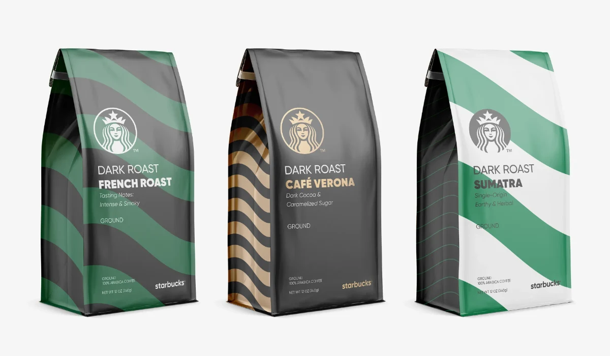
Starbucks also pays attention to the design of its product packaging. Whether it's the packaging for coffee beans, ready-to-drink beverages, or even gift cards, the brand's logo and green color scheme are prominently displayed. The packaging is sleek and modern, creating a sense of sophistication and quality. This attention to detail adds to the overall Starbucks experience and reinforces the brand's image.Famous Starbucks Logos in Movies
The Starbucks logo has become an iconic symbol of the brand's identity and has made appearances in several movies, showcasing the impact of its branding in popular culture. One of the most recognizable Starbucks logos is the mermaid, which has undergone various changes throughout the years. The original logo, created in 1971, featured a green and white vintage design.This iconic logo has been featured in movies such as "You've Got Mail" and "The Devil Wears Prada". In "You've Got Mail", the Starbucks logo can be seen in a scene where the characters played by Tom Hanks and Meg Ryan meet at a Starbucks coffee shop, highlighting the presence of the brand in everyday life. In "The Devil Wears Prada", the Starbucks logo appears on a coffee cup held by the main character, played by Anne Hathaway, during a scene where she rushes to her demanding job in the fashion industry. This inclusion of the logo emphasizes the fast-paced and busy lifestyle depicted in the movie.
These movie appearances not only solidify the Starbucks logo as a recognizable symbol but also reinforce the brand's association with their coffee products in popular culture.
Parodies and Spoofs
The Starbucks logo has become an iconic symbol associated with the brand. It is often parodied and spoofed due to its popularity. The original vintage logo features a twin-tailed mermaid or siren, which is imitated in various humorous ways. Some parodies replace the mermaid with different characters or objects, while others play around with the Starbucks name and logo.Various forms of parodies and spoofs of Starbucks can be found online, including memes, cartoons, and merchandise. These parodies often satirize different aspects of Starbucks, such as its prices, the addictive nature of its coffee, or its ubiquitous presence in popular culture. While some people may find these parodies amusing, others argue that they can be disrespectful to the Starbucks brand. The prevalence of these parodies is a testament to the recognition and popularity of the Starbucks logo.
![]()
FAQ:
Why did Starbucks change their logo?
Starbucks changed their logo in an effort to modernize their brand image and appeal to a wider audience.
What does the Starbucks logo symbolize?
Heckler's inspiration for his research came from a Norse woodcut of a two-tailed siren from the 16th century, which played a crucial role in the creation of the iconic Starbucks logo design. According to Heckler, the siren is a metaphor for the allure of caffeine, similar to the sirens who drew sailors into the rocks. This quote was originally published in The Seattle Times in 2011.
When was the original Starbucks logo introduced?
The original Starbucks logo was introduced in 1971.
What does the Starbucks logo meaning?
The Starbucks logo features a twin-tailed siren, representing the sea and Seattle, where Starbucks originated. The green circle represents nature, healing, and wealth. The logo has undergone changes over time, including a notable redesign in 2011. The original logo was inspired by seafaring and the character Moby-Dick, as Starbucks was initially named after this character. The logo's changes reflect Starbucks' history and maritime connections.
What does the siren in the original Starbucks logo represent?
The siren in the original Starbucks logo is a twin-tailed mermaid, which represents seduction and allurement, symbolizing the allure and appeal of coffee.
What are some of the changes that were made to the original Starbucks logo over the years?
Over the years, some changes that were made to the original Starbucks logo include the removal of the text and the simplification of the siren image.
Is the original Starbucks logo still used today?
No, the original Starbucks logo is not used today. It has been replaced with a more simplified and modern logo.
Why did Starbucks change its logo?
Starbucks changed its logo in 2011 to refresh and modernize its brand image. The new logo was aimed at symbolizing the company's evolution and transformation.
What was the original Starbucks logo?
The original Starbucks logo, used from 1971 to 1987, featured a brown depiction of a twin-tailed mermaid or siren. The logo was inspired by a 16th-century Norse woodcut of a twin-tailed mermaid, which represented seduction and allure.
What is the significance of the green color in the Starbucks logo?
The green color in the Starbucks logo represents freshness, growth, and the environment. It is also associated with the coffee beans and nature, aligning with the company's commitment to ethically sourced and sustainable coffee.
What is the history behind the original Starbucks logo, and how did founders like Jerry Baldwin contribute to its creation?
The original Starbucks logo featured a twin-tailed mermaid or siren, based on a 16th-century Norse woodcut, which symbolized seduction, beauty, and the essence of coffee.
How did the Starbucks logo evolve over time?
The Starbucks logo went through several changes, from the initial brown version in 1971 to the green and white version we see today, reflecting the company's growth and evolution.
Who were the founders behind the Starbucks logo design?
The original Starbucks logo was created by Terry Heckler, who was inspired by old marine books and wanted to capture the seafaring history of coffee and the company's nautical roots.
What is the significance of the name "Starbucks" in relation to the logo?
The name "Starbucks" was inspired by the first mate in Herman Melville's Moby Dick, reflecting the company's love for the sea and coffee, which influenced the design of the original logo.
What is the meaning behind the Starbucks logo's colors?
The green and white colors of the Starbucks logo represent growth, freshness, and purity, reflecting the company's commitment to quality and sustainability.
What role did graphic design play in shaping the evolution of the Starbucks logo?
Graphic design played a crucial role in refining and modernizing the Starbucks logo over the years, keeping it relevant and appealing to a global audience.
Why is the Starbucks logo considered one of the most famous logos worldwide?
The Starbucks logo is renowned for its iconic design, rich history, and global recognition, making it a standout example of successful branding and logo design.