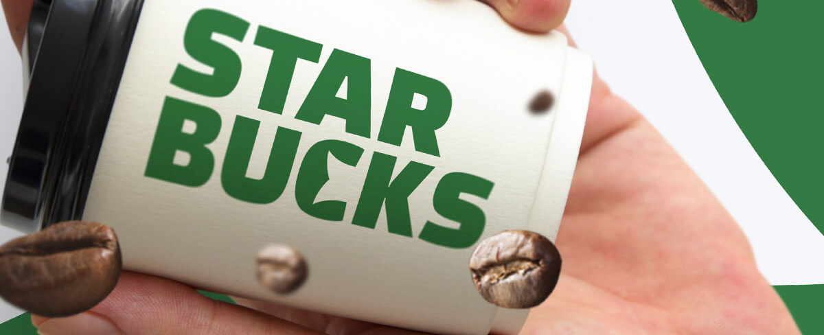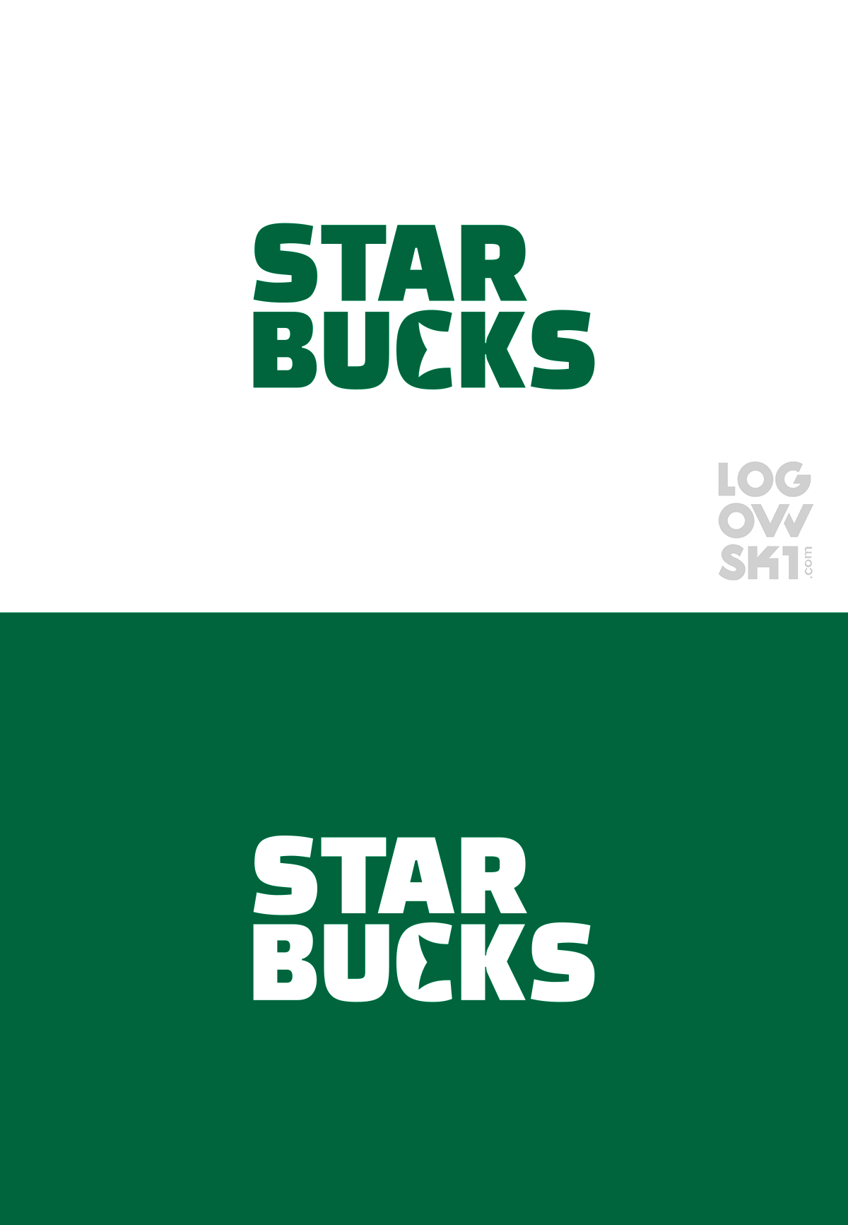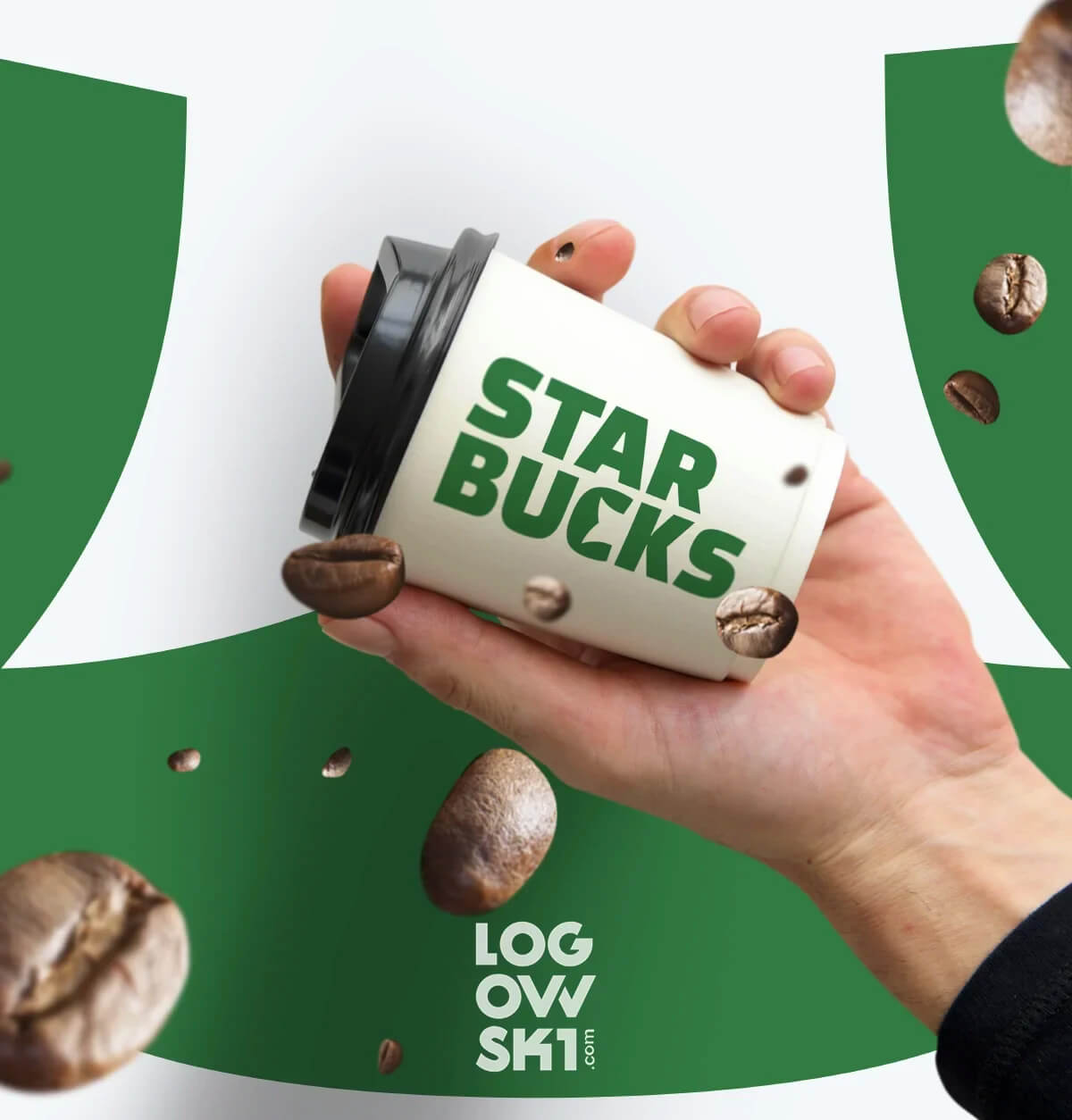
In our quest for a distinctive brand identity, we embarked on a journey to reimagine the iconic Starbucks logo. Inspired by the elegance of font-based logos, we set out to integrate the most recognizable element of the Starbucks Siren – her tail – into our design. The result? A harmonious fusion where the silhouette of the Siren's tail seamlessly intertwines with the letter "C," giving birth to a logo that is both modern and timeless.

By incorporating this symbolic "slice" of the Siren into the letter "C," our logo has undergone a transformation that not only pays homage to the rich history of the Starbucks brand but also exudes a sense of universality. This innovative approach allows our logo to stand out without the need for additional space dedicated to a traditional emblem.

The beauty of this modern interpretation lies in its ability to capture the essence of the Starbucks legacy while presenting a fresh and dynamic image. The carefully crafted integration of the Siren's tail into the letter "C" serves as a nod to tradition, yet the overall design is forward-thinking and adaptable to contemporary aesthetics.

For those curious about the origins and evolution of the Starbucks logo, we invite you to delve into the comprehensive history outlined in our dedicated documentation. This journey through time showcases the brand's growth, changes, and the thoughtful process behind the creation of our distinctive reinterpretation.
In essence, our modernized Starbucks logo is a testament to our commitment to blending tradition with innovation. By embracing the familiar "slice" of the Siren in a novel way, we have created a logo that not only respects the brand's heritage but also positions it at the forefront of contemporary design.
- Artigo AnteriorTop 15 Popular Logos You Need to Know
- Próximo ArtigoCreative YouTube Logo: Evolution from old to Youtube logo 2023