Every brand, whether good or bad, has a reputation. As a result, you may build a brand positioning strategy to assist you to manage your brand's good image and reputation. Companies will be able to stand out in the crowd by using brand positioning. Businesses can use this differentiation to raise brand awareness, convey value, and justify the pricing. All of these factors posses an impact on a company's bottom line.
You may have already developed your brand voice as a means of establishing a strong connection with your customers as a business owner. As a result, knowing what message each font delivers will make the process of selecting fonts go more smoothly for you.
Your logo design, brand colors, and brand fonts must all work together to express your meaningful story.
So, let's look at how to choose the best logo fonts for your business positioning. Continue reading to learn everything you need to know about choosing logo fonts for your brand.
Here are some of the best logo fonts and their characteristics for brand positioning:
1. Serif Fonts
We think of serif fonts as timeless, conventional, and reliable because they are the original font style. Tiffany & Co, Vogue, and Time Magazine are among the brands that use them to portray a sense of respectability and heritage.

Adjusting the font's capitalization is another reliable approach for pairing fonts. We can use an all-caps version of a serif font with itself to create a neutral, traditional, and dependable look.
2. Sans-serif fonts
Sans-serif fonts are also considerably simpler in shape than serif fonts, so they elicit a feeling of cleanliness and help you create a minimalist design. In recent years, sans-serif fonts have dominated the web, with many of the world's leading tech businesses opting for bold sans-serif logo fonts.
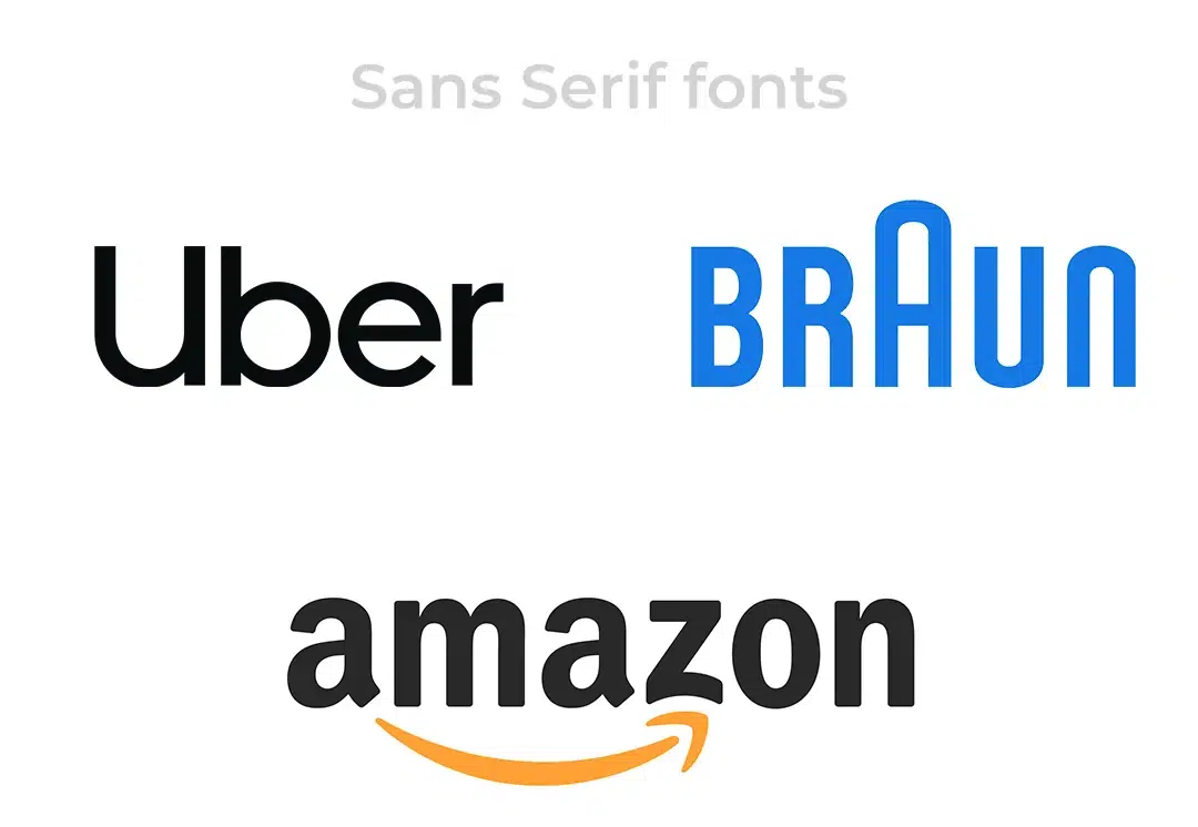
Single, Sans-serif font
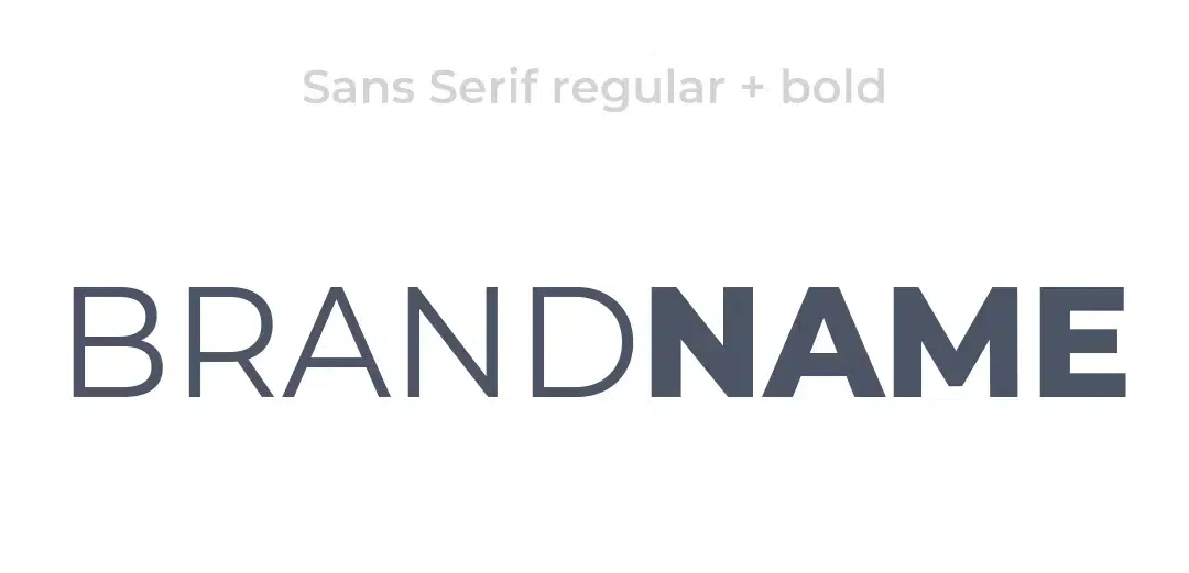
For a clean and professional design, pair a bold version of a modern sans-serif font with a regular version of the same font. When matching font with itself, you can't really go wrong, therefore it's a safe bet if you're not sure about your font talents.
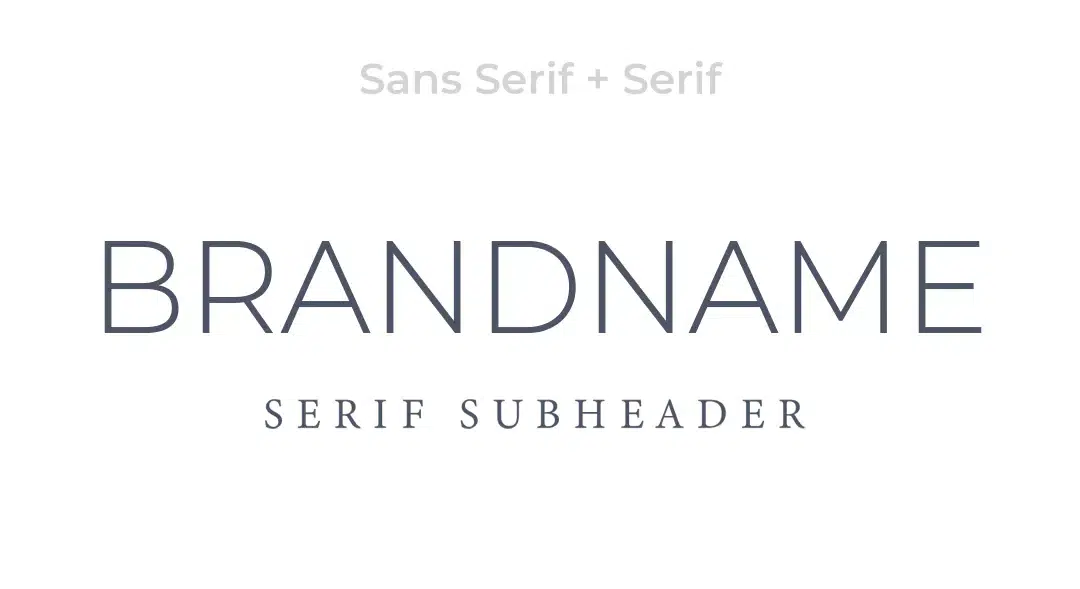
Thin, Sans-serif fonts
Thinner, lighter-weight fonts are regularly evaluated as looking more expensive than heavier, more rounded fonts, according to font psychology expert Sarah Hyndman. By combining a thin sans-serif header with a light serif subheader, you may achieve a delicate, high-end design.
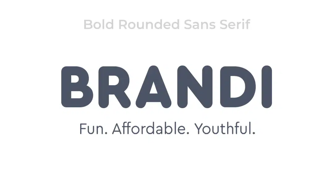
Thick, Sans-serif fonts
Thin, lightweight fonts have the opposite effect as thick, rounded sans-serifs: they appear fun, affordable, and youthful. They go nicely with brands that cater to children, such as daycares or restaurants.
3. Slab serifs Fonts
Serif typefaces with bigger, blockier serifs are known as slab serifs. As a result, they resemble traditional serif fonts in terms of ruggedness, boldness, and quirkiness. This font is ideal for brands who have a lengthy history of providing high-quality goods yet still want to appear current.
4. Script Fonts
Character strokes can connect any letter to the next in script fonts, which are attractive fonts created to emulate cursive handwriting. Each script font has its own individual feel, just like everyone's handwriting. Because they tend to follow current design trends, script fonts are a dangerous choice for a brand font because they may go out of style too quickly.
Nonetheless, corporations like Ford, Johnson & Johnson, Cadillac, and Instagram have chosen script fonts that have lasted the test of time (so far).
5. Handwritten Fonts
Fonts that are handwritten are self-explanatory...They're fonts that appear to have been handwritten. They occasionally use unusual letterforms and areas far from typical serif fonts as you can get. If you really want to promote yourself as a playful, informal, approachable, or artistic brand, they're a great option.
6. Decorative Fonts
The most varied typefaces are decorative fonts. Graffiti fonts, for example, are any font that uses distinctive shapes, forms, or proportions for a highly stylized effect.
Lego, Disney, and IBM all have unusual decorative fonts in their logos that make their brands stand out.
Let's look at the characteristics of a brand positioning strategy:
1. Value
The market position you establish and the subsequent offers you make to your target market must convey a sense of value. Values must be presented in a clear and understandable manner.
2. Individuality
You must have a unique brand positioning plan; if you enter the market with the same items or services at the same price, quality, and level of expertise as your competitors, your brand will almost certainly fail at the first hurdle. You must distinguish yourself as the obvious choice for your target market.
3. Make it crystal clear
When articulating the uniqueness and importance of your brand's market position, there should be no ambiguity. You may have built a truly unique position with the potential to revolutionize the entire sector, but if viewers do not understand the benefits, it will fail.
4. Achievable
Your brand positioning plan is, without a doubt, critical. This is the foundation of your entire branding strategy, and everything else will be built around it. Choose a different market position if you're not sure if you're the proper fit for the position you're building for your brand. Ignoring a brand's basic uniqueness is the quickest way to kill it.
5. Applicability
Your brand's position is shaped by the market's landscape and main players (i.e. your audience and competitors). If you haven't considered your audience's needs, wants desires, and pain spots, as well as your competitors' strengths and limitations. Your positioning strategy will then be irrelevant.
In short, the ideal brand fonts should:
- Be distinct and unforgettable.
- Be readable.
- Work across all platforms
- Make your brand's personality known.
- Be distinct and unforgettable.
- Be readable.
- Work across all platforms
- Make your brand's personality known.
Conclusion
You've decided on one or two brand fonts that correspond to your brand's personality. Picking brand colors, like any other brand design difficulty, is all about choosing fonts that reflect your brand personality (and that will work for everything you throw at them).