Humans are fascinated by color. Everyone in kindergarten wants the biggest box of crayons or the widest range of colored pencils. The interest does not fade with the passage of time. Colors send messages, elicit emotions, and bring radiance to ordinary objects.
Color is also essential in logos. When you visit Times Square in New York, you'll be bombarded with brand logos clamoring for your attention. Some utilize subtle but striking colors, while others scream for attention. What do different colors mean, and how have well-known brands benefited from them? This infographic provides various case studies from which any company can learn.
Every color has a personality and meaning, which is why choosing the proper logo color can make or destroy your company. Fortunately, our design experts have studied over 14,000 logos to help you position your business for success (yes, there's science behind it).

Correct Color Usage is important
Your brand, like colors, has its personality, and customers seek out things that reflect their personalities. Therefore, customers can make better purchasing judgments when you define your brand personality, and it also helps you target the proper people.
So, how would you describe your brand's personality? Begin by pondering the following six questions:
● Gender: Is my brand more masculine or feminine?
● Tone: Is my brand cheerful or serious?
● Value: Is my brand opulent or budget-friendly?
● Time: Is my brand contemporary or traditional?
● Age: Is my brand fresh or matured?
● Energy: Is my brand loud or restrained?
Your responses will offer you an insight into your brand personality, which we'll use to choose the right color for you.
Usage Errors to Correct in logos
We've seen some of the worst logo designs that make terrible use of color. Here are some of the most typical blunders people make, along with tips on how to avoid them:
1. Use colors in your logo that are unrelated to your brand
Colors are inextricably related to our emotions and serve as navigational aids worldwide. Consider color to be an element of your brand's personality or body language.
With this in mind, your logo must reflect your company's identity. Using colors that don't show anywhere else in your company identification is one of the most crucial logo blunders you can make. This is a major no-no that must be avoided at all costs.
2. Inconsistent shades and tinting
The purity of a color tone is determined by its tints and shades. Different saturations and values are one of the most prevalent reasons colors don't work well together. Making a pure-tone redwork with a pastel baby blue is HARD to pull off unless you're a seasoned designer. Instead, choose colors for your logo similar in saturation and value. It demonstrates a level of concern for your design process and a dedication to brand consistency.
Consider the Mastercard logo: note how the tones of each color are the same? Consider what would happen if the red circle were 50% less saturated. Would a pastel red go well with the rest of the logo's vibrant colors? Almost certainly not!

3. Using an excessive number of colors
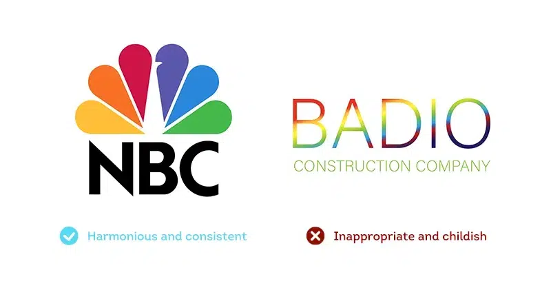
Okay, it sometimes works (take the NBC logo, for example). However, unless you're selling fortunate charms, it's not a good idea to use every hue available. Choosing too many colors indicates that you can't decide on a color scheme, which makes your brand's personality hazy—and hence less likely to resonate with your target audience.

The Pepsi logo is an exceptional example of a straightforward yet effective color scheme. Take note of how Pepsi employed negative white space to separate the colors and enhance their difference. Working with two to three hues that have a clear relationship to one another is ideal.
Of course, much depends on the specific task, the main thing is to approach the solution wisely.
4. Not comprehending the context of gradient logos
Gradient logos are becoming the principal logo for many firms in our always-on digital age. However, the trend has begun to change towards single-color logos recently.

A word of caution, though: these logos follow specific design principles when it comes to where gradients begin and the rate at which colors shift. So make sure the gradient guidelines you utilize in your logo and throughout your brand are consistent.
For example, Mozilla's logo and brand guidelines are an excellent resource for learning about the level of complexity involved in incorporating logo gradients into a more significant brand identity.
5. Choosing colors only because you like it
This is the most essential factor to consider, you never have to neglect it. This question is used by many online logo design tools and website builders to help you choose the proper color. What you enjoy makes no difference; what matters is what your ideal consumer wants. The colors you chose for your brand should represent the preferences of your clients, not your own.

6. Ignoring where and how color will be used
Color is used differently by businesses depending on the product or service they are selling. Colors that are quite different from the surrounding objects on the shelf might help a consumer brand that sells its branded product on the grocery store shelf, for example. If they like, they can use vibrant colors to cover the entire bottle or packaging.
A B2B corporation, on the other hand, often presents its brand in a very different way. They may have produced marketing materials that would be difficult to read if the important content was all take out of a field of color when attempting to make sales. If you're going to silkscreen your logo on t-shirts, embroider your gear, or paint your cars, you'll want to be sure the colors will work in all of those settings.


Final Thoughts
As a result, a logo with too many colors is difficult and expensive to print or embroider. Almost all of the world's most well-known logos have only one or two colors. Maintain a straightforward approach.
The perfect logo colors can help you emphasize your business's advantages and attract the right clients. As you might think, the wrong mix might have the opposite effect.
- Artigo Anterior7 Video Marketing Tips for Your Small Business
- Próximo ArtigoHow branding benefits a business