Logos are one of the most powerful aspects of a brand. Logos are essential for differentiating your business from the competition, helping to develop brand identification and increase brand recognition. In addition, logos can aid companies in promoting brand identification and communicating crucial information in the business arena. It is one of the first things shoppers think of when considering a specific brand.
Designing a retro or vintage logo for your business takes a lot of creativity. You've undoubtedly come here looking for samples of antique logos for your business or organization. We've gathered some fascinating retro or vintage logo designs for you to get some design ideas in this article.
What Is Vintage Logo?
Vintage logos are more than homages to 1980s arcades or 1950s eateries. A retro logo can be influenced by various factors, expressing certain tones and recollections from the past. They frequently use antique typography. These old-fashioned logos shine out, particularly on websites where a savvy usage of one may make it stand out as it is being used in a contemporary setting.
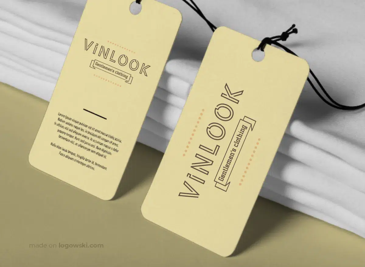
Vintage logos instantly convey a mood from a specific era due to emotional connotations with the visual elements used in the logo. They can be sleek and clever, relaxed and friendly, or even action-packed, depending on the historical period of your vintage logo inspiration. A short scan of well-known websites and numerous companies uncovers imaginative retro logo design. However, it can be overwhelming to create one from scratch.
How is it possible to create a unique logo that has a vintage vibe and sticks out from the competition? You've seen examples of the type of product you want to make, but now you need to give it a unique spin. This must be challenging. Fortunately, there are several ways to leverage classic design methods to highlight your company's most vital points.
Guidelines for Designing a Vintage Logo
Before you begin designing your graphic design logo, you should know that it will be around for a long time. Therefore, be careful to create stuff you'd like to see years from now.
Here are some crucial pointers to remember while creating a vintage logo for your business.
Select a particular decade and industry.
Extensive research is frequently the key to success in developing innovative logos. The most important aspect of research for a retro logo is choosing a particular decade. First, look at the classic styles decade by decade to identify the era that most closely reflects your aesthetic. Then, if you appreciate a specific logo, you can examine it to determine what decade it comes from. It's also a good idea to combine the aesthetics of many eras to make something exceptional and original.
Get Inspired by Our Collection of Logos from Different Decades of the 20th Century:
Logo Designs of the Early 20th Century: 1900-1910
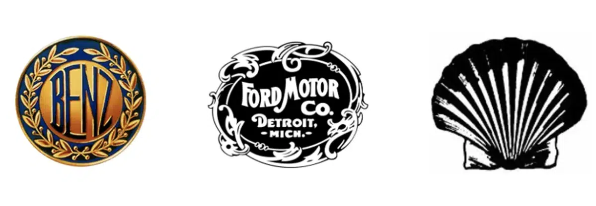
Logos of the 1920s
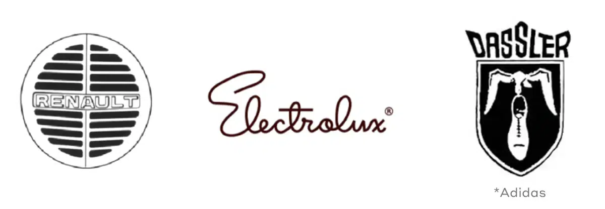
Logo Design in the 1930s
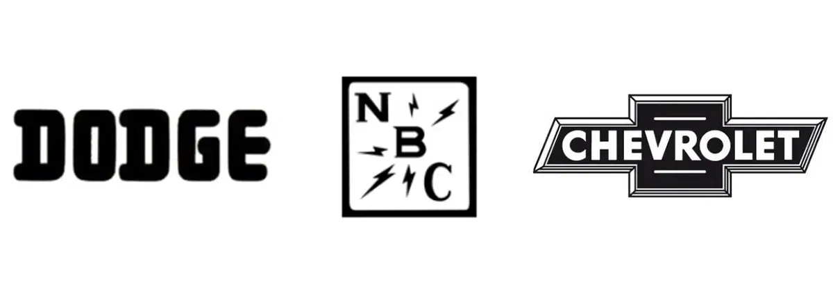
Logos 40s
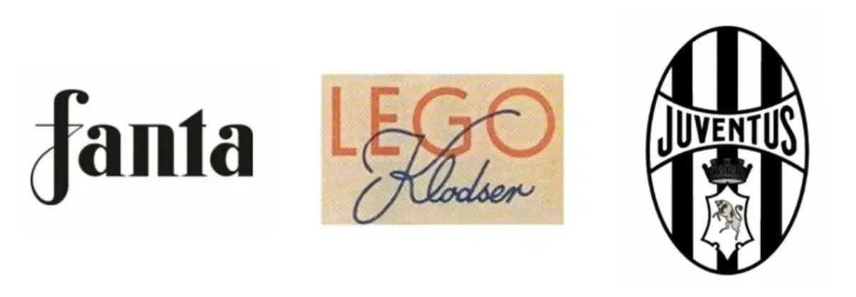
Logos Design of 50s
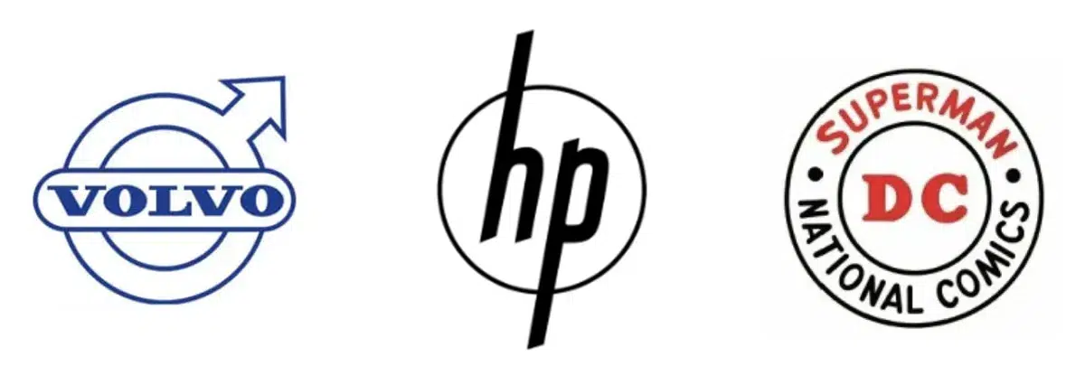
Logos Design of 60s
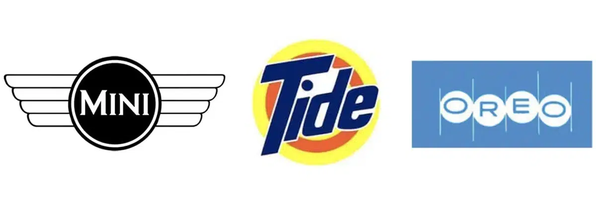
Logos of 70s
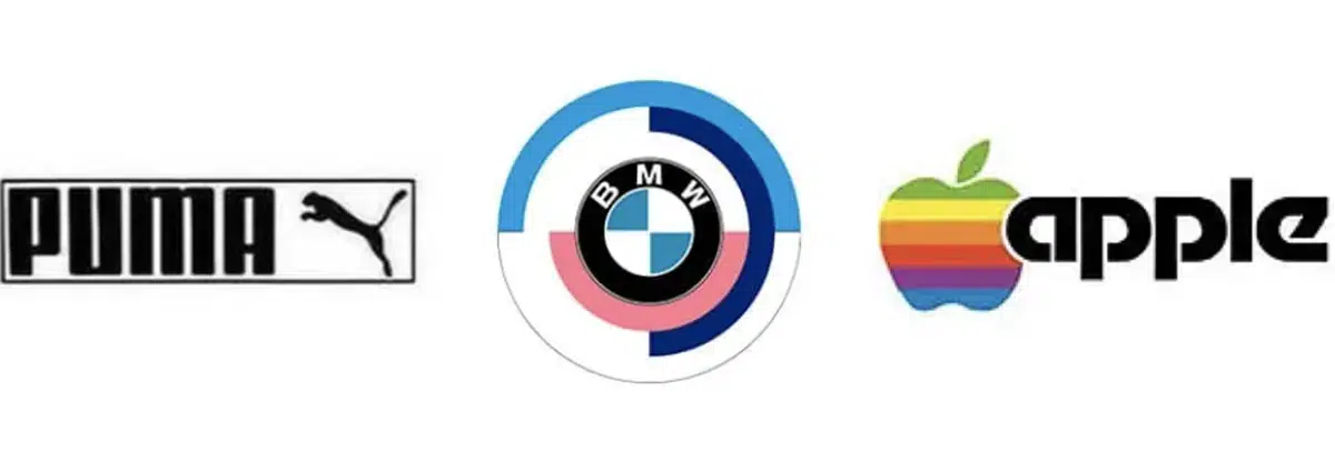
80s Logo Designs
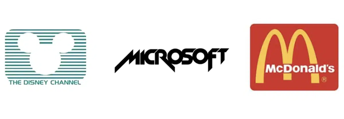
Design Evolution in the Late 20th Century: The Dance of the 90s Logos

Be mindful of the typography.
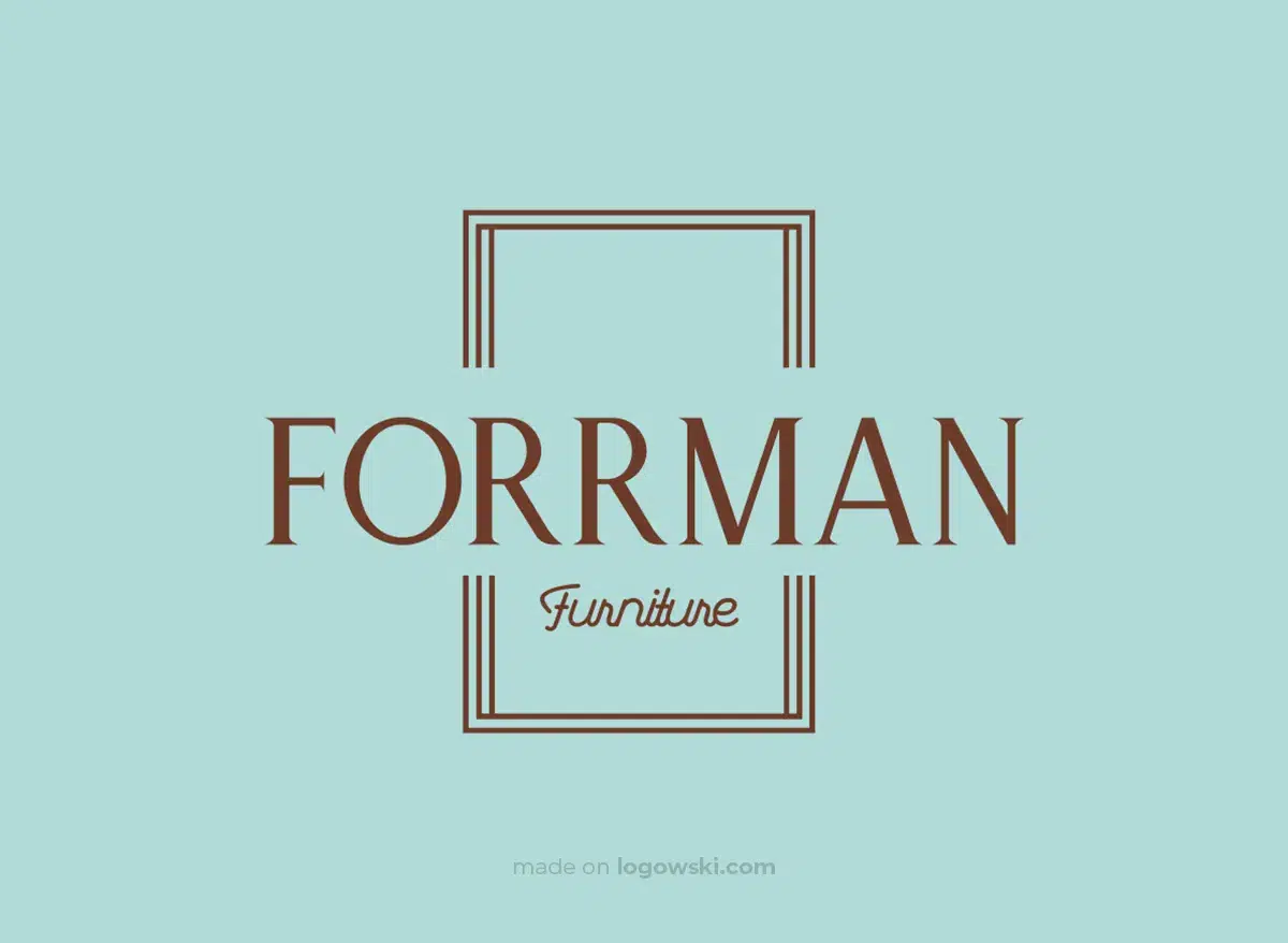
Selecting the appropriate font is the next step after researching design by decade. Your font's form, size, and selection are crucial components of your overall retro logo design since they affect how appealing your logo will be. It usually works best to use styled typefaces. However, choose one that is pretty styled since it will be difficult to see the brand name. For a complimentary design option like the ones below, it is recommended to combine a cursive font with cleaner vintage fonts:
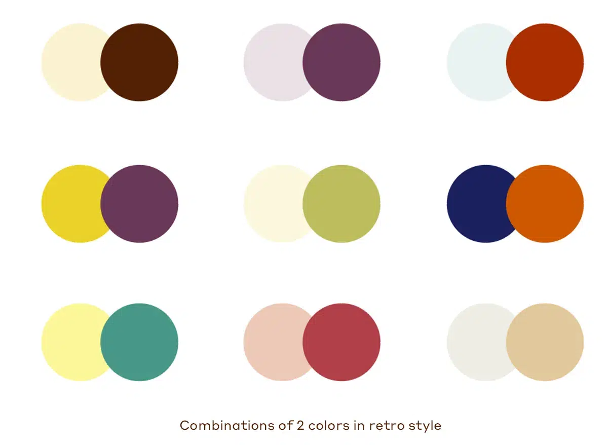
Utilize a limited color scheme.
It is crucial to keep in mind that, in the past, people had different access to a wide variety of color selections than they do now. Most antique designs depended on a limited color palette, whether due to financial restrictions, technological limits, or even aesthetic variations. This is why these vintage styles are so alluring. So be cautious about limiting your color palette to a few. Use the most famous logos from the era you are pursuing as inspiration.
Think about using borders
The use of broad, well-defined borders and badge-style iconography is one element that contributes to the distinctiveness and originality of retro design. Badges embody vintage logo design in numerous ways.
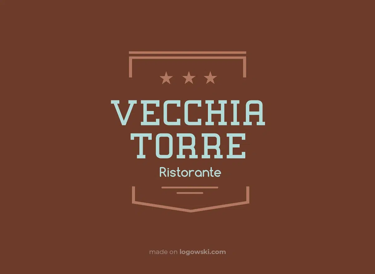
They frequently consist of basic shapes like shields, circles, hexagons, and stars that help make eye-catching patterns without taking up a lot of room. Similar to thick borders, albeit less fashionable, vintage designs frequently have them. They can also assist in making your brand logo stand out from the crowd.
Don't sacrifice quality.
Don't include intricate images in your logo because doing so will reduce its clarity. Remember that your consumer is still contemporary and anticipates some degree of simplicity in understanding your brand's identity.
So concentrate on achieving balance in your design. Avoid too intricate designs that lose the design's core.
Experiment with texture and noise
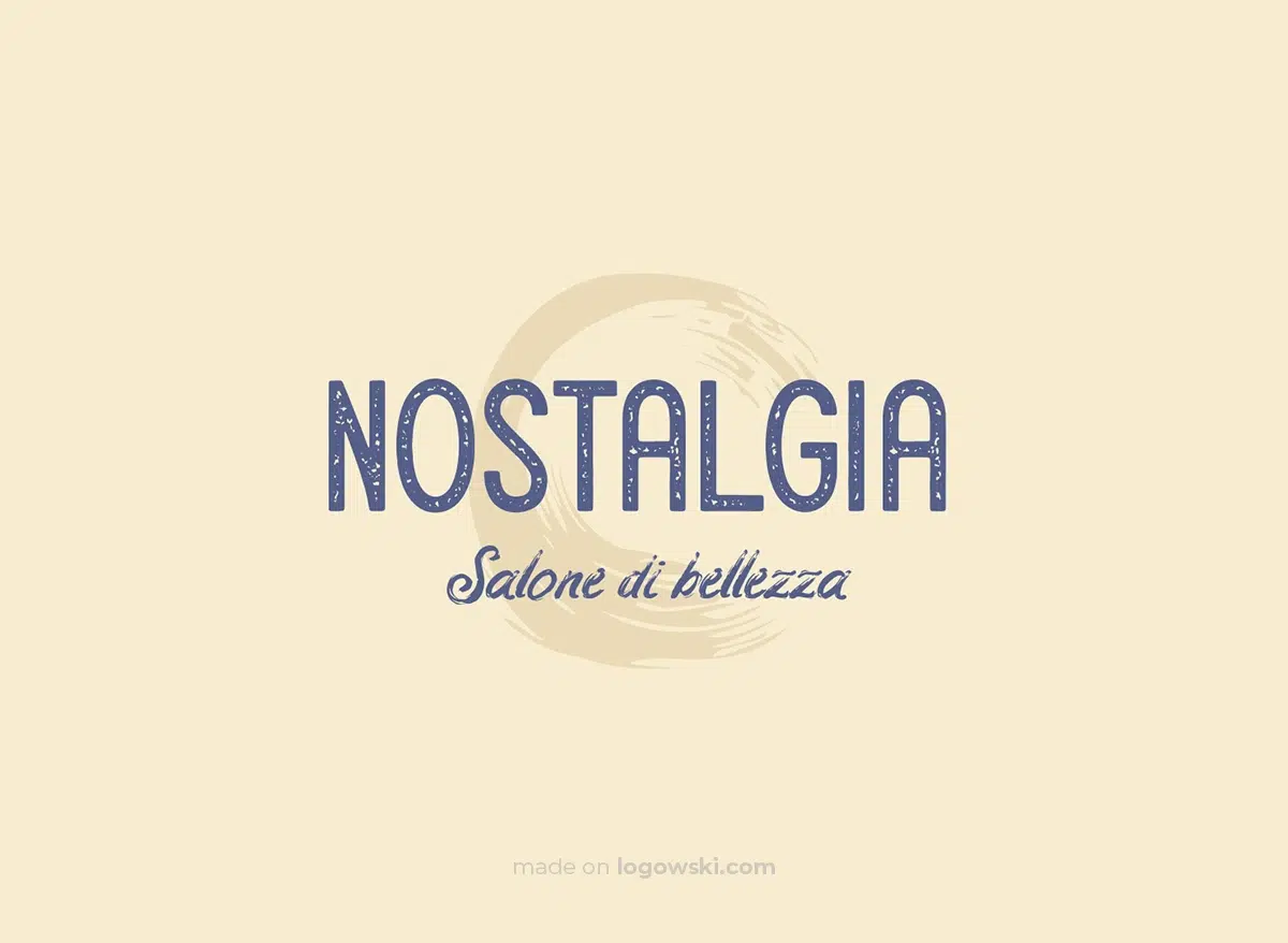
To achieve a more antiquated appearance for the logo, consider incorporating a distressed or weathered font that gives the impression of being scratched or worn over time. Additionally, using graphics with a blurred or smudged effect can further enhance the vintage aesthetic, evoking a sense of nostalgia and historical charm. These design elements can effectively transport the viewer to a different era, capturing the essence of the retro style.
Industries That Enjoy Vintage Logos
Vintage logos can be utilized effectively in any business, although they are particularly prevalent in a few. Let's explore some of the most well-liked vintage logo forums and the characteristics that appeal to each niche's audience.
Music
Anyone in the music industry, from a garage band leader to a jukebox proprietor, may profit from a retro logo. But, of course, most contemporary music is inspired by the works of some artists, Not only band logo designs, though; if you own a pub that prides itself on its record collection or operates the hippest sound technical studio in town, ageless logos are on your side.
A café or restaurant
Do you remember how it felt to go into a restaurant at any time of day, sit on a bar stool, read a newspaper, and order your preferred shake from the counter? There were free coffee refills and nearly always grilled cheese sandwiches for dinner. These classic diners were more than simply places to have breakfast for supper; they were comfortable, welcoming, and guaranteed to take better care of you no matter what.
Restaurants and cafés that use vintage logos provide a similar sense of familiarity. However, as hipster cafés proliferate and diner-like experiences become less prevalent, businesses that wish to reintroduce a homey, nostalgic vibe do so with practical, vintage decor.
Interior Design
Recall how we said that retro logos provide cafés a cozy atmosphere. The same can be said about interior design businesses, which is fortunate since interior design typically entails going inside your clients' homes and attempting to make them seem like a home.
These industrial logos frequently mimic the script typefaces that are distinctive of the antique era, giving the companies they stand for an attractive appearance (and promising your clients to deliver that elegance). You can alternatively go for a more straightforward strategy and concentrate on using subdued colors and emotive font to captivate your readers.
Breweries and bars
Bars often use historic logos to evoke the Prohibition era, which lasted from the 1920s through the 1930s, when alcohol was illegal. These emblems convey a sense of uniqueness around any bar or nightclub, possibly unconsciously making us feel fortunate for the chance to pour one out in the open.
Due to how the vintage aesthetic appeals to nostalgia, microbreweries, particularly, like making use of it. Beer has existed for a long time, and historical logos remind us of this. Linking your brewery with the past will also offer the idea that your beer is of the highest caliber available since beer enthusiasts know that matured beer is excellent.
Clothing
The logos of several well-known clothing brands have endured the test of time. While some clothing brands, such as Levi's or Nike, have abandoned their unique vintage logos in favor of a more traditional modern style, others have welcomed their ties to the past and their reputation as an everlasting clothing line.

Brand Examples
Jack Daniel's
Here is another old-fashioned whisky company logo. The logo features a timeless, antique style. Alcohol brands frequently use old and retro logos. It's a marketing ploy since older alcohol is thought to be superior. (This only applies to some beverages.) Returning to the framework of the logo, the aging effect is completed using conventional type and some soft lining.
Cabela's
The vintage logo design has only been in black and white to date. Here is a vibrant example of a vintage logo. Cabela's is one of Canada's top multi-niche leading brands. The logo looks fantastic, much like the company itself. However, the selection of color is the primary factor that gave the design its finishing touch. The logo is easy to understand, uncomplicated, and aesthetically pleasant because of the use of antique color schemes.
Waffle Press
This lovely retro-style logo for a waffle and coffee cafe transports you to a different era and location. Even though it was relatively common then, the 18th-century design and Victorian typography set it out now.
Smith’s Leather Balm
Using a sans serif typeface and various graphic features, this symbol is another example of the retro design style. It creates a stylish badge logo that can be used on any product packaging.
ZARA
This logo is a wonderful example of how retro design, seemingly, looks great and remains timeless. It is both old-school and very modern at the same time. The beautiful elegant font perfectly conveys the essence of the brand.
Barbie The Movie
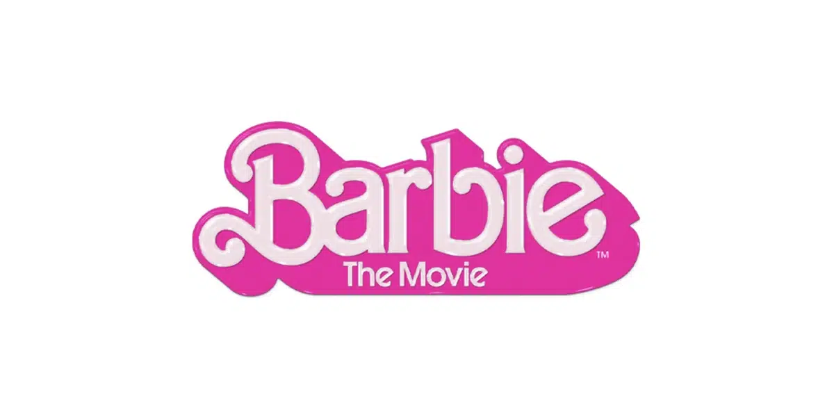
And of course, the iconic logo of the doll, which not long ago even had a movie dedicated to it. And naturally, one of the fail-proof options was to play on the sense of nostalgia and depict the logo in the style of the 70s and 80s, clearly reflected in the font and vibrant pink color. This modern vintage style is capable of distinguishing the brand among hundreds, as it reminds us of the warm, cozy times.
Final Thoughts
Creating a brand identity will allow you to stand out from the competition and expand your business's audience. Therefore, a logo has an essential place in the hierarchy of brand identification. Using a vintage logo design in conjunction with the newest fundamental trends, you may appear unstoppable.
Vintage logos have been famous for many years, and they have always given companies a chance to display their brand proudly. A designer may keep themselves current by sometimes returning to classic logo design styles, but a company owner would benefit from researching the numerous types of logo designs available.