It's not easy to have your own YouTube channel! Especially if you're continuously developing and uploading fantastic video content for your subscribers but aren't seeing the desired outcomes.
You'll need a professional-looking YouTube logo to take your branding to the next level. It not only helps to market your brand, but it also helps to establish trust and credibility with your followers. There are no distinctions between the company's logo and YouTube, but the logo should be bright and expressive. Of course, it all depends on the topic and how you want to be perceived.

Don't be concerned! From gaming and e-sports to travel and beauty, our AIl YouTube logo builder can create hundreds of great designs. Enter some channel information, pick a design you want, and tweak it to your heart's delight. Changing the size, symbol, color, and A font logo is an excellent option. It works great with a wide range of information and is simple to animate and manipulate.
Take a look at our best YouTube logo design ideas below before you try them out for yourself, and we'll teach you how to make the perfect logo for your YouTube channel.
Let's check out how to create a logo for a youtube channel.
1. Lifestyle
Are you a YouTuber who focuses on lifestyle? You're a lifestyle YouTuber if you post videos about your own life, daily activities, current events and actively connect with your viewers' interests, such as pop culture.
Popular lifestyle YouTubers currently use a text-only logo with an eye-catching script font that deviates from the norm. Script fonts are great for conveying your friendliness and the intimate nature of your channel.
The color you choose for your lifestyle logo is the final component of the jigsaw. You can't go wrong with tones of yellow if you want to convey a sense of warmth and joy. On the other hand, choose a blazing orange if you're vivacious and want to share that in your logo. It's energizing, but not to the point of being uncomfortable.
If you want to draw attention to yourself, use a bold, vivid hue like red or even violet. Darker colors should be avoided. They have the potential to depress your audience's mood, which is in direct opposition to your purpose of engaging and entertaining them.
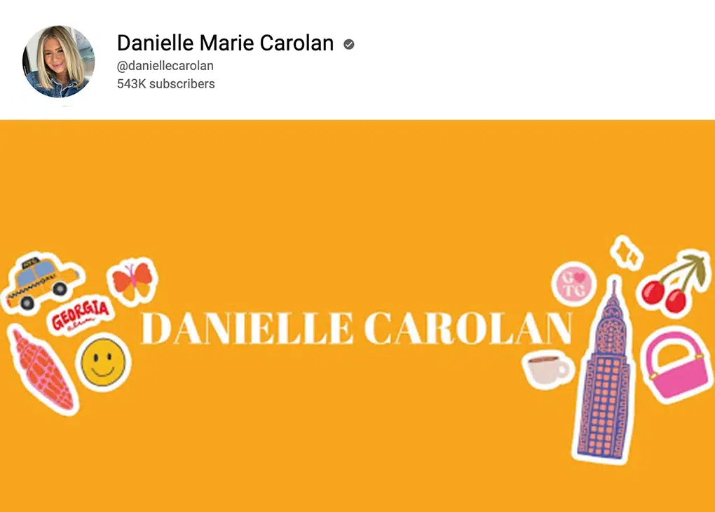
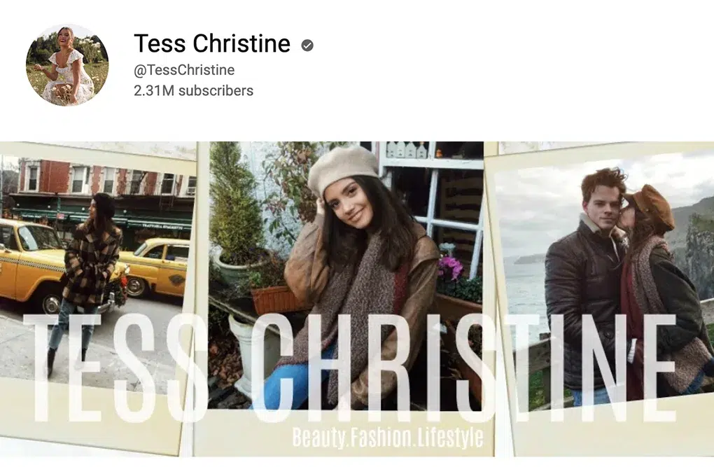
Examples of the design of popular lifestyle vloggers:
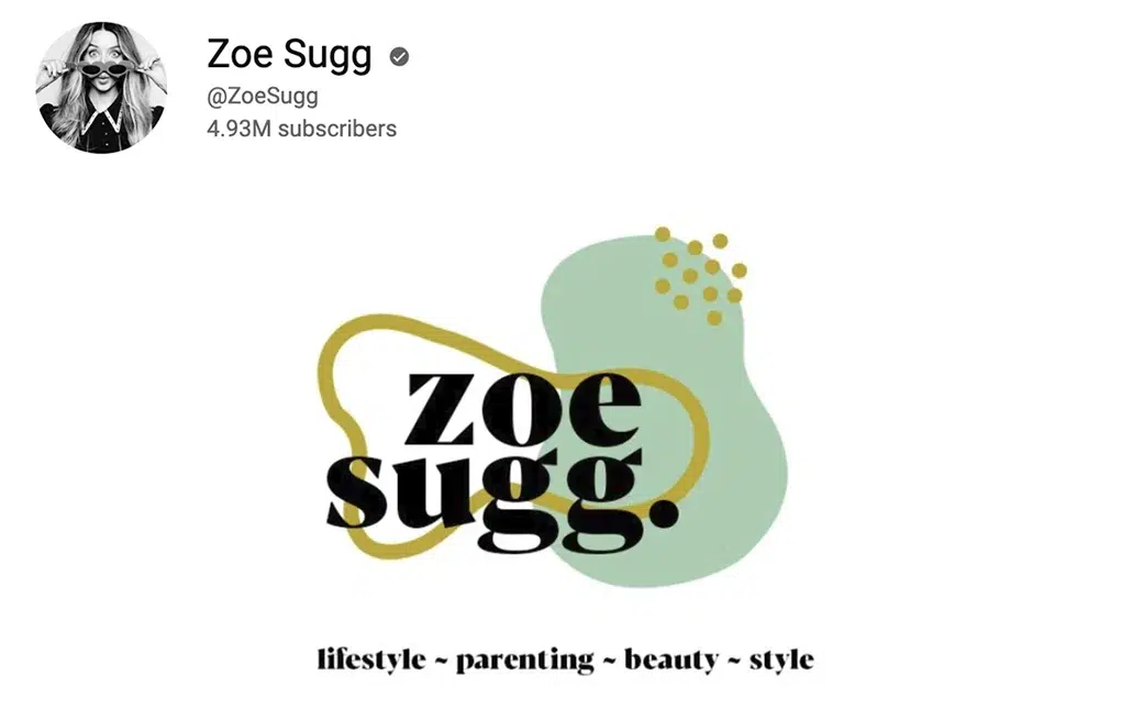
Emma Chamberlain Youtube Channel

Danielle Marie Carolan Youtube Channel
Tess Christine Youtube Channel
2. Comedy
Unless your audience knows who you are or clicks on your videos, they won't see your humor, whether you're amusing them with stories, sketches, or songs. Your goal is to make your audience or fan feel happy by entertaining them. So having a dull logo isn't going to cut it. Here's how to make your logo design fit for a king or queen of comedy. And, when it comes to humor fonts, comic sans might be the most acceptable option. It's a fun font with a lighthearted feel to it. Consider choosing a serif font like Helvetica for a more refined look.
If you want a friendly and personal font, sans-serif is an excellent option, mainly because it's high current. Moreover, your color palette should elicit the appropriate emotions, taking your brand's personality into account. For example, yellow is more laid-back and enjoyable than blue, a subtle, cerebral color.
Examples of the design of popular comedy channels:
Comedy Central Youtube Channel
3. Challenges/Pranks
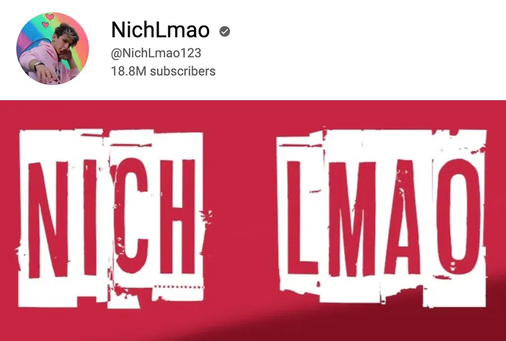
It's all about having a good time, making people laugh, and doing the seemingly impossible on prank and challenge channels. A high-energy and attention-grabbing YouTube logo is required when creating a prank or challenge. Your job is to keep people entertained, not to put them to sleep.
Some of the most popular prank channels have dazzling icons that communicate the channel's essence. Choose an image for your challenge logo that is closely tied to the types of challenges you face on your track, whether physical challenges like hiking up mountains or artistic challenges like re-creating stunning photographs with low-tech cameras.
You can't go wrong with amusing fonts and color palettes when it comes to drawing people's attention and making them grin. Use vibrant and energising colors like orange, green, red, and purple.
Regarding font styles, avoid extremely professional-looking serif fonts favoring sans-serif or script fonts. They're more at ease and upbeat.
Examples of the design of popular challenges/pranks channels:
4. Travel
It's all about sharing those once-in-a-lifetime events with your audience while you travel the world. Whether you're visiting popular sites and staying in 5-star hotels or teaching folks how to travel on a budget and get the most bang for their dollars, it makes no difference. You're displaying the world through your eyes to your audience. And one of the reasons they're paying attention is to see you.
When developing your logo, you'll be tempted to select the apparent go-to emblem – an airplane. But be careful. Otherwise, your logo can end up sounding too much like a vacation agency.
When it comes to font selection, a sans-serif font, for example, is ideal for showing trust and camaraderie. In addition, if you're visiting hot areas, you can pair it with a warm hue like dark red or orange and green if you frequently travel through the jungle or other lush green landscapes.
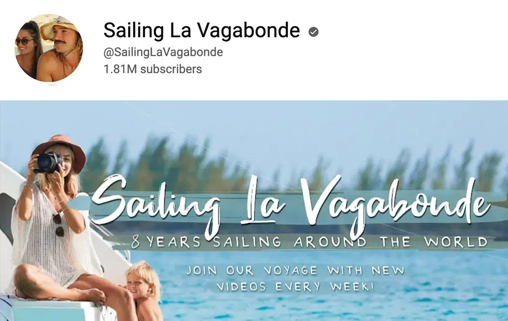
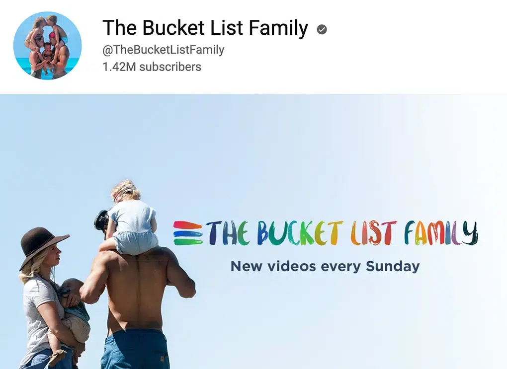
Examples of the design of popular travel vloggers:
Sailing La Vagabonde Youtube Channel
The Bucket List Family Youtube Channel
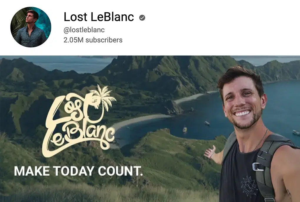
5. Gaming
There has never been a recommended time to be a YouTube gamer. As a result, E-sports is fast growing in popularity, particularly as more people turn to computers and consoles for amusement.
Look to your favorite games or appearance for inspiration when picking what image to utilize as your logo icon. For example, many live streamers expose their faces while playing, so if you always wear a hat or sunglasses, you may incorporate them into your logo to help promote your unique brand.
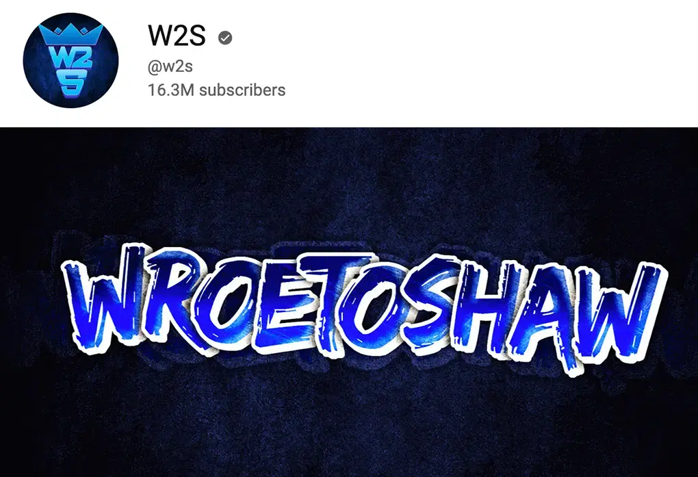
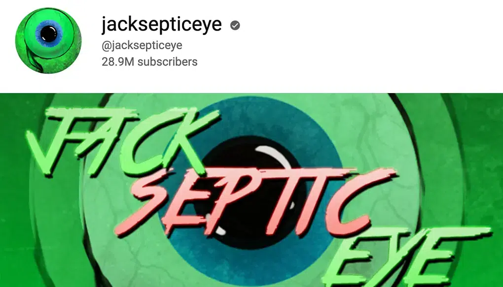
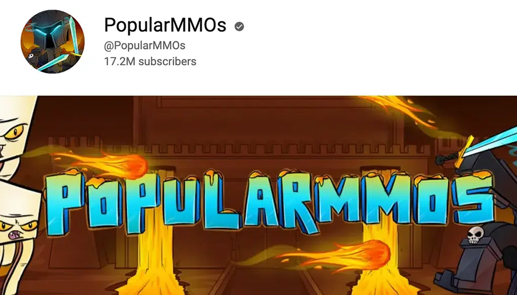
Your gaming font logo should be simple to read. It's all too easy to get caught up in the trap of using a cool-looking font that's difficult to read. Again, tailor your font to the game genre you're playing. Use bold fonts in action games like first-person shooters and adventure games or a more relaxed sans-serif font in social or exploratory games.
The same logic holds for your color scheme. You want your brand identification to stand out to your customers and reflect your brand as well as your preferred gaming titles and genres. However, it's vital not to resemble other successful gaming YouTubers like Ninja.
Examples of the design of popular gaming channels:
Conclusion
In our opinion, in 2023, a great solution for YouTube design will be:
For avatar: personal unusual photo
For the cover: a photo of your everyday space that has a part of a uniform background (sky, darkness, wall, etc.) on which you can place your logo.
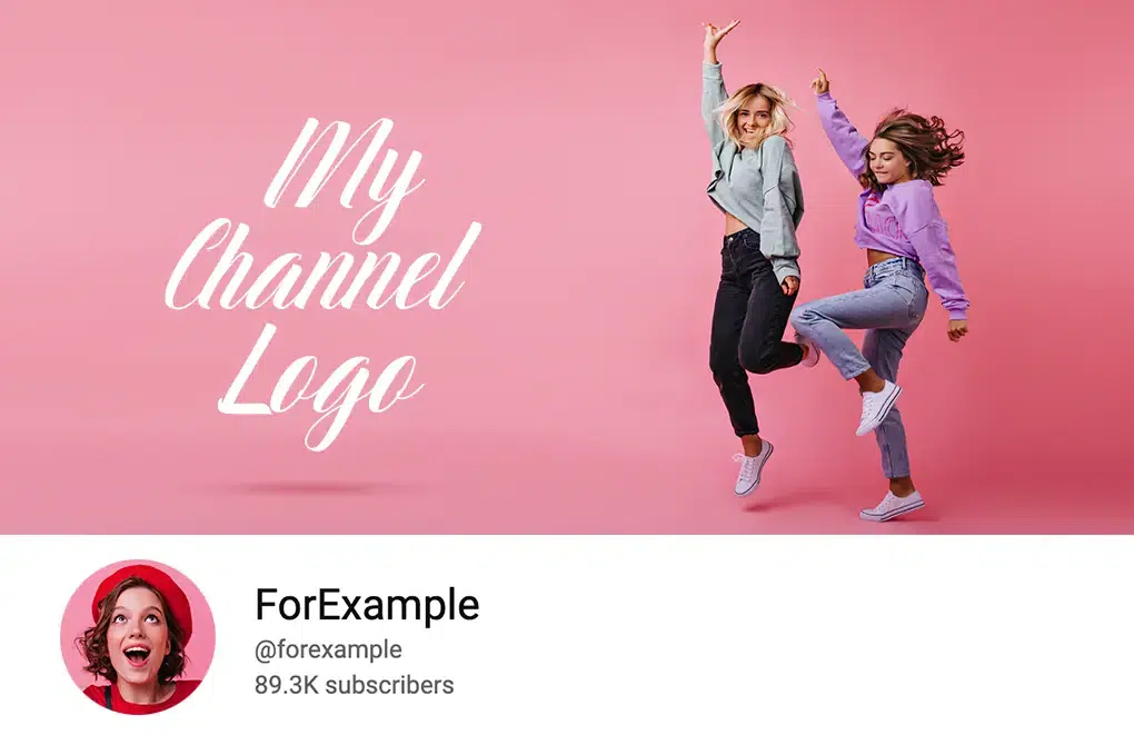
The simplest method for creating a YouTube logo! Pick a template that matches your channel's aesthetic and that your subscribers would enjoy! Then make your logo by modifying a template! There will undoubtedly be a logo for you!
- Artigo AnteriorHow do you measure your productivity
- Próximo ArtigoHow to register a logo as a trademark